Designing from scratch the portal that turns real-estate data into decisions
Valua is a data product for the real-estate sector that was starting from zero. My brief was to design its owner portal — the experience where a person checks what's happening in their area and decides who to trust. With no prior product to lean on, the work meant turning a set of business needs into a mobile-first interface — simple and actionable.
0 → 1
Portal designed from scratch, with no prior product to reference
Mobile-first
Hierarchy built for mobile so it never drowns in data
6 screens
A complete system: home, area, movements, rankings, agency and property
The brief
Valua is a data product for the real-estate sector that was just being born. Behind it sat a clear set of business needs; my part was one very specific piece of the puzzle — the owner portal, the face seen by the person who wants to understand the market in their area.
There was nothing to start from. No earlier product to redesign, no inherited pattern — the challenge was to shape an experience from scratch and leave it ready for the team to build.
The portal had to answer, simply, two questions any owner asks themselves — what's happening in my area? and who can I trust?
The challenge
The starting material was dense — prices, time-to-sell, movements, comparisons — and the biggest risk was the most obvious one — overwhelming the person with data until the product became useless.
The constraints I set myself
- Mobile-first, for real. Not a stripped-down version of the desktop, but designing for the small screen first and forcing myself to prioritise which piece of data earns its place.
- A logged-in experience. Assuming the person already has their property and their area, the portal had to get straight to the point from the very first moment.
- From data to decision. Every screen had to make clear not only what it shows, but what do I do with this — compare, explore the area, choose.
So the design question wasn't how do I show all the data, but what does the person need to see at each moment to take the next step with confidence.
The solution — the screen system
I designed the portal as a system of screens that lean on each other, each one solving part of the journey without asking the person for more attention than necessary.
- Home. An entry panel with the essentials at a glance — the pulse of the area and the property, the latest movements and a shortcut to everything else.
- My area. A map centred on the property to get your bearings — what's for sale, what has sold and who operates nearby.
- Movements. A filterable feed of the area's recent activity — new listings, sales, price changes — to follow the market effortlessly.
- Rankings. A list where the person chooses the sort criterion, to compare by what genuinely matters to them.
- Agency profile and property profile. The detail — the profile of each professional and each property, with Valua's unique data front and centre.
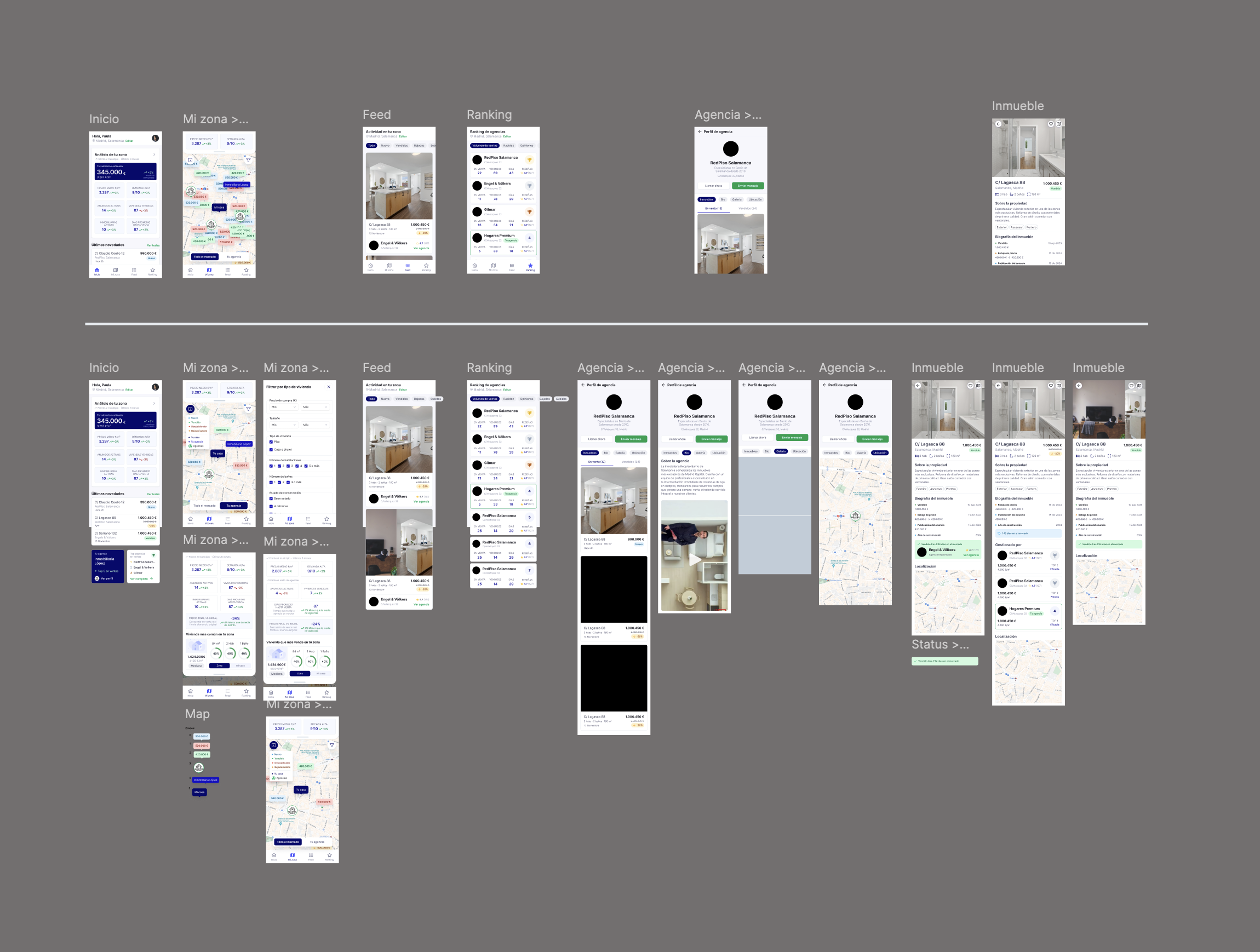
The key piece wasn't any single screen, but the flow between them — start with a simple read, let the person dig deeper when they want, and make every jump — from area to ranking, from ranking to profile — feel purposeful.
From design to product
The portal didn't stay as screens — it shipped. These are shots of the product already up and running, where the design proposal — enter through the simple and let the data speak — holds up outside Figma too.
Design note
With a data product, the hard part isn't showing the information — it's deciding what to leave out. My job was to turn a dense volume of data into a simple journey where the person always knew what their next step was.
Design note