A dissection of Higgsfield's initial conversion funnel
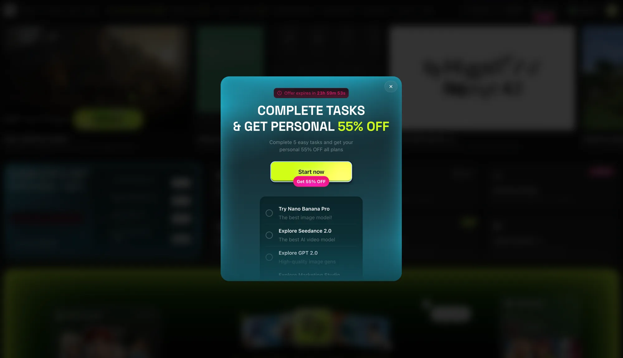
It had been a while since I’d seen a conversion funnel as strong as Higgsfield’s.
The tool is growing like wildfire: every day we see it integrated with the big players in creation and AI — with Claude via MCP and, a few days ago, with Figma via plugin.
The best part is that it’s becoming #1 in its niche without being the provider itself — it’s an aggregator of models under a single subscription. In fact, it’s as if it were overtaking several of them on the inside lane, or doing their dirty work, depending on how you look at it. The play here is to keep the customer relationship and commoditize the provider: you pay Higgsfield, not ByteDance (Seedance 2.0) or Google (Nano Banana Pro). Pure disintermediation, in other words.
Let’s break down the onboarding and conversion funnel of this dizzying SaaS — and its aggressive Growth machine.
Onboarding: qualify and commit
The first thing that happens when you sign up is an onboarding flow that qualifies you as a user. Super clean and elegant. These folks have invested in UI and branding.
It’s not just cosmetics, segmentation or user research: every question is a micro-commitment. It’s the foot-in-the-door technique —small “yeses” that create dissonance if you later abandon— grounded in Cialdini’s principle of commitment and consistency. By the time you reach the offer, you’ve already invested two minutes “building” your profile, and nobody wants to throw that away (the IKEA effect: you value more what you helped assemble).
The first voucher: the gift with a countdown
The end of onboarding is a discount voucher — a gift of 55% off that expires in 3h. The neon-pink accent against the black screen grabs your attention right away. Instant FOMO.
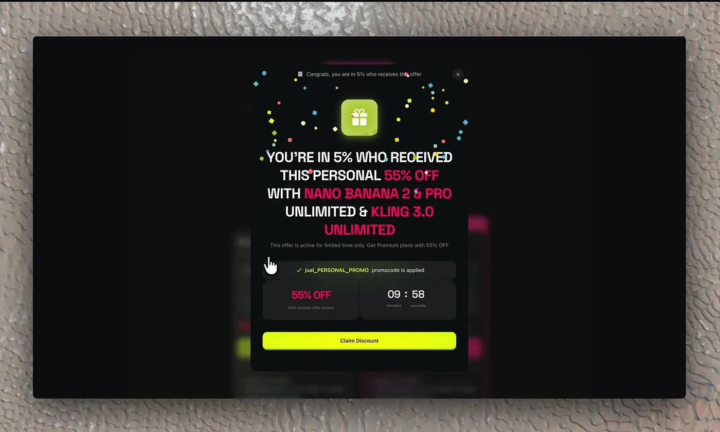
There are three stacked levers here, and it’s worth naming them:
- The color contrast isn’t aesthetics, it’s the Von Restorff effect (or isolation effect): the element that breaks the visual pattern for the first time for the user —fluo pink over black and over the primary (lime)— captures attention and memory above everything else.
- The “gift” triggers reciprocity: they frame it as a present (gift icon included), not as a commercial discount, so you feel a small debt.
- “You’re in the 5% who get this offer” is scarcity + exclusivity + flattery. And the code literally carries your name: personalization that fires the endowment effect (you perceive it as yours, it almost belongs to you already, it’s harder to let go).
We move on for now.
Note: in the video version the first voucher appears with a 10-minute timer only. Which makes me suspect they’re running at least one A/B test on the intensity of the urgency. The underlying question their growth team is asking: does a short countdown convert more through pressure, or does it burn more through reactance? My guess is they segment by behavior.
The fine detail: where “close” takes you
Interesting point: when you close the pop-up you don’t land on the dashboard, you go straight to the pricing screen, with discounts already applied to every plan and the timer running against you.
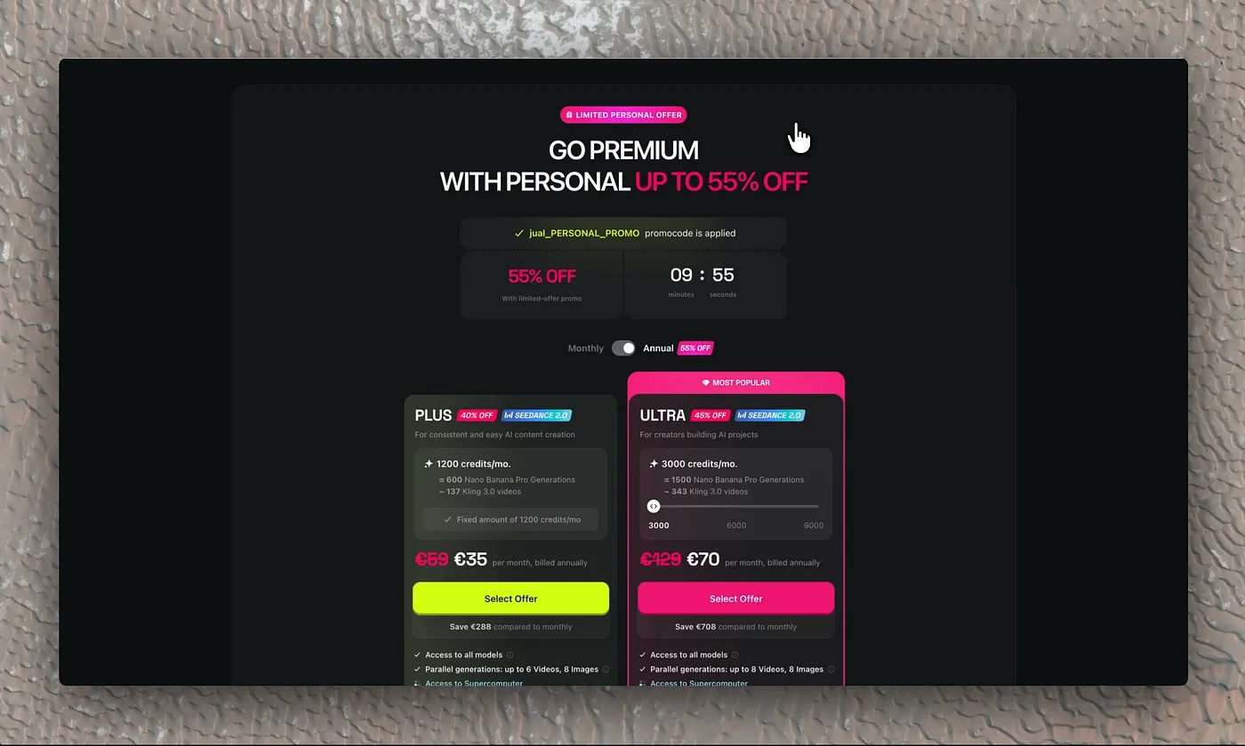
This is a deliberate default: instead of letting you land where you wanted (the product), they drop you where they convert (the price), with the discount pre-applied so the mental anchor is no longer the list price but the discounted one. Closing the modal isn’t escaping: it’s advancing one step in their funnel.
We keep moving. We just want to try the tool for free. Everything else is irrelevant.
The dashboard: abundance and cognitive load
Next, you enter the dashboard. You immediately notice the richness of the ecosystem: onboarding cards promoting features, an endless array of modes and tools. All well executed and elegant, but with an enormous cognitive load.
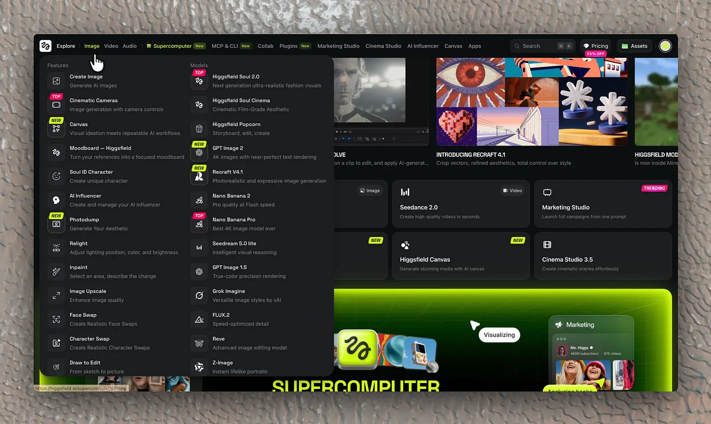
We’re looking at Hick’s law (decision time grows with the number of options) and the paradox of choice. It’s a double-edged design decision: it communicates “here’s all the power of AI” (reinforcing the aggregator’s value proposition) but overwhelms the newcomer. The very excess of options pushes you, paradoxically, toward the shortcut: paying for someone to bring order to the chaos.
Moving on. Let’s get to the good part.
The aha moment… and the wall
I want to animate something I consider very hard. In the video I couldn’t pull it off, but the first time I used it —without even knowing which model I was using (note, again, the heavy cognitive load across the whole site)— it produced the final frame (from my initial output) and I was amazed. With a minimal prompt it made something genuinely great.
We want to generate the video and… bam! Paywall.
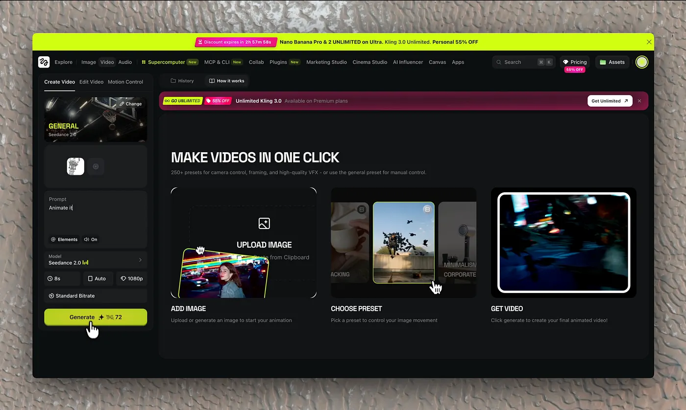
The timing is surgical. They let you try right up to the moment of peak desire —the aha moment— and cut you off there. It’s the Zeigarnik effect (unfinished tasks create psychic tension that demands closure) combined with a paywall positioned at the emotional peak. They don’t block you on entry, when you don’t care yet; they block you when you already want the result. Textbook value-first paywall.
The pricing table: anchoring, decoy and center-stage
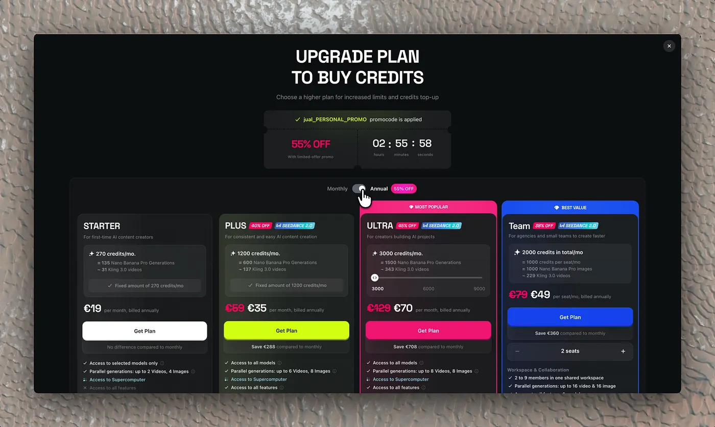
The STARTER plan (€19) is practically irrelevant; even as a novice I wouldn’t consider it. It’s not there to be sold: it’s a decoy that makes everything else look reasonable by comparison.
Option two, PLUS (€59), is the one that catches my eye the most. Good discount. It’s the effect Netflix popularized (again a decoy effect): they use the most expensive plan (the one on the right / Premium) as the “decoy.” At Higgsfield that premium piece is ULTRA (€99, struck through from €199, “Most Popular”). The “Premium” (Top) plan isn’t designed to be the best-seller: it’s given a notably high price and highlighted above the rest. Its only function in the experiment is to alter the customer’s perception of value.
The visual and mental contrast: when you look at the ULTRA plan (very expensive), your brain automatically resets its “anchor” of what’s acceptable to pay. The nudge toward the left (the PLUS or middle plan) is unconscious, and it goes from looking “expensive” to looking like a real bargain or the “sensible,” balanced option. The user feels they get almost the same quality while saving a lot of money versus the top plan. After ULTRA comes the Team plan (€59/seat, “Most Value”), the upper anchor aimed at companies.
Clearly, Higgsfield’s main value proposition, at least on this screen —coming in from video generation— is Seedance (not “sedante”): ByteDance’s model, which they highlight on the plan cards.
The middle plan seduces me. The UI seduces me. The UX is built so you charge in like a bull into the ring. Then comes the toggle trap (annual pre-selected): when you pick the monthly option, the discount on PLUS —the most reasonable one— is laughable. The juicy discount lives in the annual plan: they push you from the free trial to a 12-month commitment with almost no intermediate step.
So there you are: you haven’t even spent four minutes on the page and you’re already considering hitting a button that takes you to a checkout to shell out €500 (if, like me, you didn’t even realize you were on the annual plan) for something you neither know how to use nor have tried. Dark UX or masterful — I’ll leave the labels up to you.
The checkout, the escape… and the in-app retargeting
For some strange reason you reach what looks like the Stripe checkout. You see the amount —you were complaining about how expensive Claude Code is, and that’s not even a wrapper—. You run away from there.
But when you come back, another pink-and-lime pop-up greets you, offering up to 62% off —“an extra 7% on top of your personal discount; this is our absolute best offer”— just for being you, and with exactly 10 minutes to claim it and grab your dazzling prize. You close the banner again.
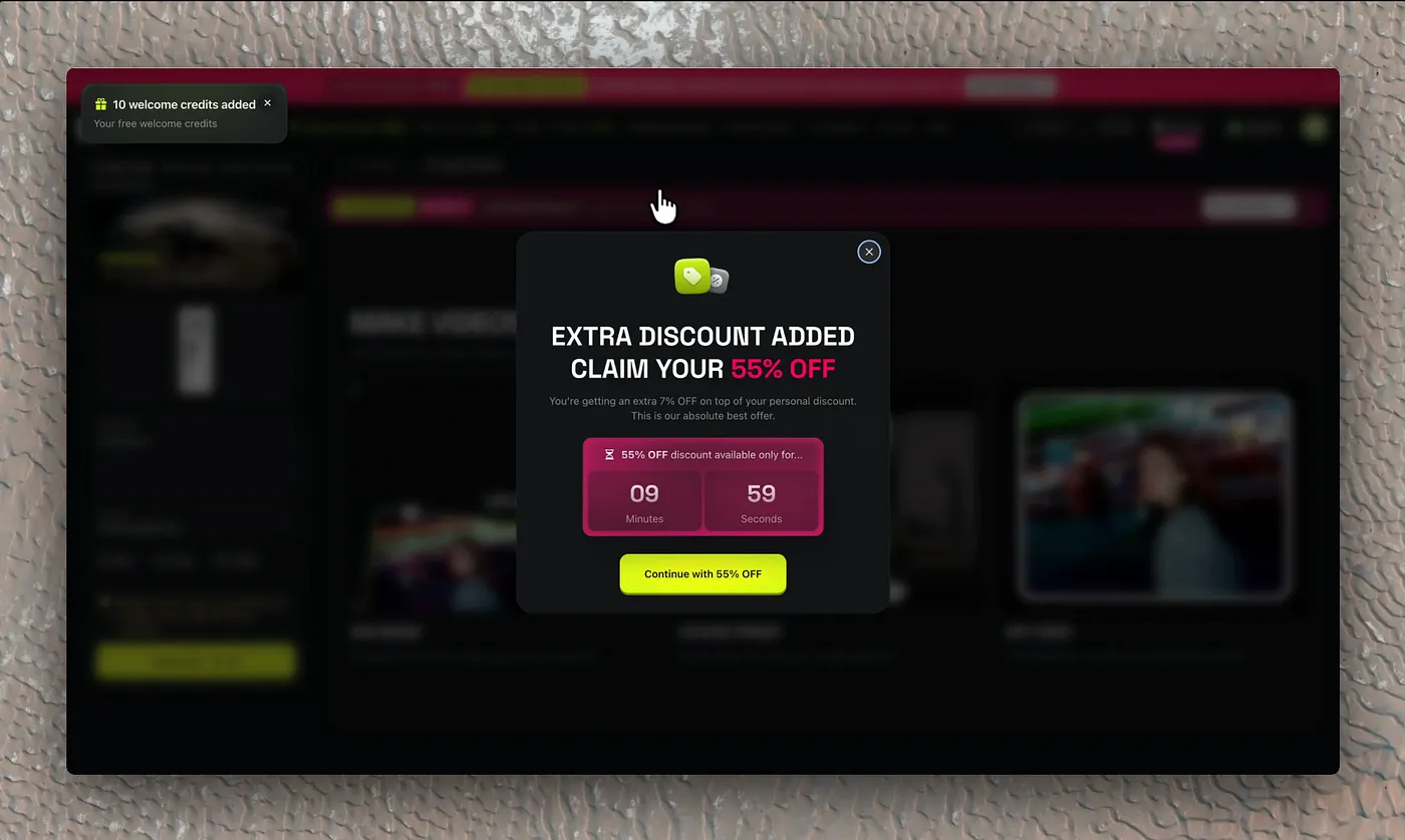
This is exit-intent retargeting done inside the product, and the discount escalation (55% → 62%) is price laddering: every abandonment unlocks an “impossible to refuse” offer. The message “our absolute best offer” closes the door on waiting for more (anti-procrastination). Notice the shift in register: the first voucher was a gift (reciprocity); this second one is a rescue (they’re going to save you from losing the offer). Different emotion, same countdown.
The persistent banner: from discount to loss
And, once again, you land on the pricing screen —but now with a huge top banner reminding you that you have 9 and a half minutes left to secure savings of up to €70 on the recommended plan (where your eyes go instantly) and €30 on the reasonable one, the one you’d been considering. The “62% OFF” stays pinned even on the “Pricing” item of the navigation menu: the urgency stops being a one-off modal and becomes ambient, following you all over the app.
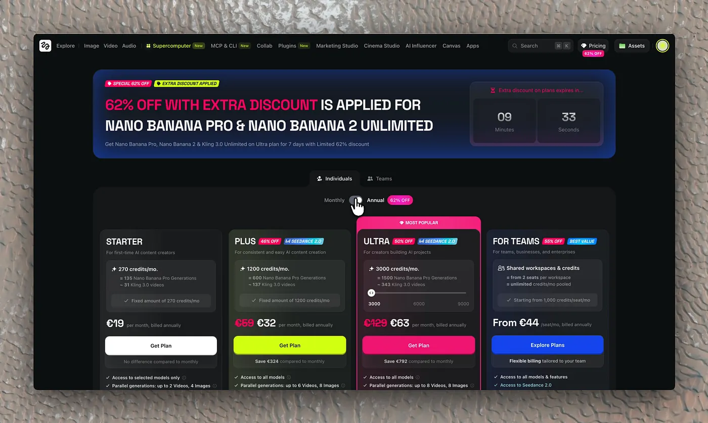
And here’s the finest psychological maneuver in the whole funnel: the reframe from “percentage” to “euros you lose.” Going from “62% OFF” to “you save €70” activates loss aversion (Prospect Theory): losing hurts psychologically about 2× more than gaining the same amount pleases. You’re no longer deciding whether to spend €99; you’re deciding whether to lose €70. Framing is everything.
The worst part is there’s no going back. You came to generate videos; if you don’t pay, you can’t make them. And from what you’ve seen, this is where the market’s best solutions are gathered in one place. So you have two options left: carry on as before, or invest in something different. I don’t know their conversion rate, but I have a hunch they’re doing very well.
Conclusion: aggressive, but with silk gloves
Without resorting to “Temu-style” tactics —I mean the UI pattern of many Asian companies that overwhelm the user with paywalls, spin wheels, stacked discounts and gamification to the point of nausea, triggering reactance and banner blindness— Higgsfield builds, relatively easily, elegantly and above all fluidly, a very powerful CRO strategy.
And most importantly: without having yet tested the tool’s real power, I’m almost in.
I haven’t examined the rest of the UI closely, but I deduce there’s nothing here left to chance: if the entry funnel is this calculated, the exit one wasn’t going to be any less. Even delete account becomes a psychologically harder task than what we’re used to on most platforms.
It’s the roach motel pattern —easy to get in, hard to get out— and it’s executed with the same care as the paywall. Before letting you delete your account, they don’t just list everything you’ll lose forever —your generations, your library, your settings… and, not by chance among the last on the list, “your discounts” and “the credits left in your balance” (detail: the “55% OFF” badge stays pinned in the menu even on the deletion screen)—; they make you select these benefits one by one, checkbox style, so you become gradually aware of everything you’re agreeing to throw overboard.
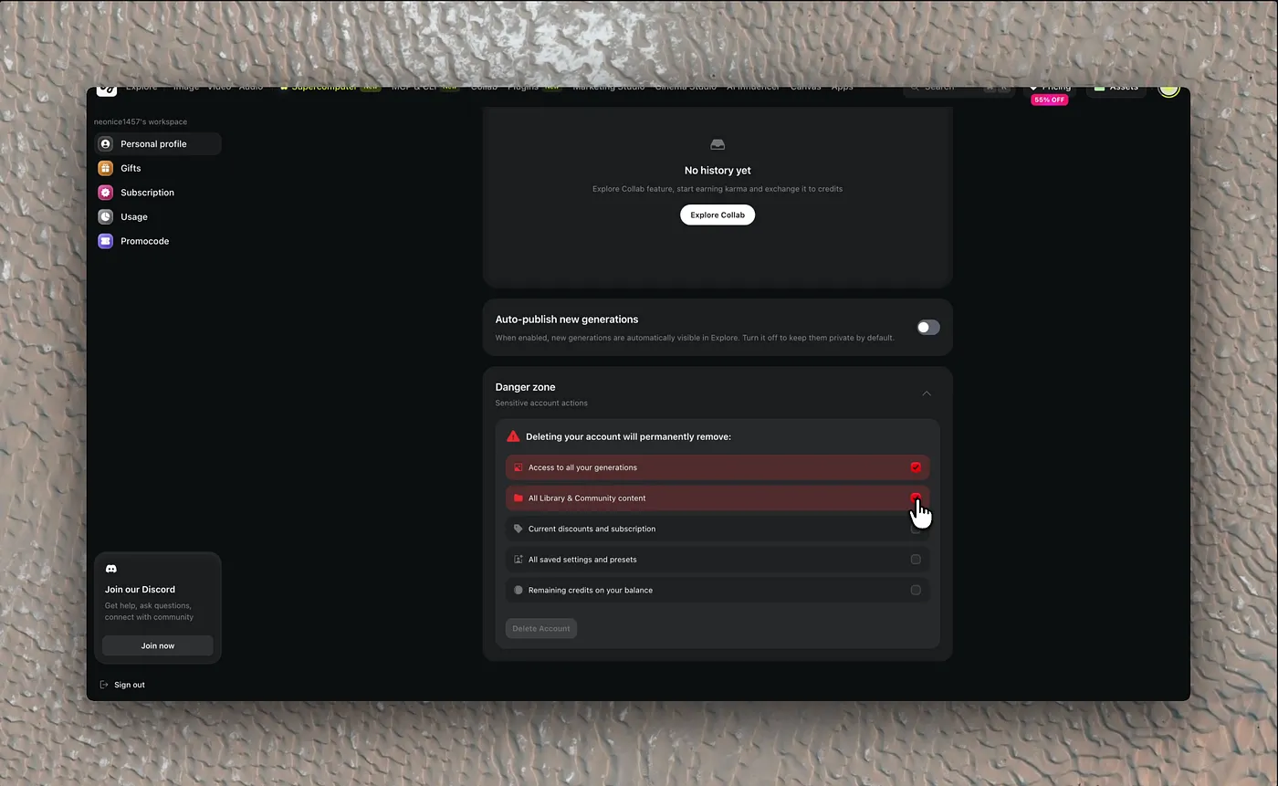
The conclusion is the same as everywhere else in the product: every millimeter of the interface is optimized for a metric. The entrance, to maximize conversion; the exit, to minimize churn.
Most likely, geographic and cultural proximity (the platform launched in April 2025 from Kazakhstan) is behind Higgsfield’s affinity with the “growth through visual addiction” model typical of ByteDance (TikTok) and neighboring platforms, where interface design is more a funnel of instant gratification and gamification than a sober work tool (Silicon Valley).
The key difference from the more aggressive strategies of the “Eastern school” is restraint: they use exactly the same levers as a Temu (urgency, scarcity, anchoring, loss), but measured out and wrapped in a premium UI. They avoid the confirmshaming and aggressive nagging that generate rejection. The result is a dark pattern that doesn’t feel like one: pressure without friction.