Rebuilding trust in information by showing its structure.
Iceberg News takes on misinformation and the collapse of media trust among young audiences — a short-form video news platform with radical source transparency and a second layer of depth.
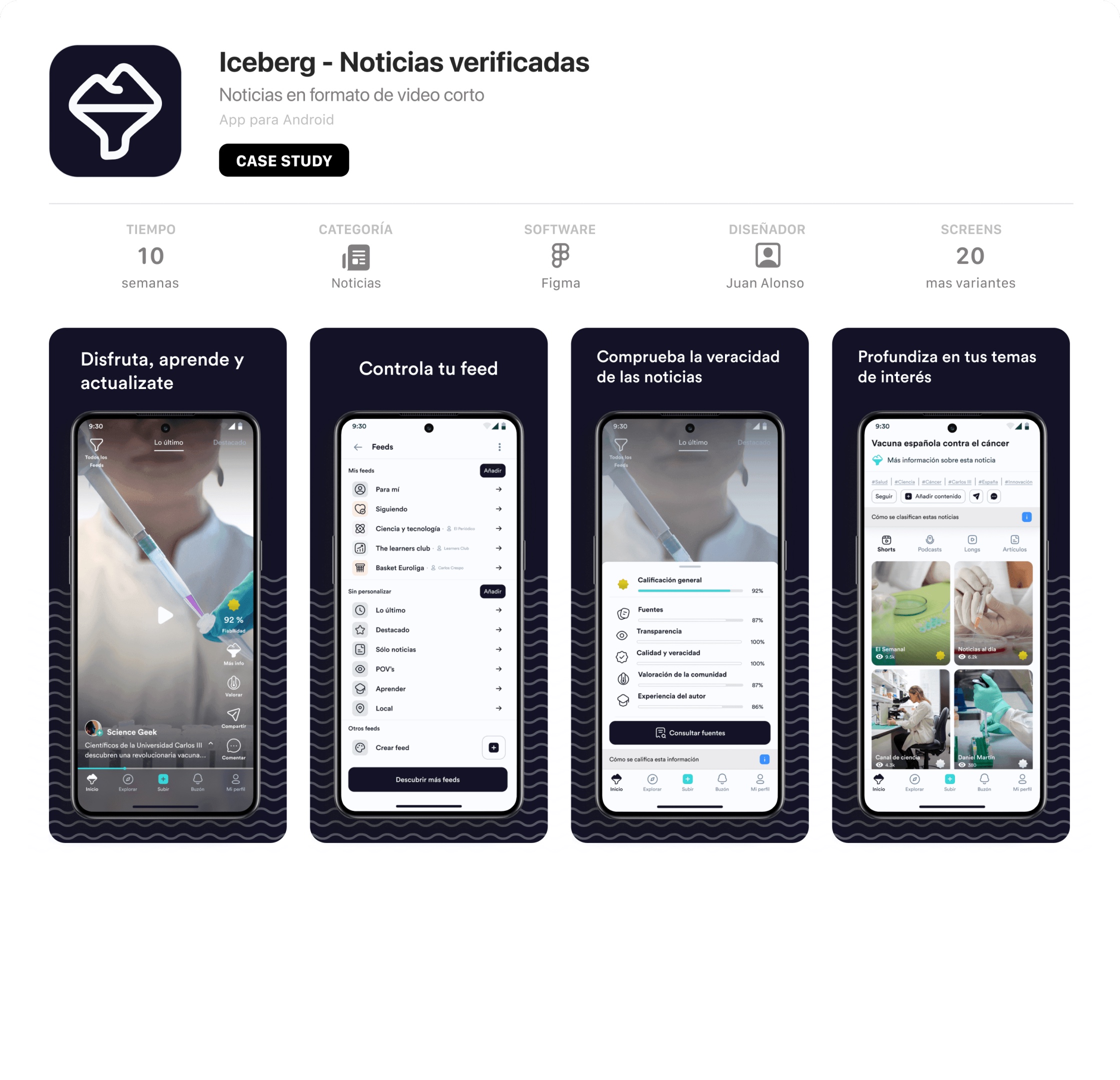
10 weeks
From the initial challenge to a working high-fidelity prototype.
187 surveys and 6 interviews
Conducted, with 78.6% of survey respondents within the target.
8 features
Must-have MVP set distilled from 60+ ideas with MoSCoW.
Welcome to the Iceberg

In the middle of the information age, young people are more dissatisfied than ever with traditional media — they neither feel comfortable reading news nor trust the objectivity of whoever writes it. The alternatives are even more disheartening — fake news, polarisation, hate and echo chambers flood the networks.
Before the internet, press, radio and television controlled the flow of information and shaped public opinion. As the web expanded, the old gatekeepers lost their monopoly on the narrative — information decentralised, objectivity fragmented and attention became the new currency. Under the rise of social media a new paradigm emerged — the post-truth (Oxford dictionary's word of the year in 2016) — where emotion beats fact and truth yields to virality.
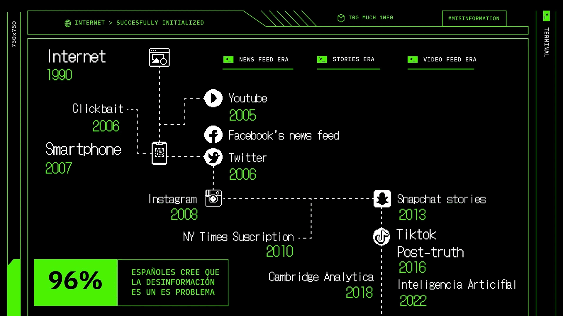
It all started with a seemingly simple question — why do the most informed generations in history trust information less than ever?
Media offer credibility without connection; social media, connection without credibility.
The challenge — redesign the news-consumption experience for audiences aged 16 to 35 and turn it into a working prototype. All in ten weeks. The goal? A platform aligned with young people's cognitive habits and cultural codes, able to deliver information that's verified, cross-checked and as complete as possible.
Research plan
The good thing about tackling such an ambitious problem was one certainty — there would be no shortage of quality information. The first phase — Desk Research — meant diving deep into the existing sources (market reports — especially the Reuters Digital News Report 2022 —, academic papers and articles) to understand the context. With that base (what I know), the next step was to challenge what I doubt and discover what I don't know through Human Research, getting close to users to validate hypotheses and surface new insights.
Finally, I analysed the current solutions — established and emerging — to identify the main strategic opportunities.
The misinformation loop
After analysing the available data, the findings were clear —
The Desk Research revealed a misinformation loop in consumption patterns. What looked like a lack of interest was something deeper — a widespread information fatigue and a crisis of trust between generations, media and users. Young people hadn't disconnected from reality — they'd disconnected from the noise.
Decoding the audience
The next step was to get close to users — to understand not just what they consume, but how and why. I ran a survey (187 responses) and conducted 6 in-depth interviews with social natives (16–24).
- The survey painted a clear picture — the biggest frustration, by far, was the lack of truthfulness in the media, followed by the shallowness of the content and the feeling of being trapped in echo chambers within their favourite platforms — social media.
- The interviews revealed the why — they love the video format but are frustrated by its superficiality and having to leave the app to go deeper into a topic. They trust independent creators more than traditional journalists, and they validate credibility through the community consensus in the comments.
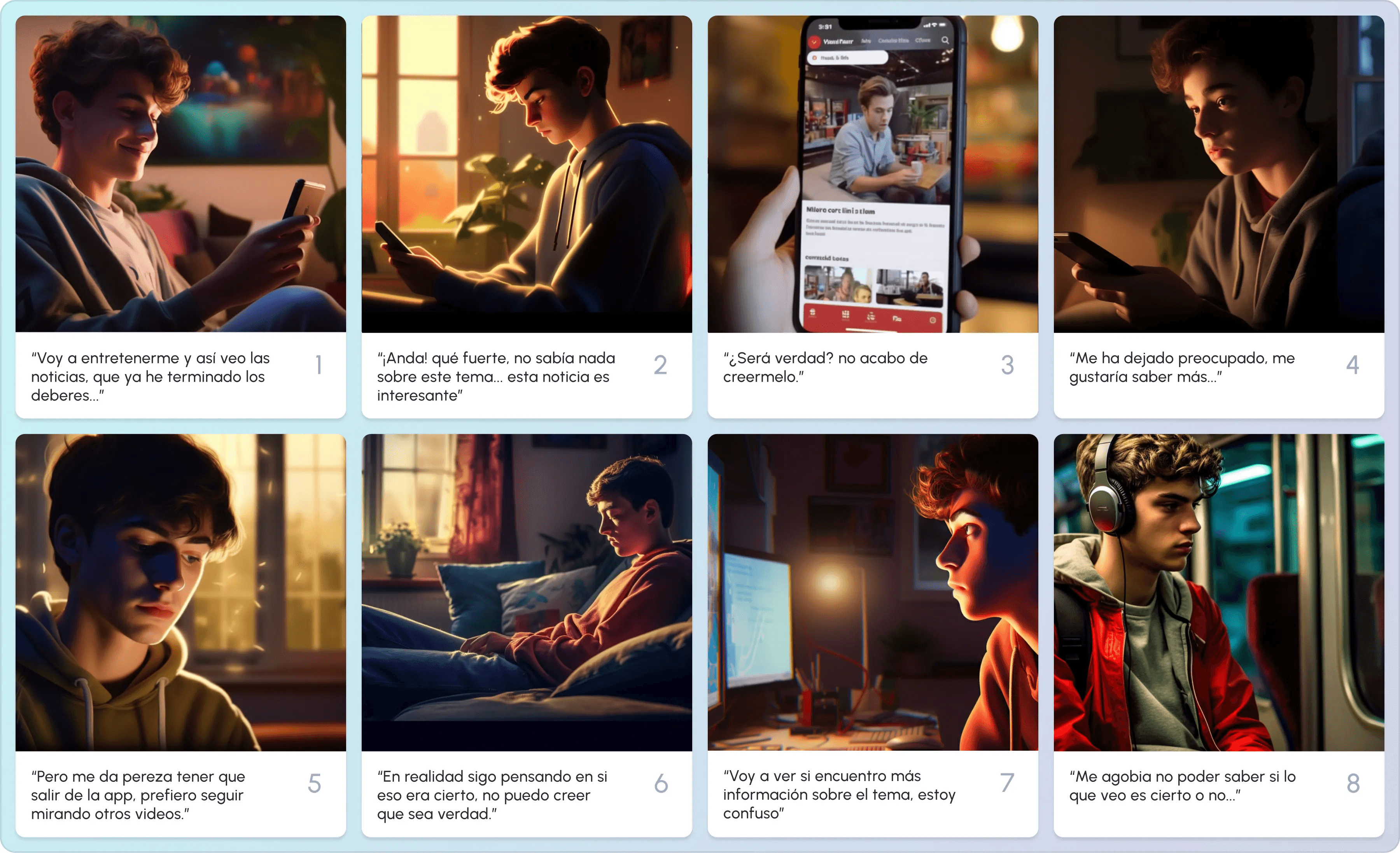
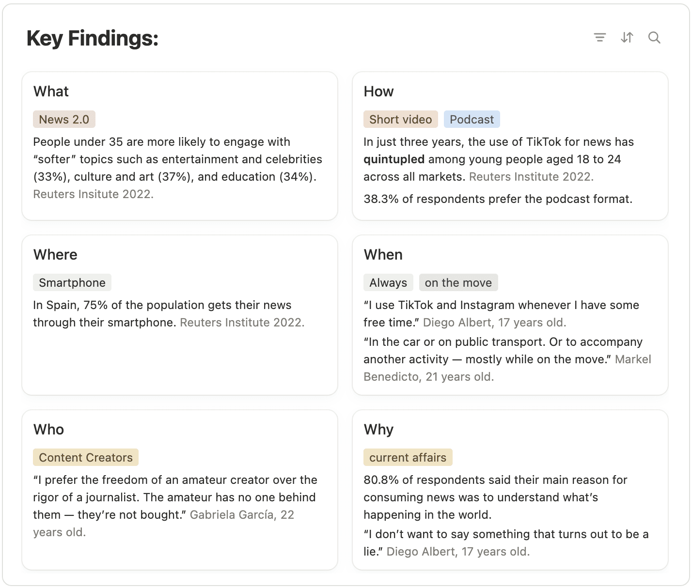
The opportunity
After mapping user behaviour, I examined the ecosystem where Iceberg would be born — a landscape split between the traditional authority of the media and the emotional agility of social networks. Between those two extremes lay an untapped space — a platform that combined the speed and appeal of social media with the rigour and transparency of journalism.
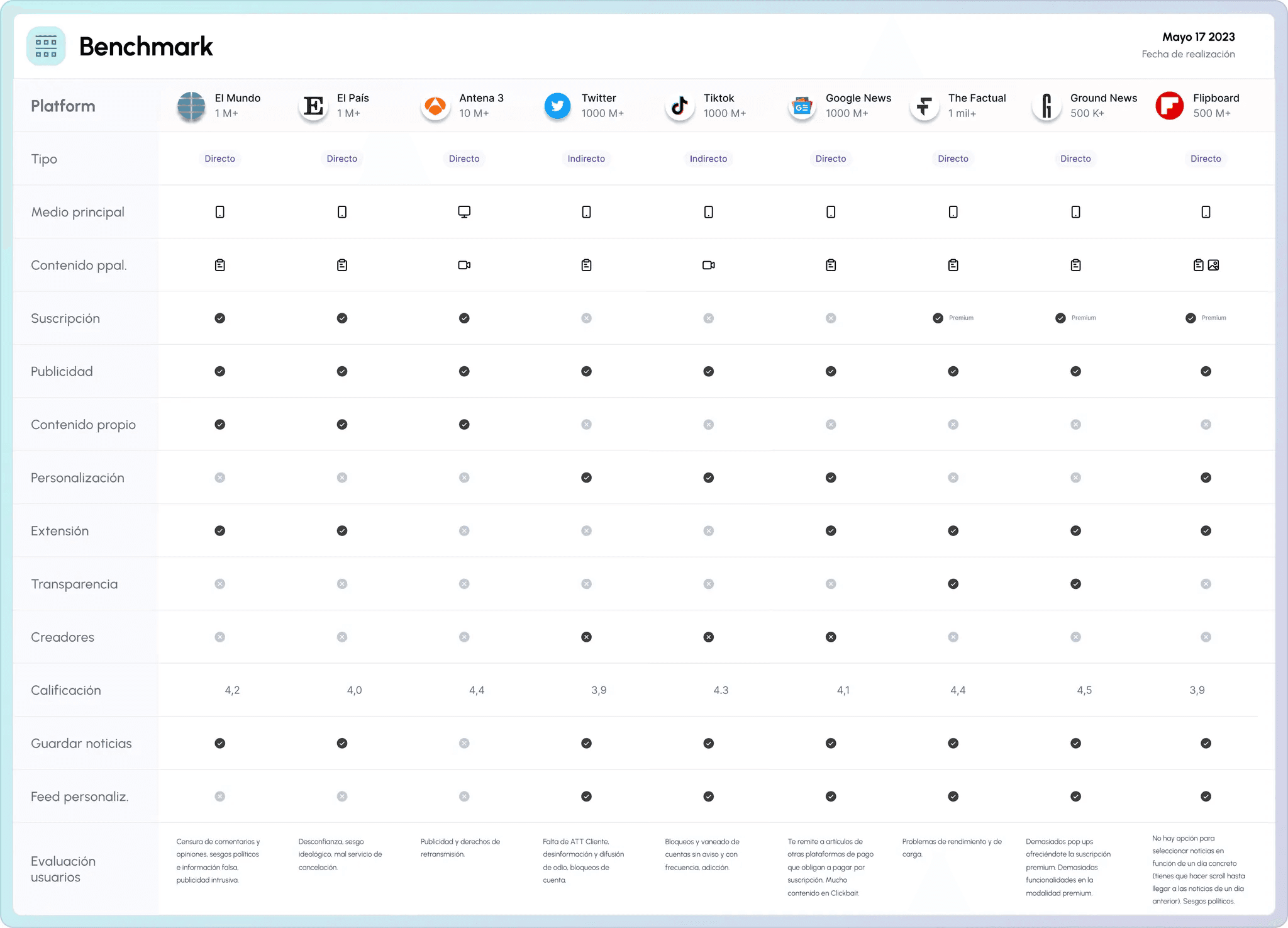
The research made it clear that the problem wasn't a lack of information — it was a lack of trust. Young audiences distrust imposed objectivity and value the honesty of the process — knowing who is telling something, from where and with what intention. Truthfulness stops being objectivity and becomes the traceability of a point of view.
How might we rebuild trust in information by showing its structure instead of hiding it behind the headlines?
Out of that question came the working hypothesis — if we offer a short-form video news platform, with transparent sources and the option to go deeper into every topic (podcasts, articles or long videos), we can win back the trust of young audiences and foster news consumption that's critical, engaging and healthy.
Business strategy
To define the product's identity and its viability I applied several frameworks — Mission, Vision and Values, a Business Model Canvas, a Stakeholder Map and two value propositions (creators and users) that converged into the final UVP.
At its core, Iceberg prioritises reliability over absolute objectivity — acknowledging that pure objectivity is impossible. The platform promotes transparency and empowers independent creators who openly own their own biases.
- Trust in independent creators — young audiences value the amateur's freedom over the rigidity of traditional journalism; they prefer the ideological transparency of creators.
- Demand for a dual format — they seek the instant gratification of short video, but they want the option to go deeper when something really interests them.
- Community credibility — truth is often validated by social consensus; community ratings are signals of reliability.
The business model follows an attention scheme (eyeball model) — free for the user — with three revenue streams — native advertising embedded in the feed, commission on creators' premium content (documentaries, podcasts, reports) and a quality-verification subscription — a badge for creators and media that meet the transparency criteria, with greater visibility in the curated feeds. Credibility assessment is outsourced in partnership with fact-checking organisations like Common Sense Networks or Poynter.
Ideation
With the strategic base clear, ideation was a creative balance between journalistic integrity and social-media agility. With Jobs To Be Done I mapped the functional, emotional and social jobs of news consumption.
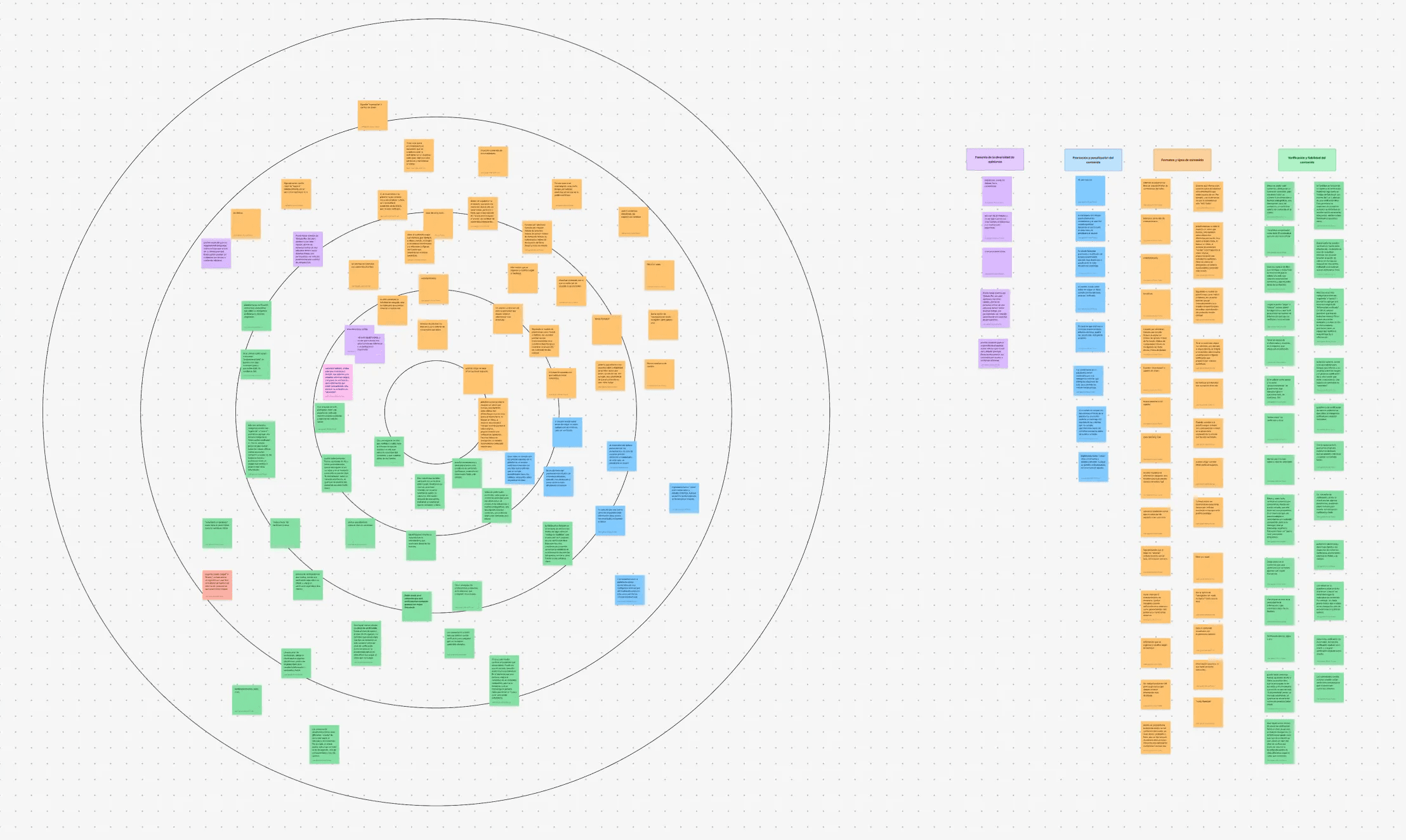
A group ideation workshop (Crazy 8's, Round Robin, Lotus Flower) generated more than 60 ideas, later organised into an Affinity Map. The MoSCoW method narrowed them down to the 8 must-have features that defined the MVP.
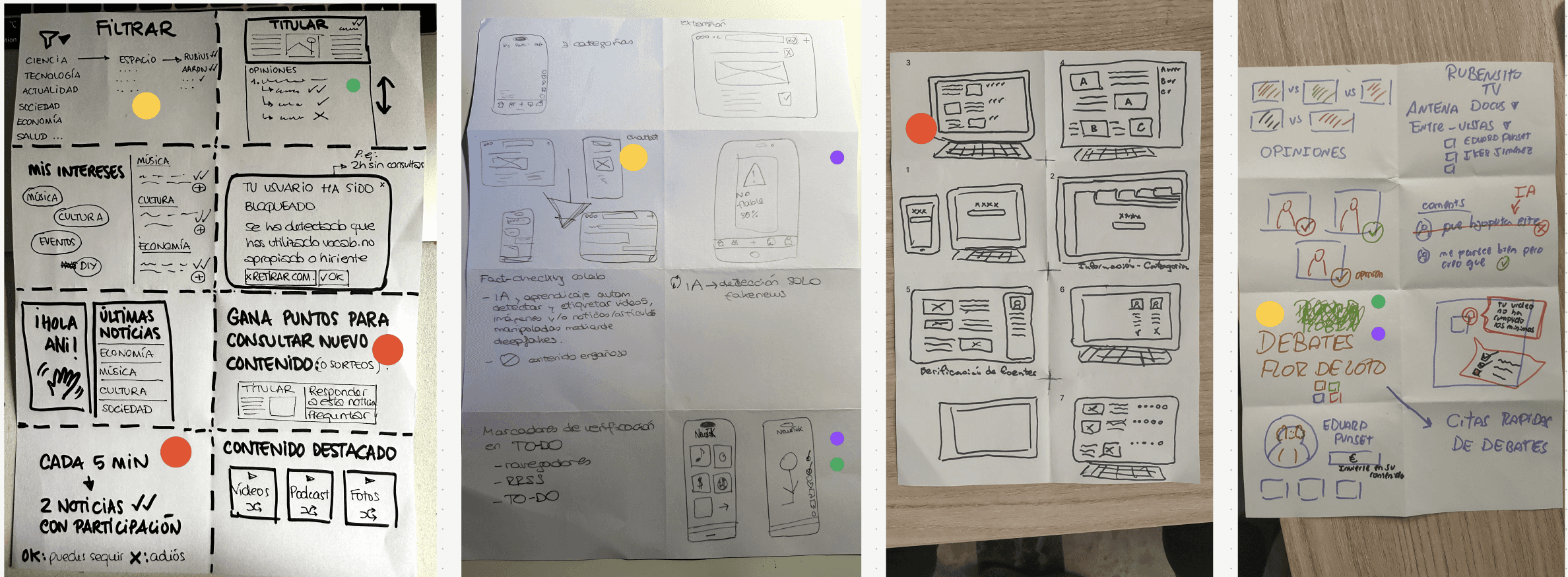
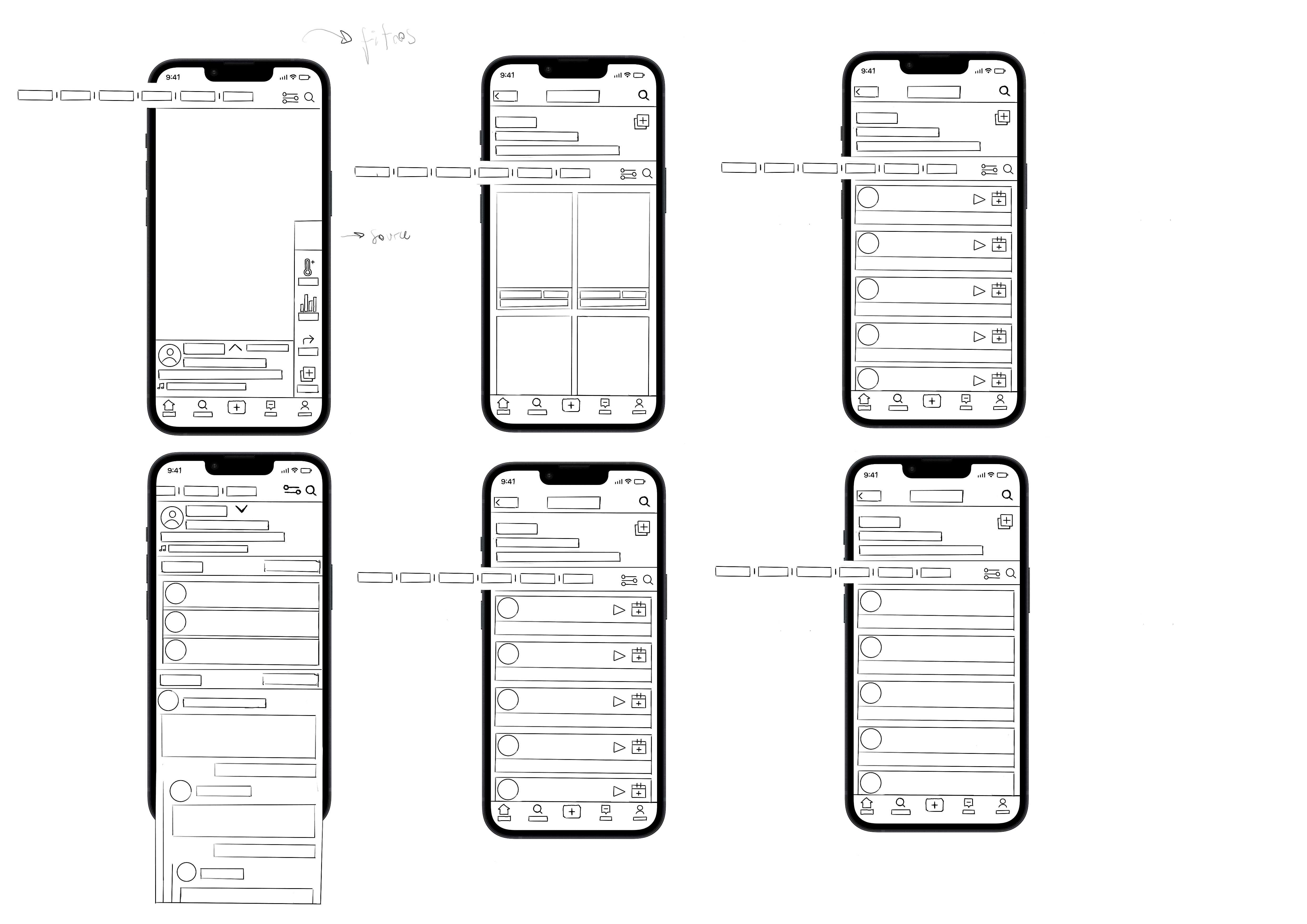
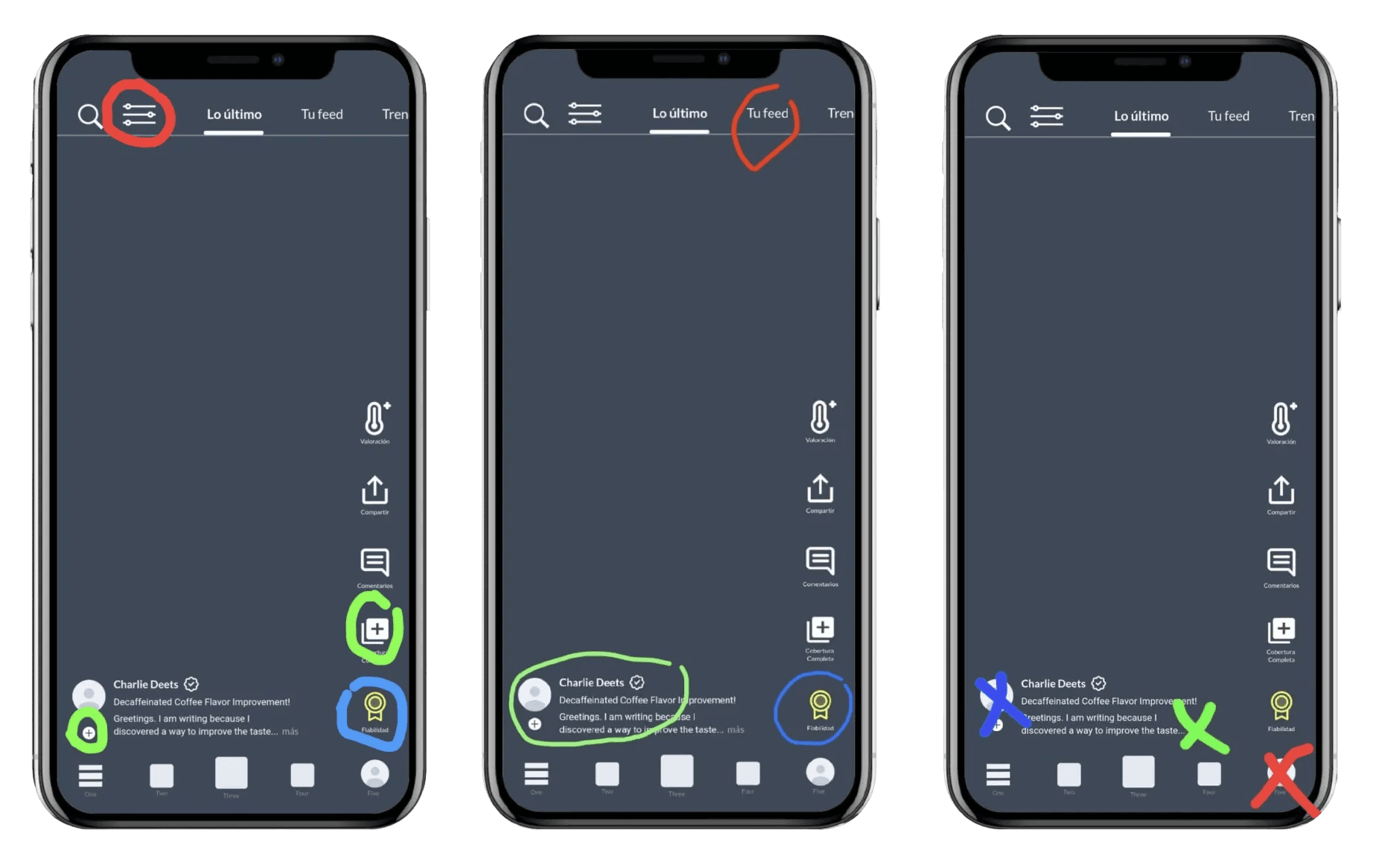
A mid-to-low-fidelity prototype was validated with several guerrilla tests, letting real users interact with the first version of the experience.
The three bets
1 — Engaging format, real depth (against superficiality). If TikTok taught us anything, it's that speed and immersion aren't negotiable. Iceberg adopts that rhythm — a vertical short-form video feed — but adds what no platform offers — a second dimension of depth. Each piece is the doorway to a bigger story — by swiping or tapping «Explore», a second layer with multiple points of view, podcasts, long videos and articles. Content is split into POVs (personal, opinionated perspectives) and News (verified factual coverage) — the user decides how deep they want to go.
Scroll fast. Think slow.
2 — Transparency as trust (against misinformation). Instead of promising objectivity, Iceberg builds credibility through radical transparency. Every story reveals its structure — who created it, where it comes from and how the community rates it. A Reliability Rating System makes it visible at a glance — original sources and metadata, community assessment and author quality. Custom filters let you adjust the political bias (left / centre / right) and the desired reliability level. For the first time, the user doesn't adapt to the algorithm — the algorithm adapts to the user.
3 — Empowering creators and community. Creators are this generation's new journalists. Iceberg elevates the independent voices that openly declare their ideological stance — bias becomes visible and, therefore, debatable. The community is the mechanism of collective validation — comments, debates and ratings that keep information honest and alive.
Transparency isn't built alone — it's built together.
Information architecture
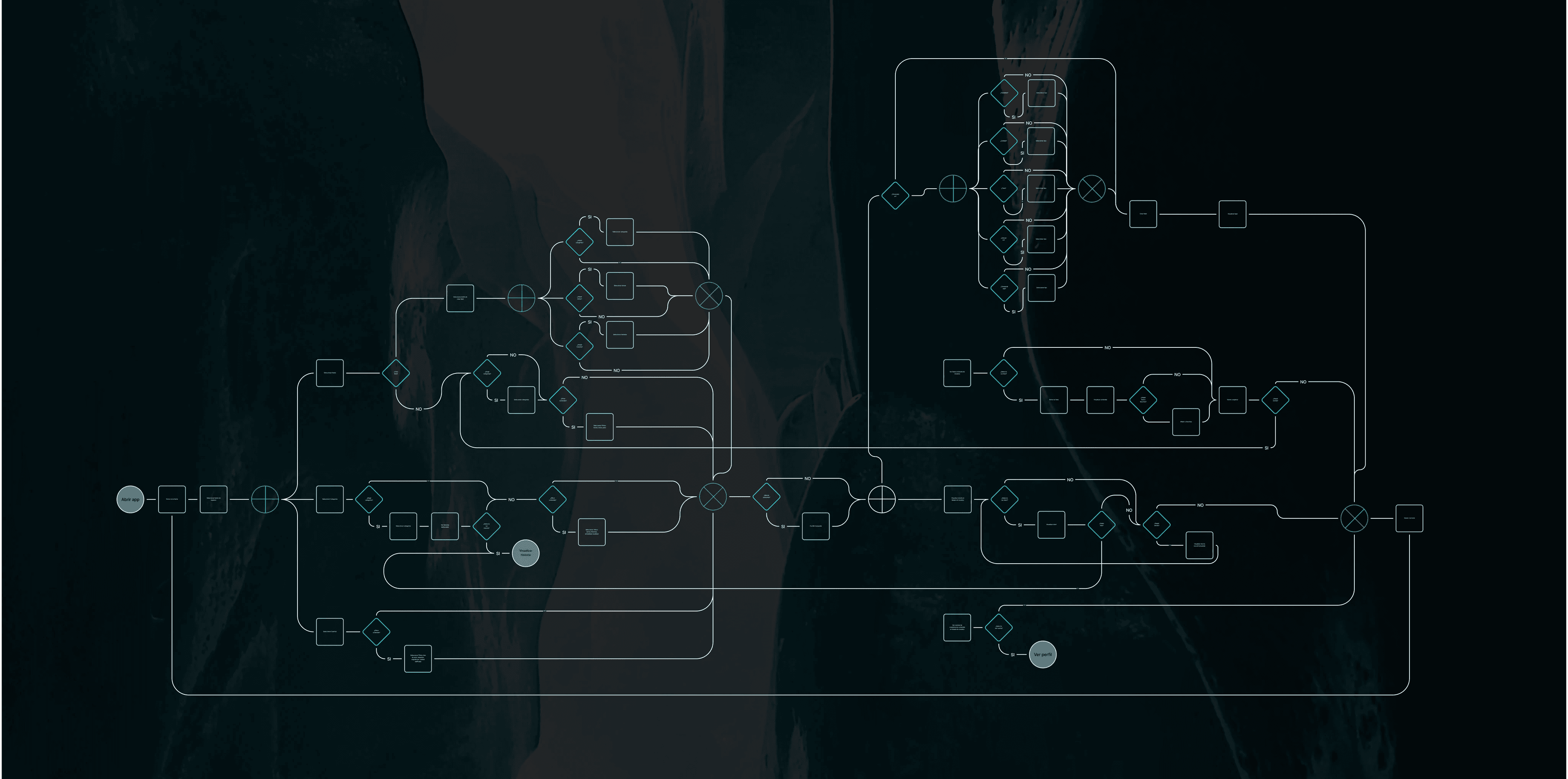
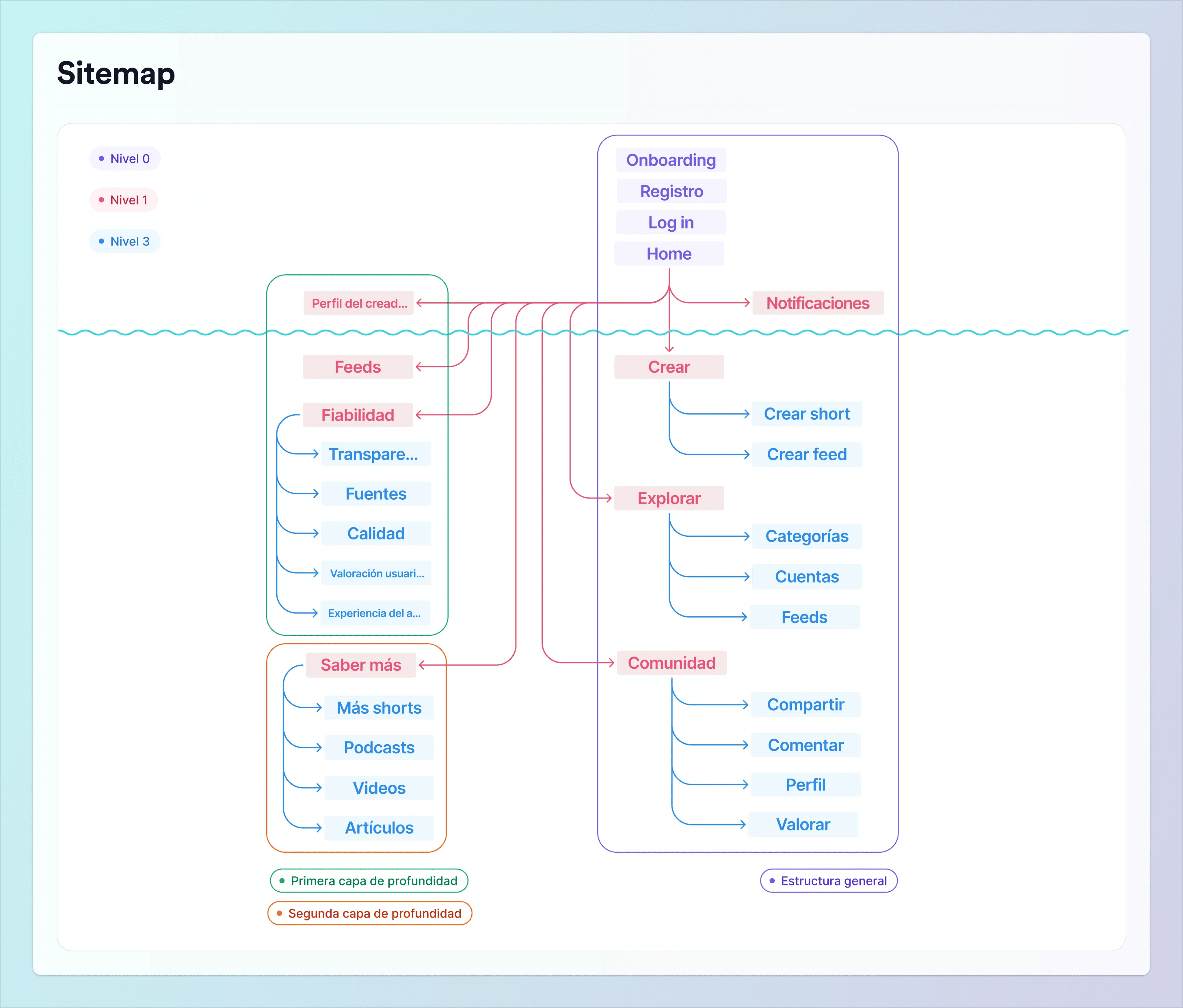
With the concept validated, it was time to turn strategy into structure. The user goals (JTBD) were translated into taskflows and flowcharts that mapped every possible path, culminating in a sitemap and a detailed content inventory.
Navigation was built in layers of depth, reflecting Iceberg's dual nature — fast consumption on the surface, structured exploration underneath.
- Level 1 — General — Home / Feed and Explore.
- Level 2 — Depth — Reliability (checking a piece of content's credibility), Learn more (full coverage — related shorts, podcasts, videos and articles) and Feeds (creating and customising new information feeds).
Design
The design phase turned Iceberg's conceptual depth into an interface that's clear, accessible and trustworthy. Every decision — from layout to typography — followed one central goal — making complex information feel light. Simple visual hierarchy, always-visible credibility indicators and one- or two-tap interactions.
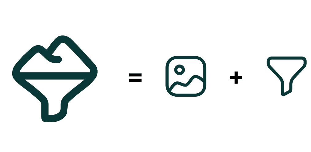
The logo fuses two symbolic elements — the image (the first appearance) and the filter (the depth and control over the feed). Together they form the Iceberg icon — a metaphor for how the platform reveals what lies beneath the surface of information.
The key UI piece is the Reliability Screen — an overall credibility score (e.g. 84%) broken down into sources, transparency, quality, community rating and author expertise. Trust turned into readable, comparable data, assessable at a glance.
The branding settled into a detailed styleguide under atomic-design principles — from low- and mid-fidelity wireframes to the final high-fidelity screens.
Learnings
As my first solo UX/UI project, Iceberg was far more than a design exercise — it was the introduction to the real mindset of product design.
Research is everything. The quantitative side defined what the problem was, but it was the interviews that revealed why it existed. Only after talking to users did I understand that the real opportunity wasn't to recover objectivity, but to rebuild trust through transparency and consensus.
With this research you've already done 80% of the product.
José Luis Tienza — Lead Instructor, The Bridge
Simplicity is harder than complexity. Translating a deep idea like traceable truth into something intuitive was the biggest design challenge. Leaning on familiar patterns — the TikTok-style feed — was the right call — it let me focus on the experience, not the novelty.
The MVP should have been sharper. If I went back, I'd trim the scope — I tried to include long videos, articles and podcasts when a single well-validated format would have been enough. Even so, the ambition came from a sound observation — creators are increasingly omnichannel, reusing the same content across multiple formats.
Testing early isn't negotiable. Even with limited time, the guerrilla tests made all the difference to interactions and navigation depth. The logical next step would have been the usability test with the high-fidelity prototype.
Note — months after closing the case, the news-verification systems built into social networks (like Grok on X) confirmed that the problem explored was real and timely. An academic project can also anticipate emerging industry challenges when it's grounded in solid research.