Metropolis Underground — re-engaging the users who stopped riding the metro.
Cabify's Marketing & Comms challenge — an email to re-engage the people who had left the Metropolis Underground app —the «mu» metro— and a landing to back it up, for a Gen Z who cares about getting around sustainably. I started with the persona and ended up validating five emails and twenty subject lines with 20 users in Maze.
The challenge
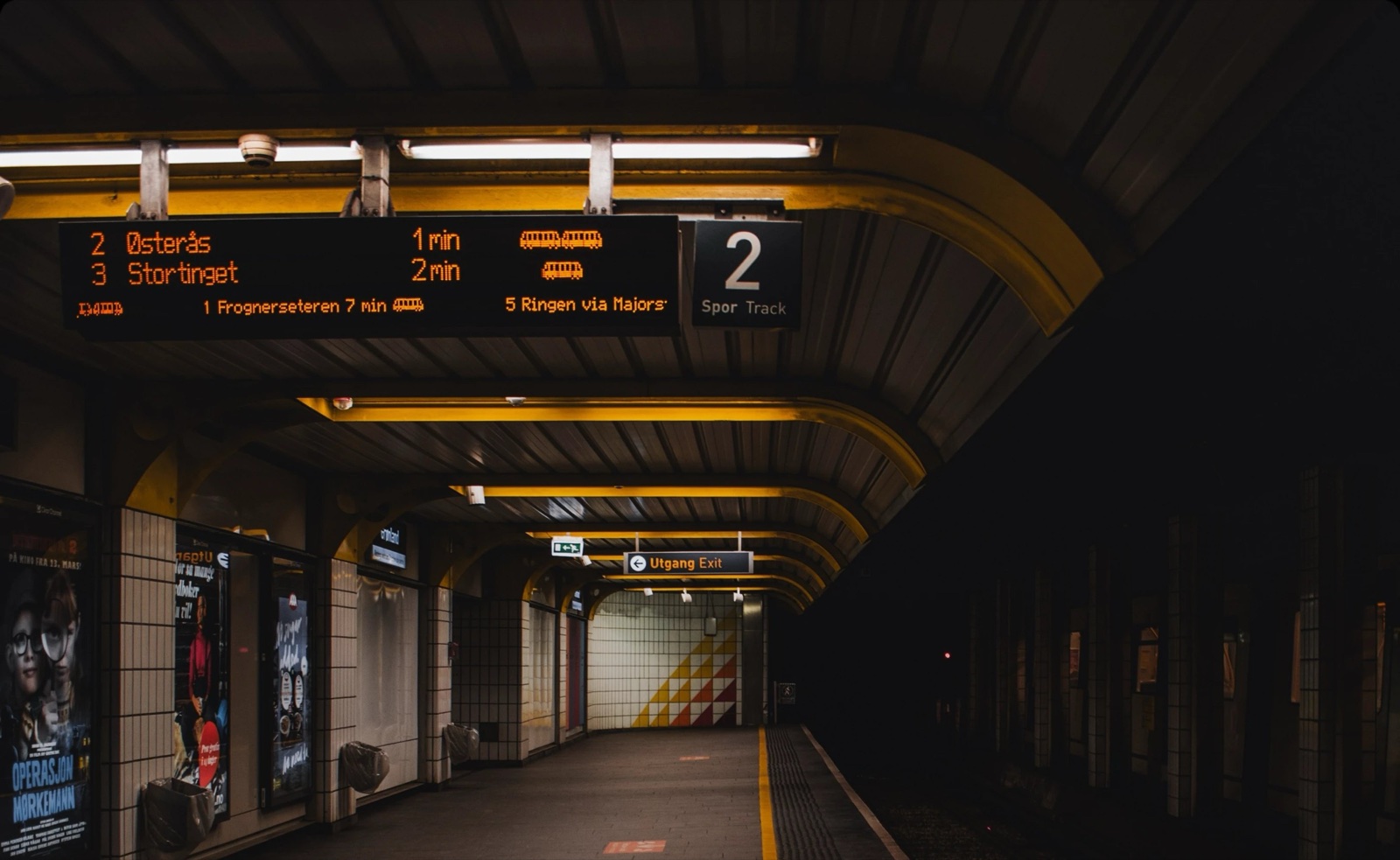
Cabify set me a Marketing & Comms challenge around Metropolis Underground —«mu», a city metro with its own app that had just rolled out a set of improvements—.
They asked for two pieces that worked together: an email to re-engage whoever had stopped using the app, and a landing to catch that renewed interest. The audience — young people who care about getting around sustainably.
I didn't start with the design, but with the question underneath it: who am I talking to, and why did they stop riding the metro?
The research
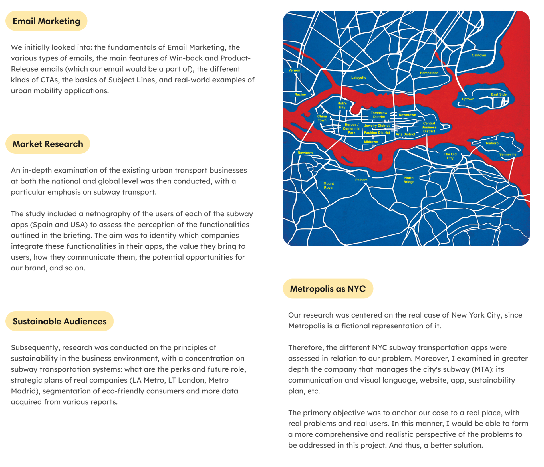
Before writing a single line, I did my homework: how email marketing works, how mobility apps communicate, and how you talk to an audience that values sustainability.
And since Metropolis is New York under another name, I used its real metro —the MTA— as a case to pull from, with a bit of netnography to understand its people.
The angle: who I'm talking to
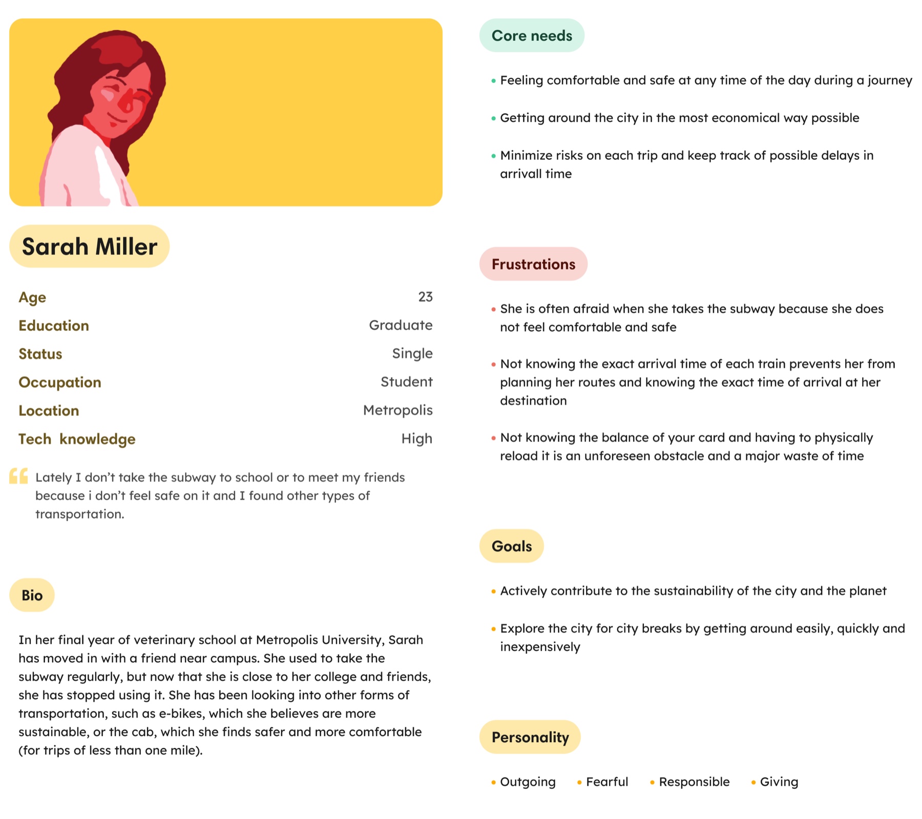
So I wouldn't design blind, I built a persona: Sarah Miller, 23, who had left the metro because she felt neither safe nor informed —not when the train arrives, not how much is left on her card—.
I read that «young audience» as Gen Z —that's how the reports define it— and grounded it with a netnography on New York mobility and on that generation.
One decision shaped the rest: think not only about the app, but about the whole metro. App and service are one and the same, and the message had to treat them that way.
A visual system of its own
Cabify handed over its brand resources, but «mu» needed an identity of its own, so I gave it one.
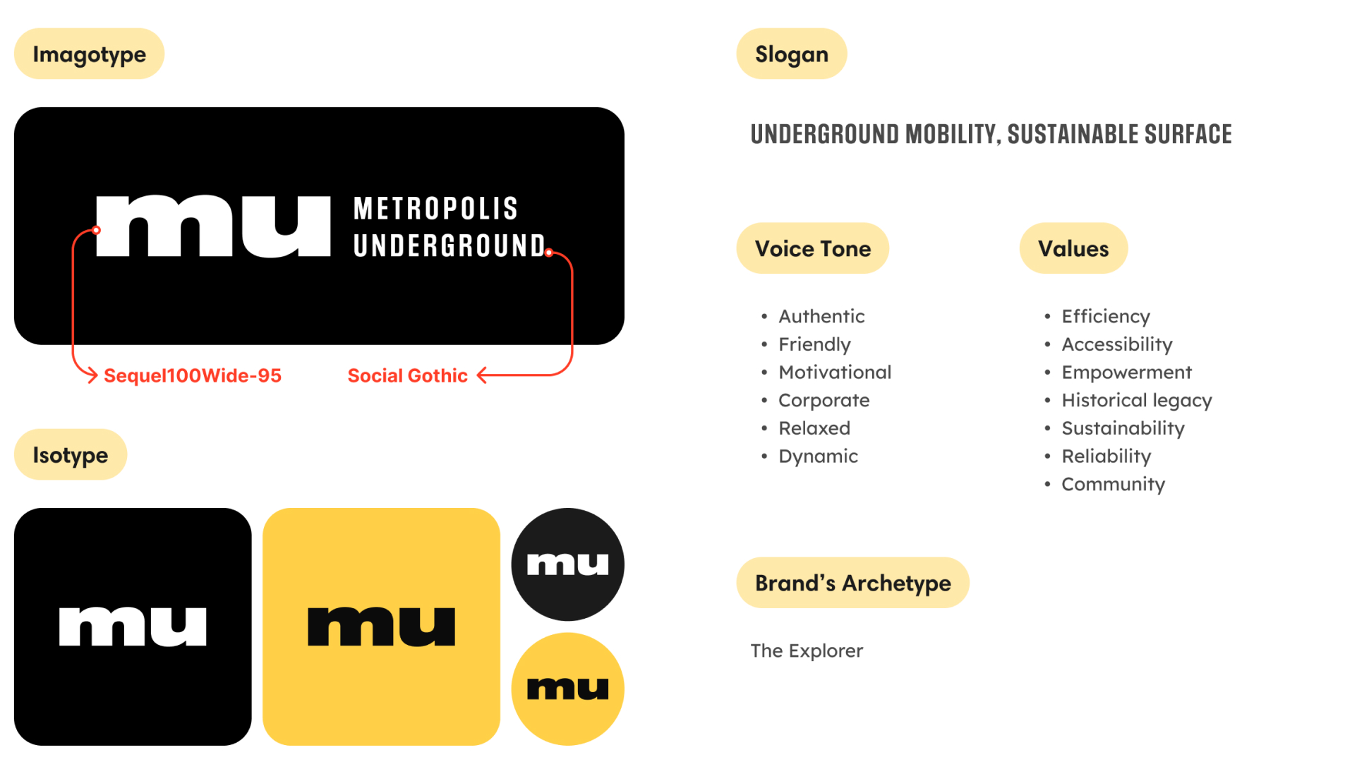
The logo came as a .jpg, with no fonts; I hunted down the closest matches on MyFonts and recovered them to use everywhere else. For the slogan I tried several with users and kept the one that best summed up the brand: «Underground mobility, sustainable surface».
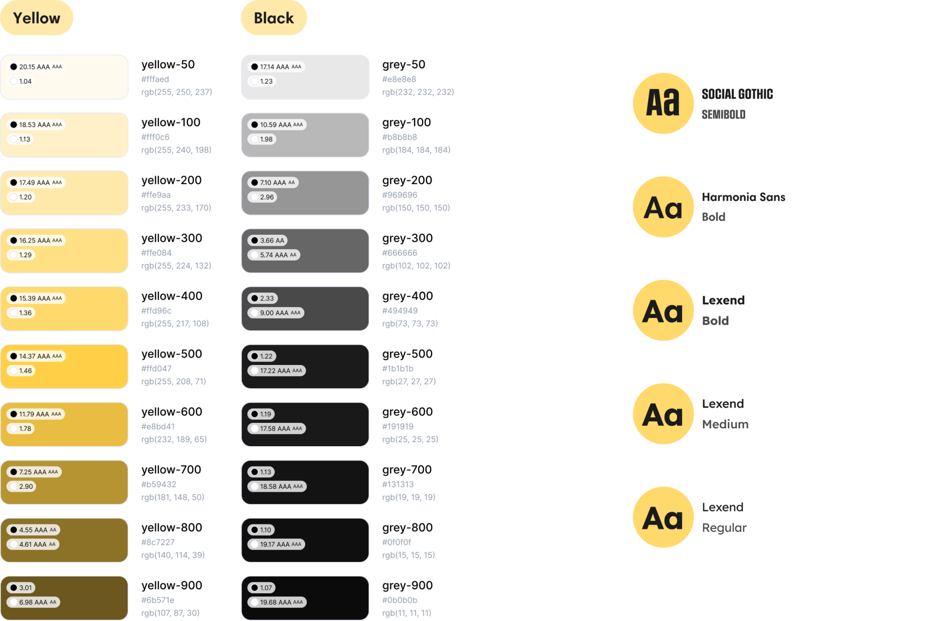
The colour, yellow and black —yellow for energy, for the CTAs; black for its nod to the New York taxis—. And three typefaces of its own for the landing (Social Gothic, Harmonia Sans and Lexend); the email sticks with Gmail's Roboto, for compatibility.
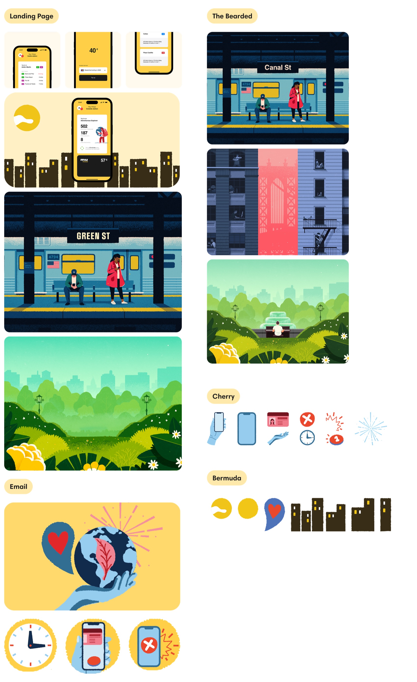
And an illustration set of its own: I combined pieces from Iconos8 and The Bearded, recolouring and retouching by hand where needed —the leaf in the email, the station name on the landing, cutting out whatever didn't belong—.
The copywriting
With the persona locked, I built a Value Proposition Canvas and drew the thread of the story from there. The email's structure followed Cabify's guidelines; in each block, say the most with the least.
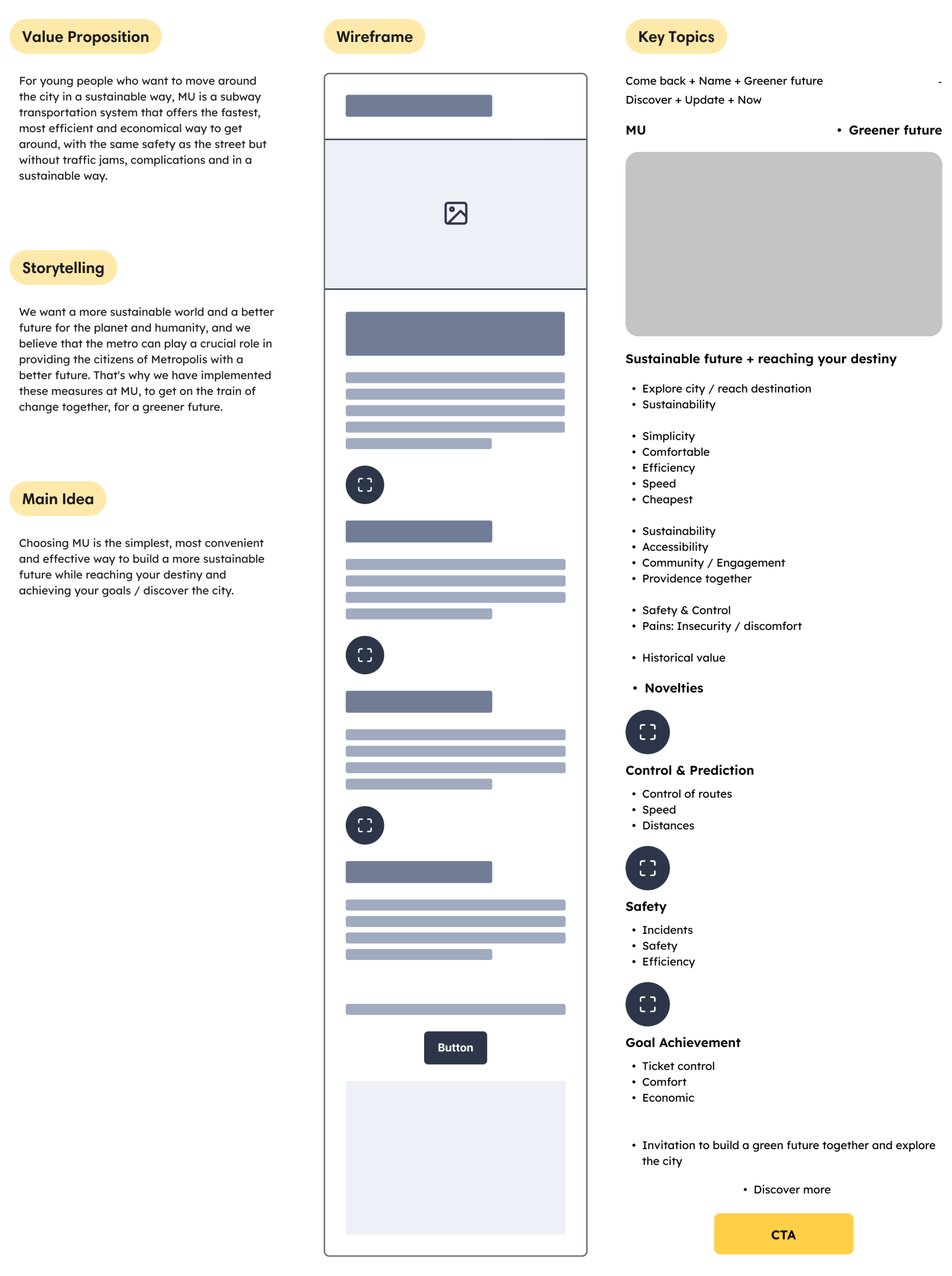
I built the hook on three things: the sustainable story, the gift —the update wrapped as a Christmas present, with its touch of FOMO— and the promise that everything gets better without touching the fares. All personalised to Sarah.
All written for Sarah, tied to a headline —«The simplest path for a greener goal»— and to what a real email can bear: widths, fonts and fallbacks that survive any mail client.
The user test
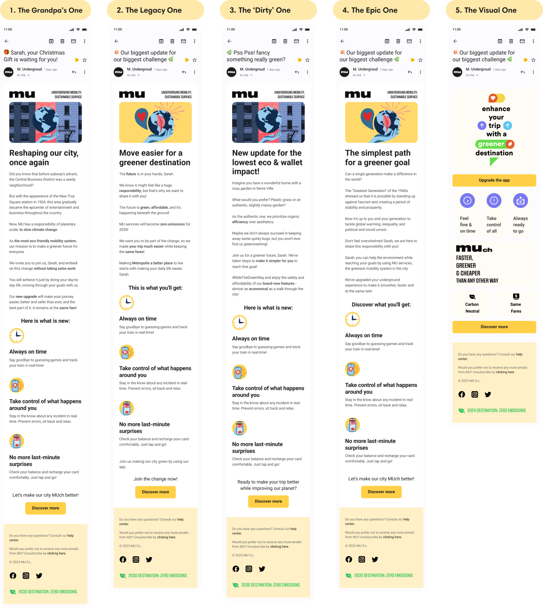
With five emails and twenty subject lines on the table, I decided not to trust my own judgement: I tested them in Maze with 20 people, millennials and some Gen Z.
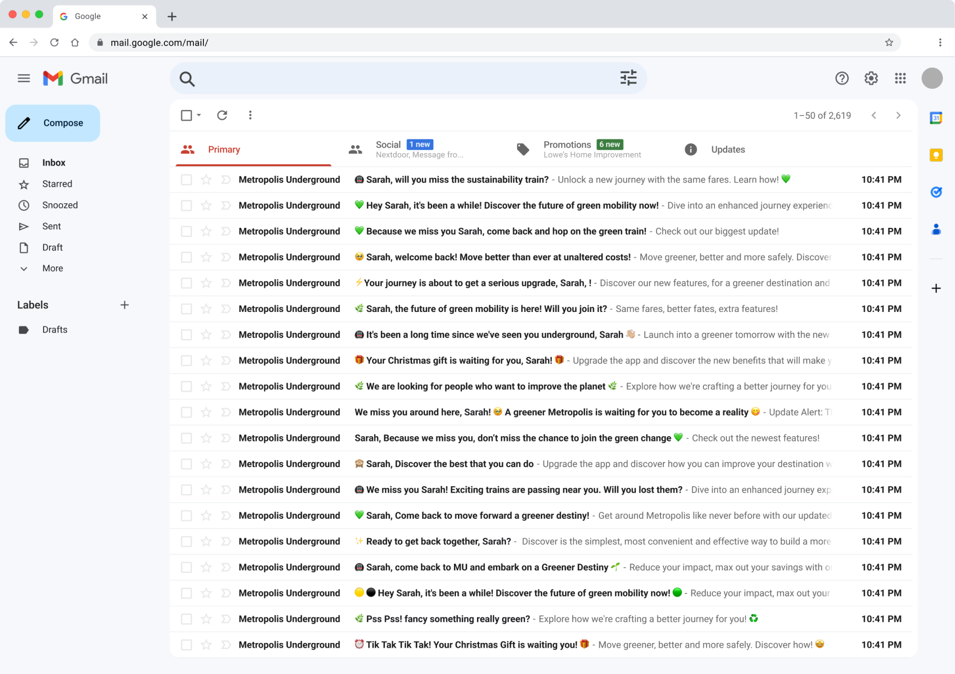
I introduced them to Sarah and asked them to choose fast, by instinct, what caught their eye. To keep it realistic I set it up inside a simulated Gmail —the inbox and the opened email— so I could see what really happens: which subject reads in full without the «…», how much people scroll.
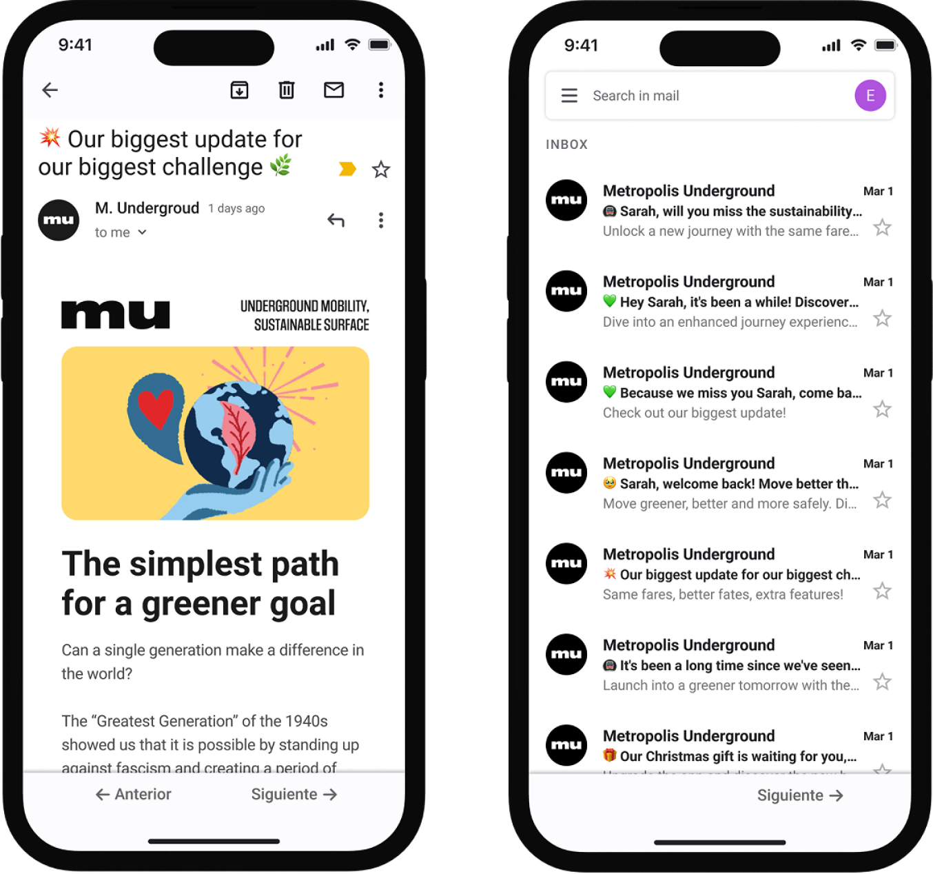
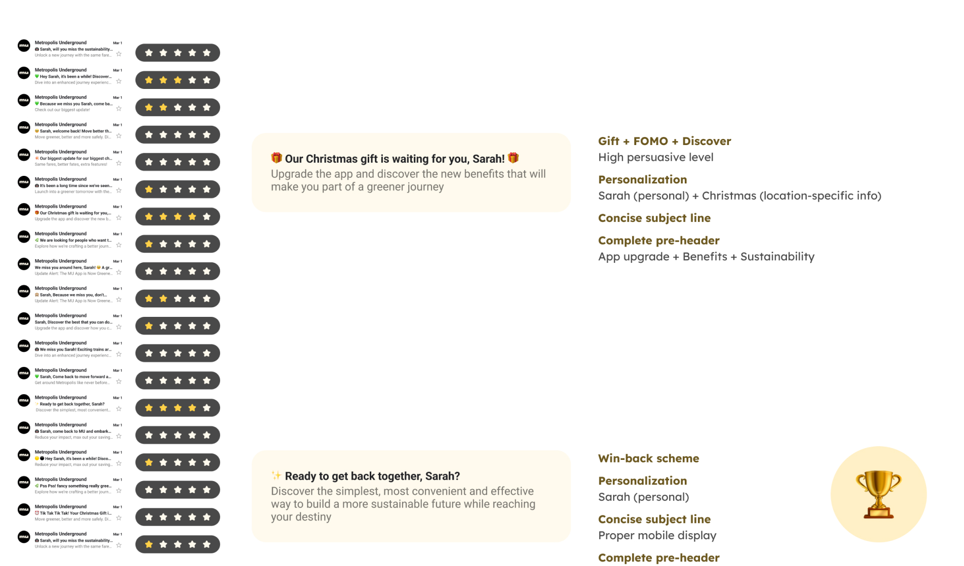
The subject-line test surfaced things that changed the pieces: explosion emojis taste like spam, the sober ones win, the gift works on its own and the short ones read in full on mobile.
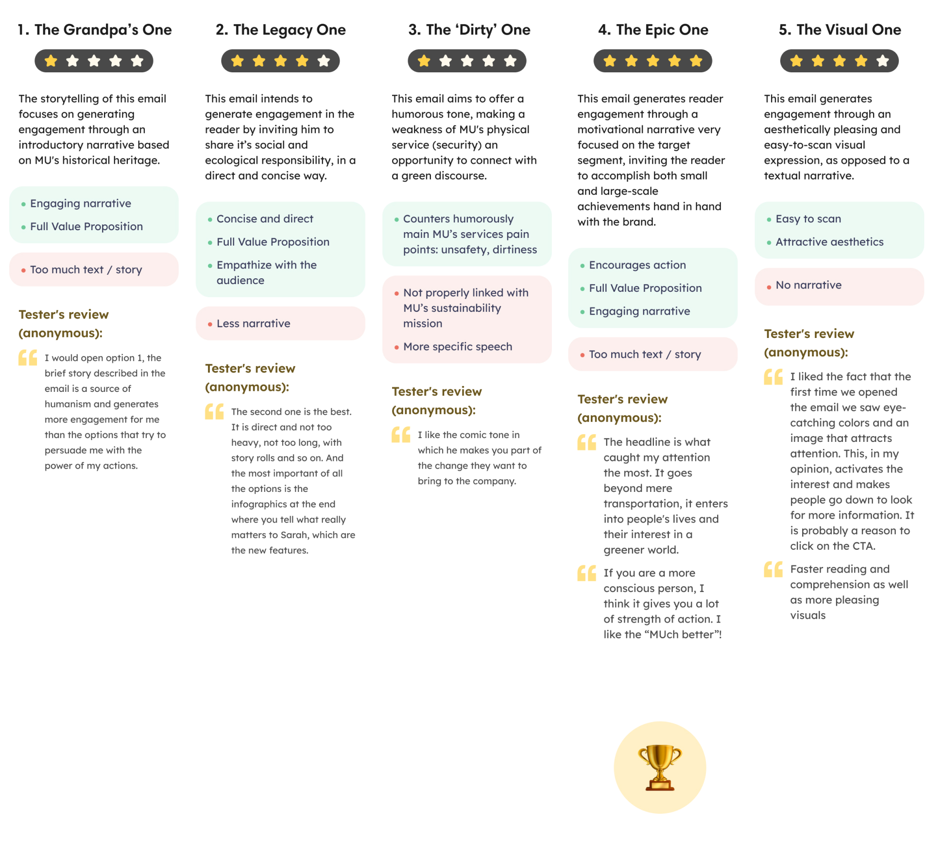
The email test showed that yellow images pull people in more, and that there are two readers: the one who wants something visual and fast, and the one who asks for a story. «The Epic One» won.
I like newsletters that look like they're not selling you something.
A tester
The email
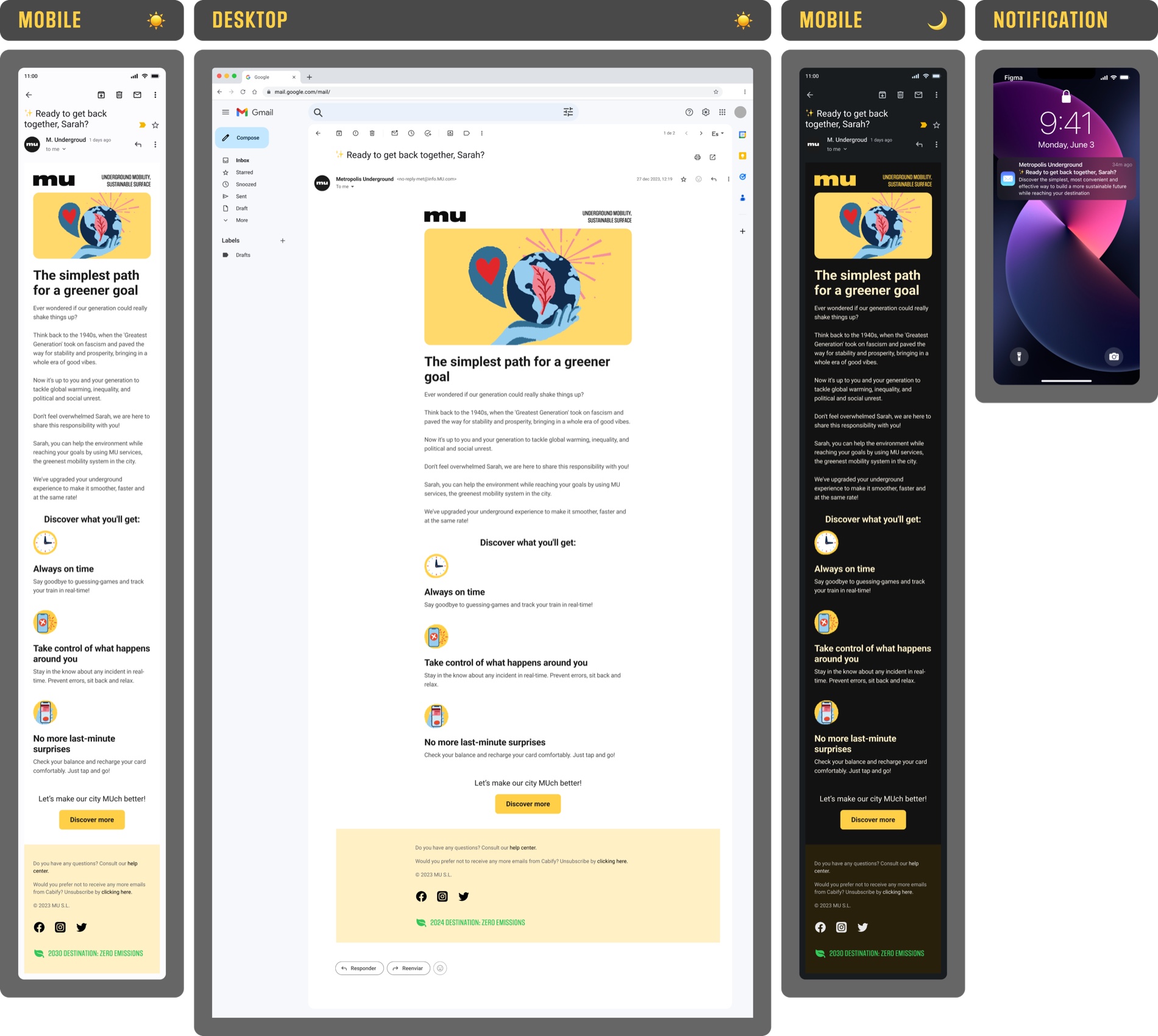
Choosing the content was the hardest part: you have to condense and prioritise, and a subject's success is unpredictable —it depends as much on the reader as on the segmentation—.
«The Epic One» opens with a story that seems beside the point —the 1940s generation and the challenges they were handed— to land on the message: Gen Z has its own, and riding the metro is already doing your part. I drew the comparison between generations from the Oliver Wyman 2023 report; the tone borrows, in plain terms, from Isra Bravo's copy.
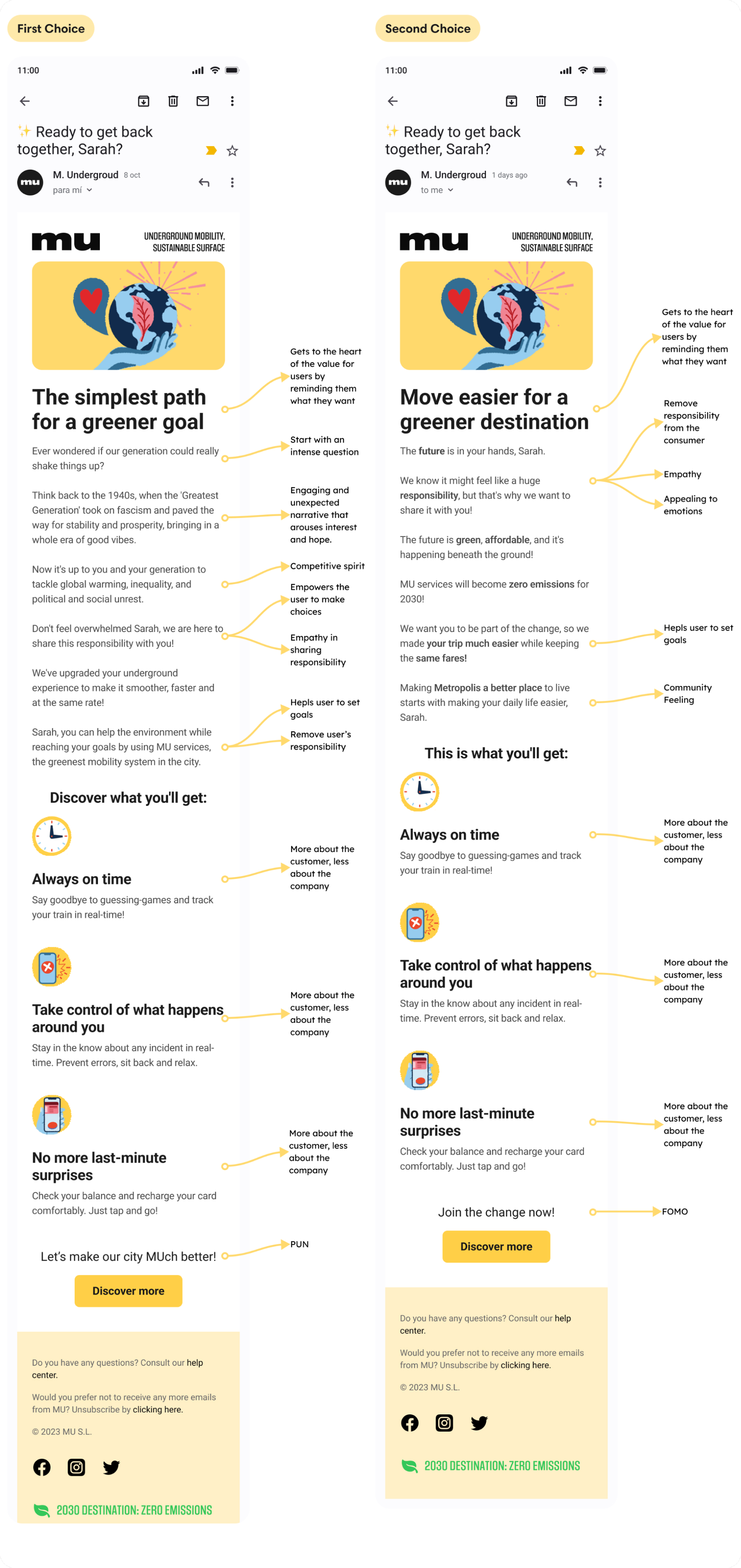
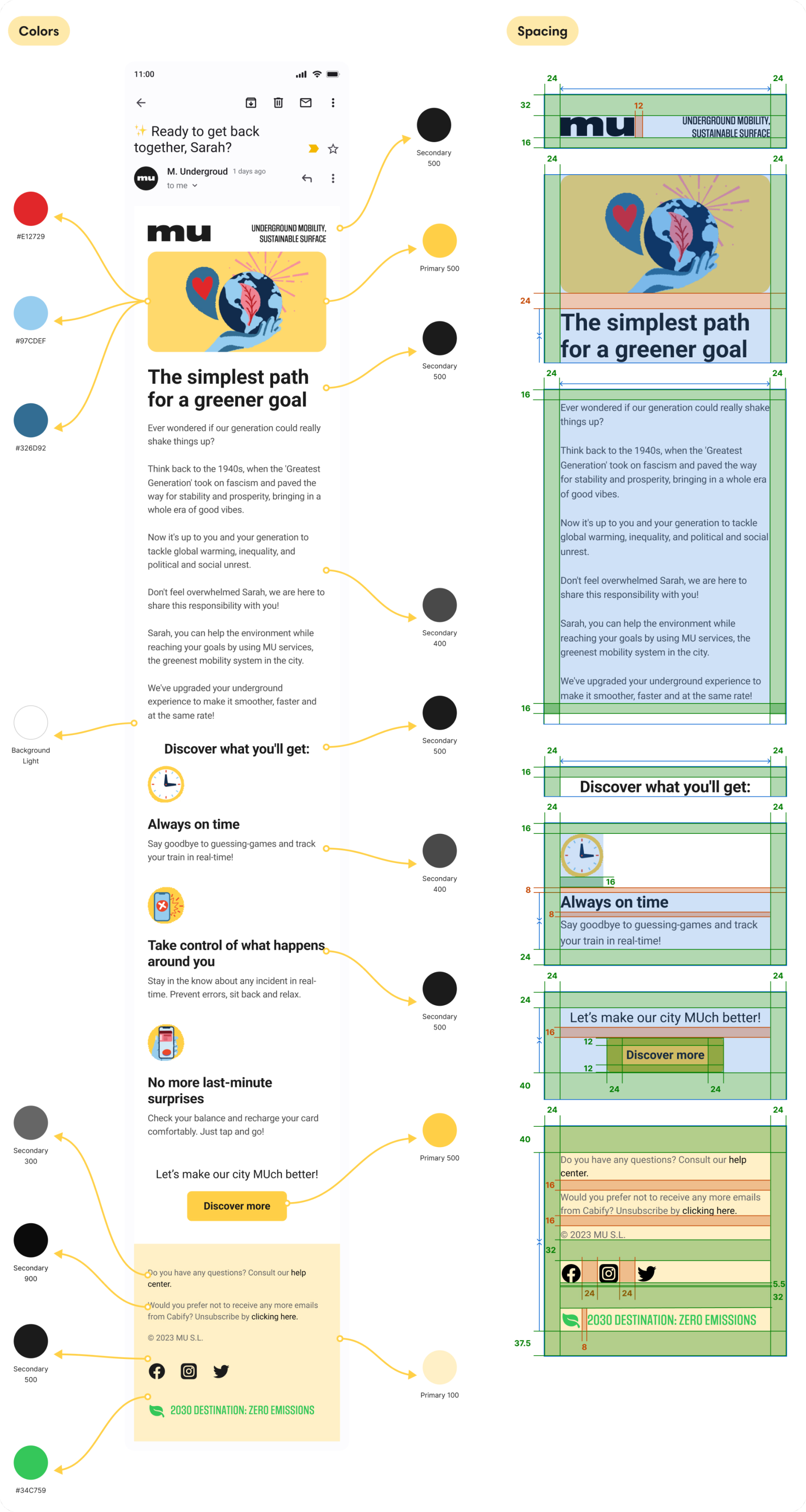
On design I didn't try to reinvent: I stuck to Cabify's guidelines and to the shape of their newsletters. One of the criteria was the fit with their product, so I aimed for something practical, not for showing off with a piece that stood apart.
The landing
The landing is for whoever clicks and wants more. Same sustainable story, but here I put the new features up front: they're the reason for the update.
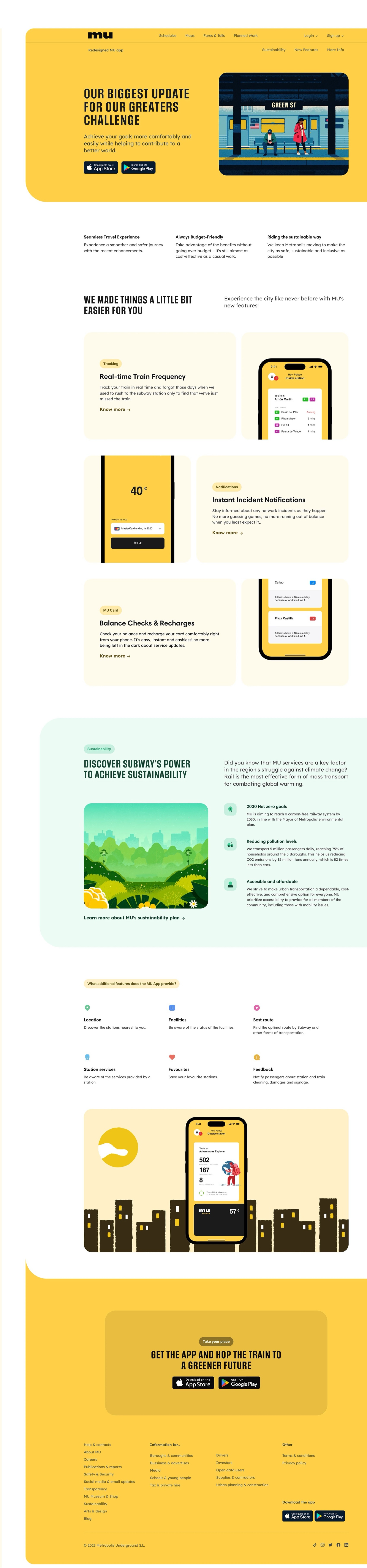
Below it I added a sustainability layer with real data —inspired by the MTA's annual report— that wouldn't fit in the email. I laid it out in a bento grid to prioritise without overwhelming.
For the closing and the footer I looked at metro sites like the MTA; for the launch tone, at Uber and Airbnb.
The close
A tightly scoped brief, but with the same method as a big one: start with the persona and not the piece, build the system that holds up the message —brand, copy, tone— and validate before calling anything done.
More than the outcome, what this challenge teaches is how I decide.