Context
Alquizen is a marketplace designed to sell rented properties to investors. Every asset already has a tenant, so the value proposition is clear: immediate yield and leverage, not "finding your dream home".
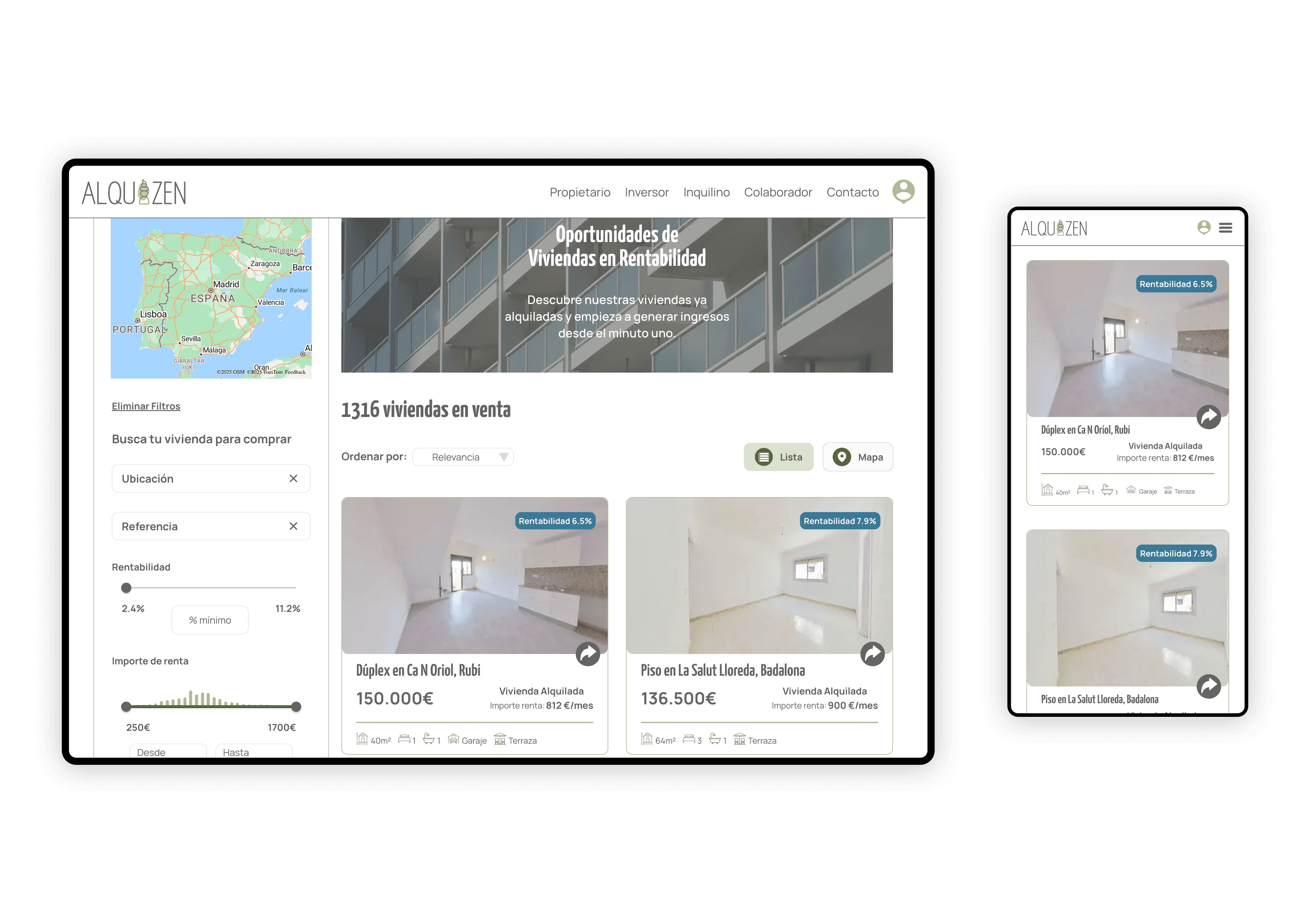
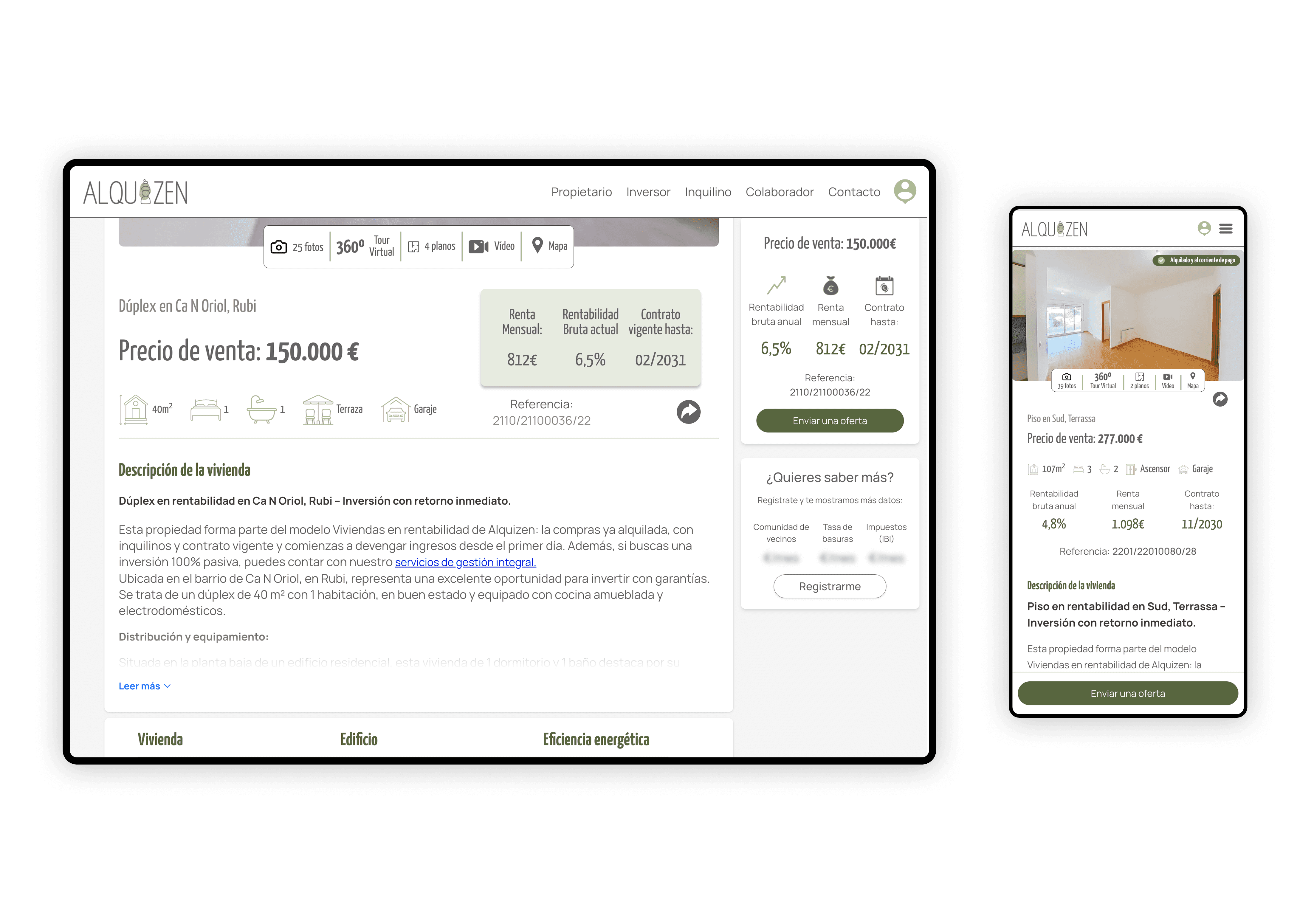
However, the product was originally designed like a traditional real-estate portal (Idealista/Fotocasa style): a cold list of flats with generic CTAs.
Core misalignment
The user is not a homebuyer.
The user is a generalist investor looking for:
- Financial peace of mind
- An asset that "works for them"
- Clarity on risk, yield and liquidity
Design challenge
How might we improve the experience so more users actually convert?
The current UX treats properties as "listings".
But the product is, in reality, a catalog of investment products.
Redesign goal
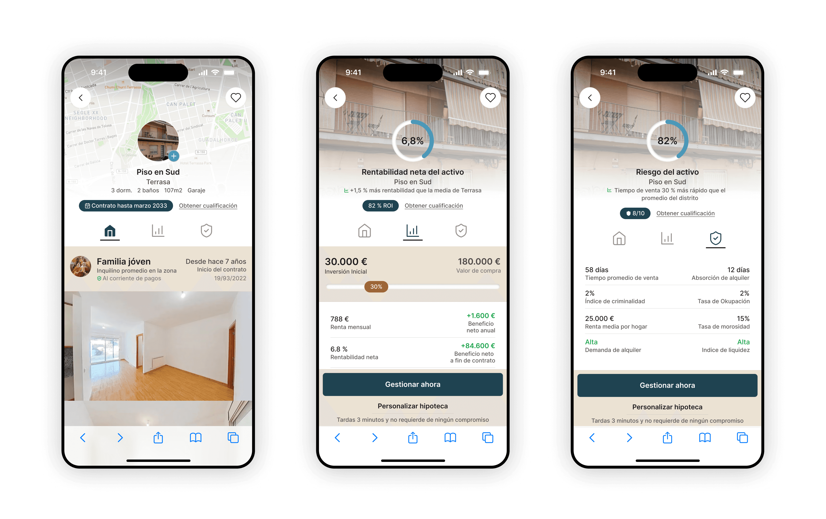
Transform a cold, technical marketplace (a list of units) into an immersive, transparent investment platform where a user can instantly see:
- What they can buy given their liquidity
- What net yield they get and when
- What risk and liquidity profile each asset has
- How solid the tenant and context are
- What the lifecycle of the investment looks like (until contract end and after)
Design process
Analyse the current product from the investor's perspective
First, I reviewed the existing marketplace as if I were the user:
- What value proposition is implicit but not clearly told?
- How fast can I scan safety, profit and viability of an asset?
- Where does the experience behave like a generic portal instead of an investment product?
I captured the key questions, frictions and opportunities in handwritten notes and quick sketches.
Externalise thinking with ChatGPT (voice → structure)
Once I had the raw analysis, I recorded the whole reasoning as an audio explanation to ChatGPT.
- The transcription becomes my "thinking dump".
- ChatGPT helps me structure, reorder and clarify the journey, turning scattered notes into a coherent flow and screen list.
First prototype with Gemini Canvas
I paste that structured text into Gemini Canvas to get a first pass of the flow:
- Gemini sketches the initial screens and navigation.
- I iterate on top of it, adjusting steps and content.
- For long funnels, I split them into separate canvases and later merge them to avoid losing detail.
High-fidelity mocks with GPT
In parallel, I ask ChatGPT to land the flows into concrete screens (JPG-style descriptions) and to suggest UI patterns. This gives me a set of high-level mockups that I can then refine visually.
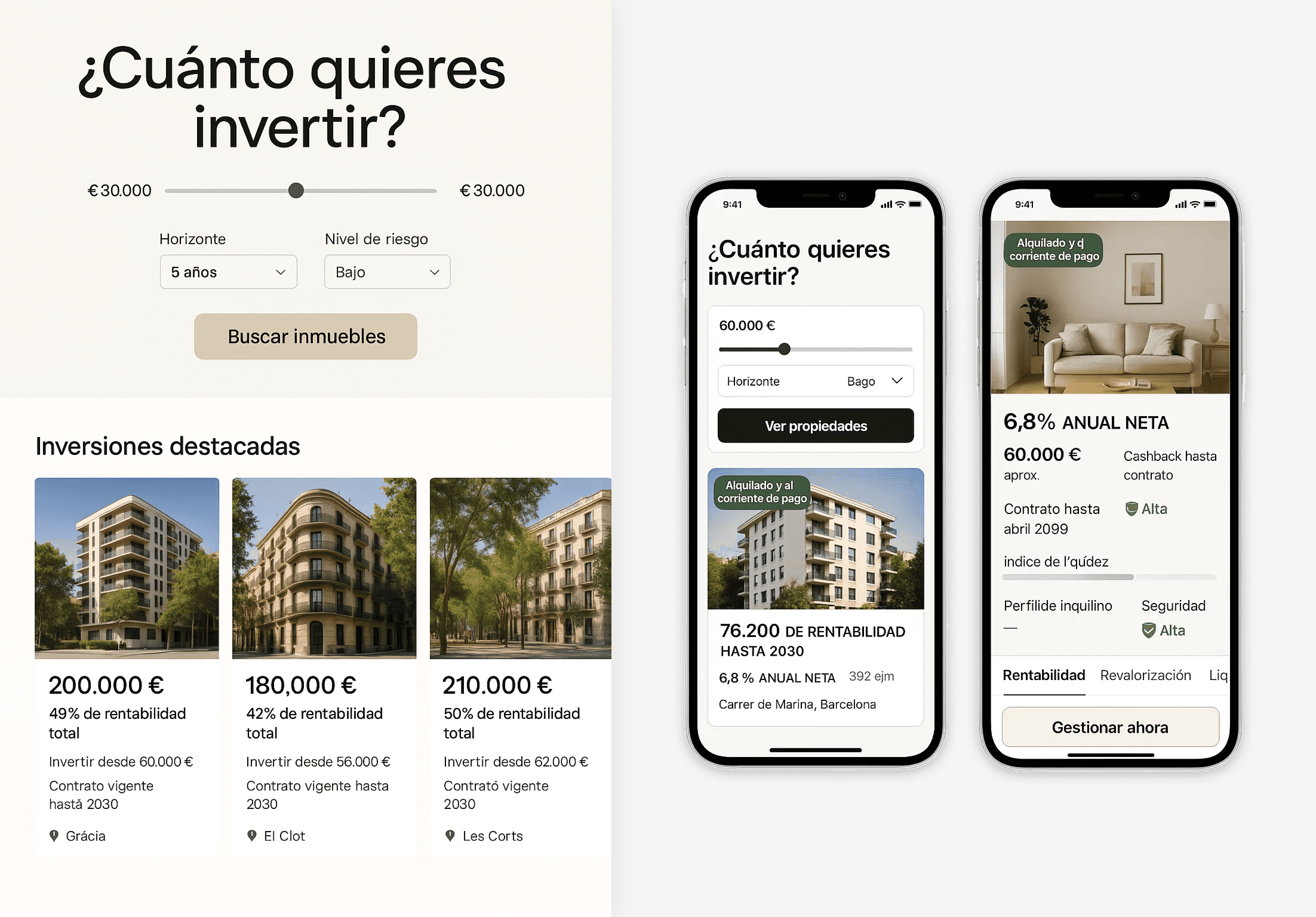
Refine screens & interactions with ChatGPT
I ask ChatGPT to land the journey into concrete screens:
- Screen-by-screen descriptions, states and microcopy.
- UX ideas like dynamic CTAs depending on the user's intention (check contract, simulate mortgage, talk to advisor).
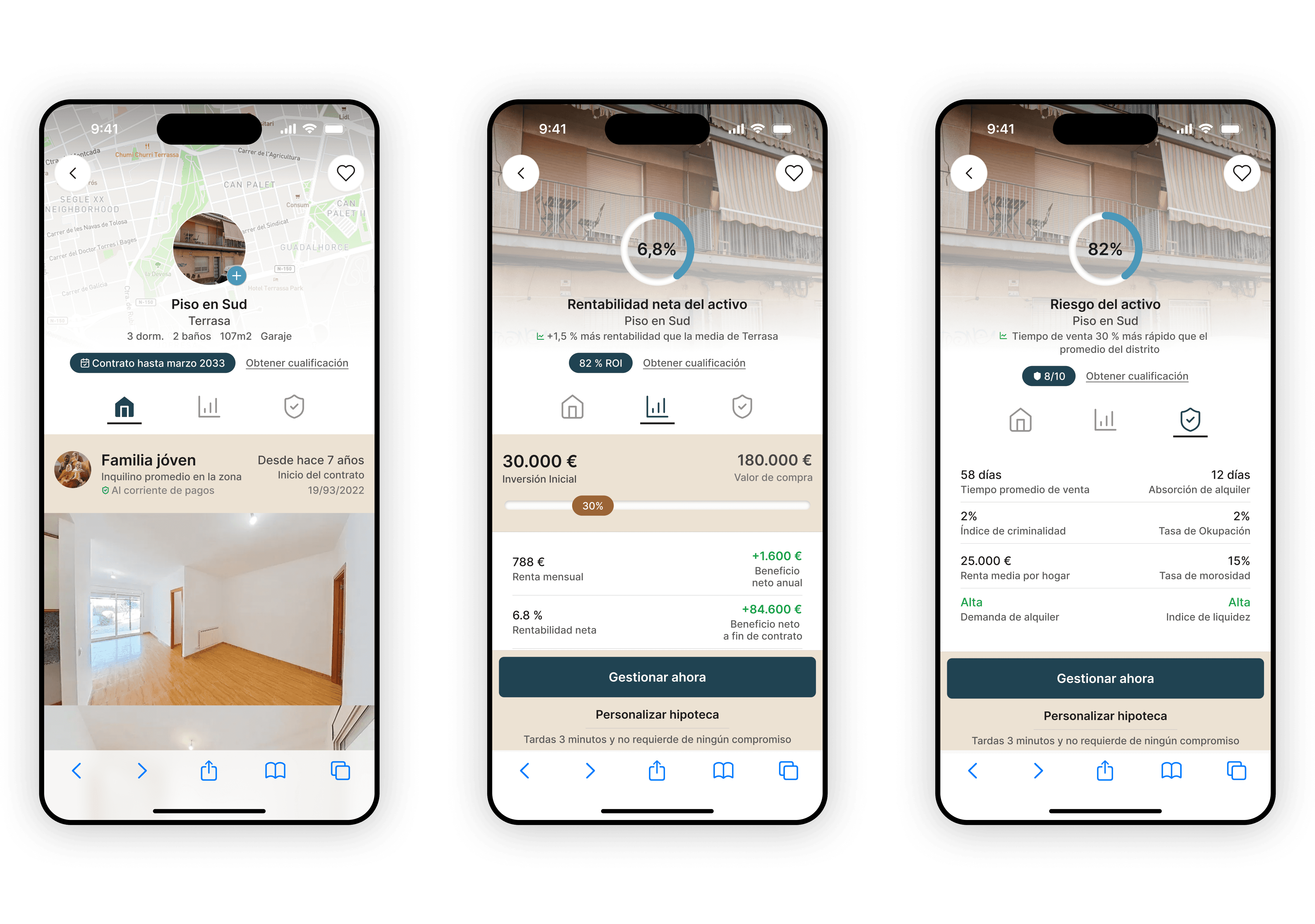
Design the visual layer in Figma
Once the UX makes sense, I move fully into Figma:
- I design the final layout, hierarchy and look & feel.
- I translate the investment story into a warm, editorial UI that still works like a product.
From Figma to code with ChatGPT → back to Gemini
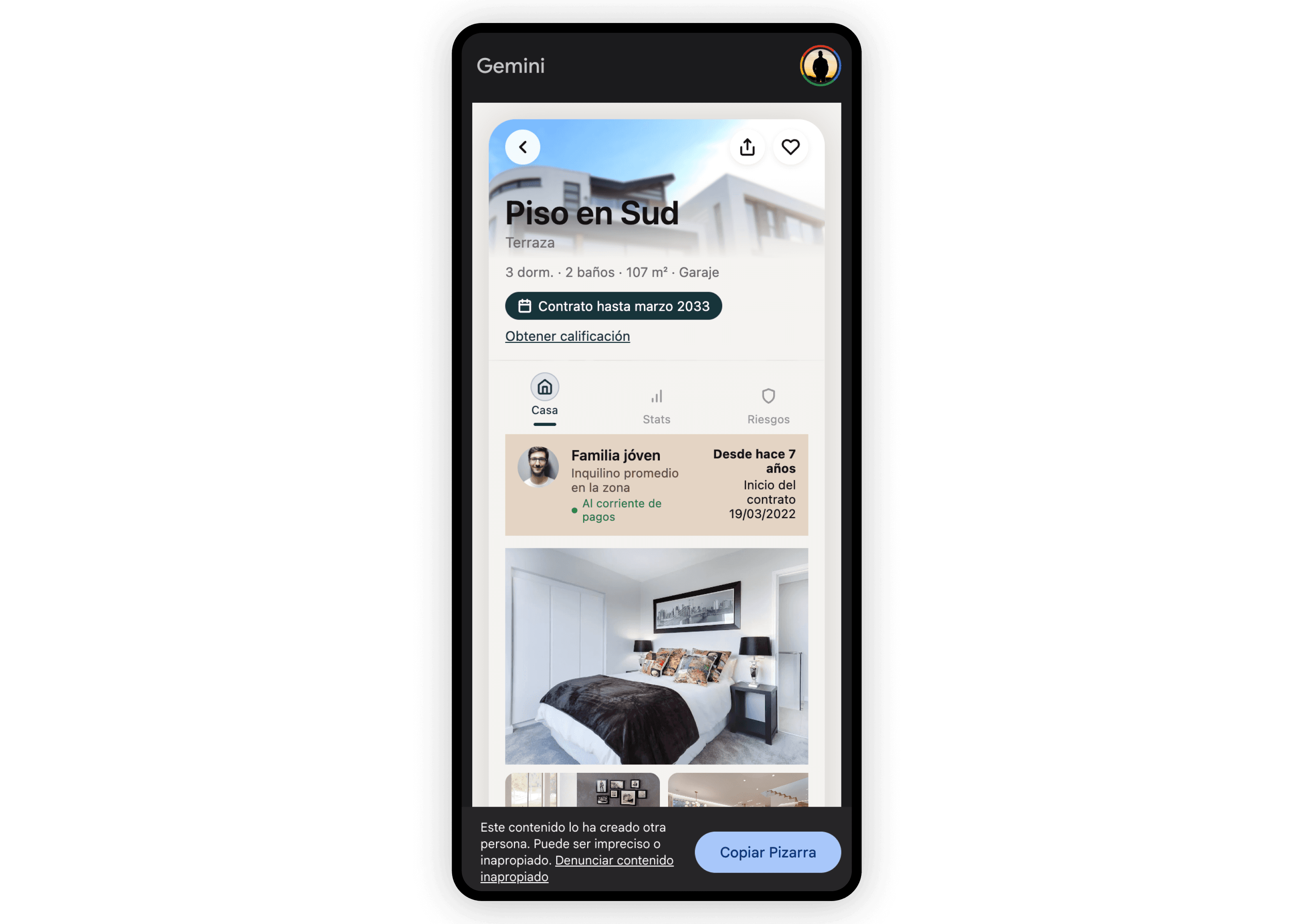
When I'm happy with the Figma design, I close the loop between design and implementation:
- I describe the final screens to ChatGPT and ask it to generate:
- Markdown structure (sections, components, hierarchy)
- Vanilla HTML + CSS styles matching the design system
Designing the qualification panel
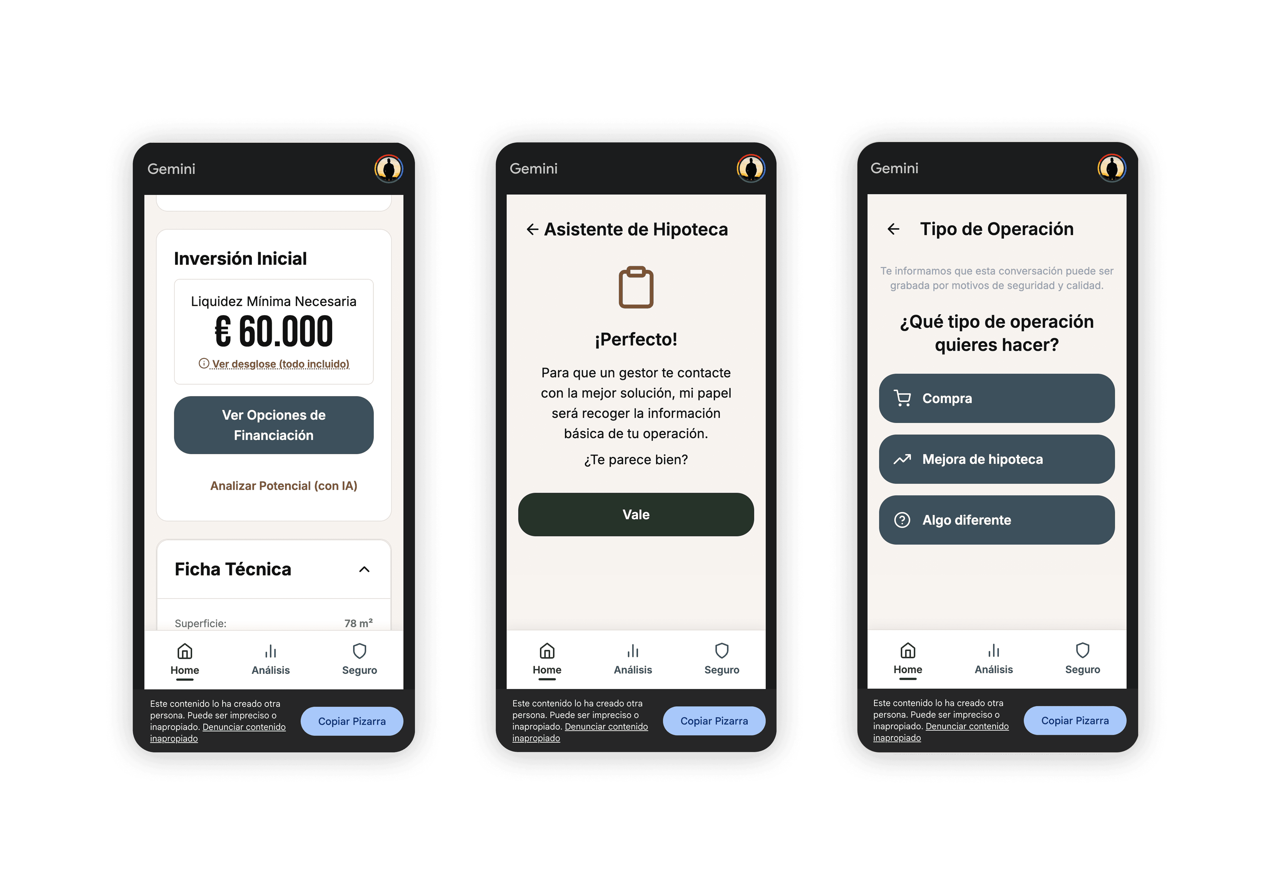
For the qualification panel (mortgage / investor funnel), I didn't start from zero:
- I benchmarked Hipoo (a national mortgage comparator with an AI phone-based agent) and Zillow (a more traditional qualification panel).
- I used ChatGPT in "agent mode" to simulate a full qualification call and obtain a structured Markdown report of all the questions and decision points.
- I transcribed the HIPO experience in Notion and, combining both, designed my own qualification panel tailored to Alkizen's needs.
Why the new UX looks the way it does
Objectives at screen level
- Confirm the asset is safe and the tenant stable
- Surface the core return and payoff structure at a glance
- Help the user see if it fits their investment strategy
- Nudge them to the next step of the funnel (reserve, ask, simulate mortgage)
Key UX decisions
- From listing to storytelling
The property detail stops being a technical sheet and becomes an investment narrative: security → yield → liquidity → action. This reduces cognitive load and increases emotional retention. - From table to perception
Instead of dense tables, financials become cards with clear visual hierarchy. Each metric (ROI, net yield, cashflow) is designed to be understood without reading a full paragraph. - From flat scroll to modular exploration
Introduced a tabbed / carousel-like system for 3 main blocks: Home, Performance, Risk. The user can explore layers without losing context, avoiding scroll fatigue. - From generic CTA to contextual CTA
Instead of a single "Invest" at the bottom, CTAs become contextual: "Reserve managed purchase" → guided onboarding or contact form. "Find optimal mortgage" → smart simulator crossing rate, term and risk. Each one matches the mental step the user is actually in. - From cold finance to emotional trust
The visual language moves away from the typical blue/grey "financial dashboard" and towards a warm, editorial palette (beige, copper, olive). This evokes tangible, stable, human investment rather than abstract spreadsheets. - From scattered facts to integrated risk story
Data about tenant, area and risk are presented together to answer a single question:"Is this safe enough for me?"
In the original design, this information was fragmented or implicit.