
Usability and accessibility analysis of the Zalando website
1. Introduction
In today's digital era, e-commerce has become an integral part of our lives. Among the numerous e-commerce platforms available, Zalando stands out as one of the most popular in Europe. Offering a wide range of products spanning clothing, footwear, and accessories, Zalando has earned the trust of millions of customers due to its user-friendly interface and efficient customer service.
However, like any other digital platform, the usability and accessibility of Zalando are crucial aspects that can determine its success or failure. Website usability is essentially how easy it is for users to interact with the site and achieve their goals. Usability has been defined by five components: learnability (ease of performing basic tasks on the first use), efficiency (speed in completing tasks after learning the system), memorability (ease of resuming use after a period of inactivity), errors (quantity and severity of errors made, and ease of recovery), and satisfaction (pleasantness of the system). Jakob Nielsen, a pioneer in the field of usability, established ten design principles, often known as "Nielsen's heuristics," widely used by professionals to assess and improve the usability of a system or website.
On the other hand, accessibility in the context of the web refers to the practice of making websites usable by as many people as possible, regardless of their physical or cognitive abilities. This may include ensuring a website is readable for individuals with visual impairments, providing subtitles for those with hearing impairments, or designing interfaces that are easy to use for individuals with motor disabilities. The Web Content Accessibility Guidelines (WCAG), developed by the Web Accessibility Initiative (WAI) of the World Wide Web Consortium (W3C), are a set of recommendations that provide a framework for making web content more accessible for people with disabilities. The WCAG is widely recognized and internationally adopted as the de facto standard for web accessibility.
In this post, we will conduct a heuristic analysis of Zalando based on Nielsen's principles to assess the website's usability. Additionally, we will use the WCAG guidelines to evaluate its accessibility. Our objective is to identify the strengths and weaknesses of Zalando in terms of usability and accessibility and provide recommendations to enhance the user experience. The specific task we will analyze is the purchase of black and blue sneakers with a discounted price, a process that involves multiple stages and can reveal important aspects of the site's usability and accessibility.
2. Methodology and Procedure
Heuristic analysis is a usability evaluation technique that involves examining the interface of a system and comparing it to a set of usability principles (heuristics). In our case, we will use Nielsen's ten principles as our guide.
Applying them to Zalando, we will assess aspects such as system status visibility, real-world matching, user control, consistency, error prevention, ease of recognition, flexibility, minimalist design, error recovery assistance, and availability of help and documentation. These principles will enable us to determine whether Zalando provides an efficient and satisfactory user experience.
To evaluate the usability of Zalando, we focus on the task of a typical user: purchasing discounted black and blue sneakers. This process involves multiple steps, including entering the website, selecting the 'Men' category, accessing the 'Sale' section, searching for 'Sneakers,' choosing the desired product, and finally making the purchase. Each step corresponds to a specific screen on the Zalando website, from the homepage to the shopping cart. This analysis will allow us to assess the user-friendliness of Zalando in a realistic purchasing scenario.
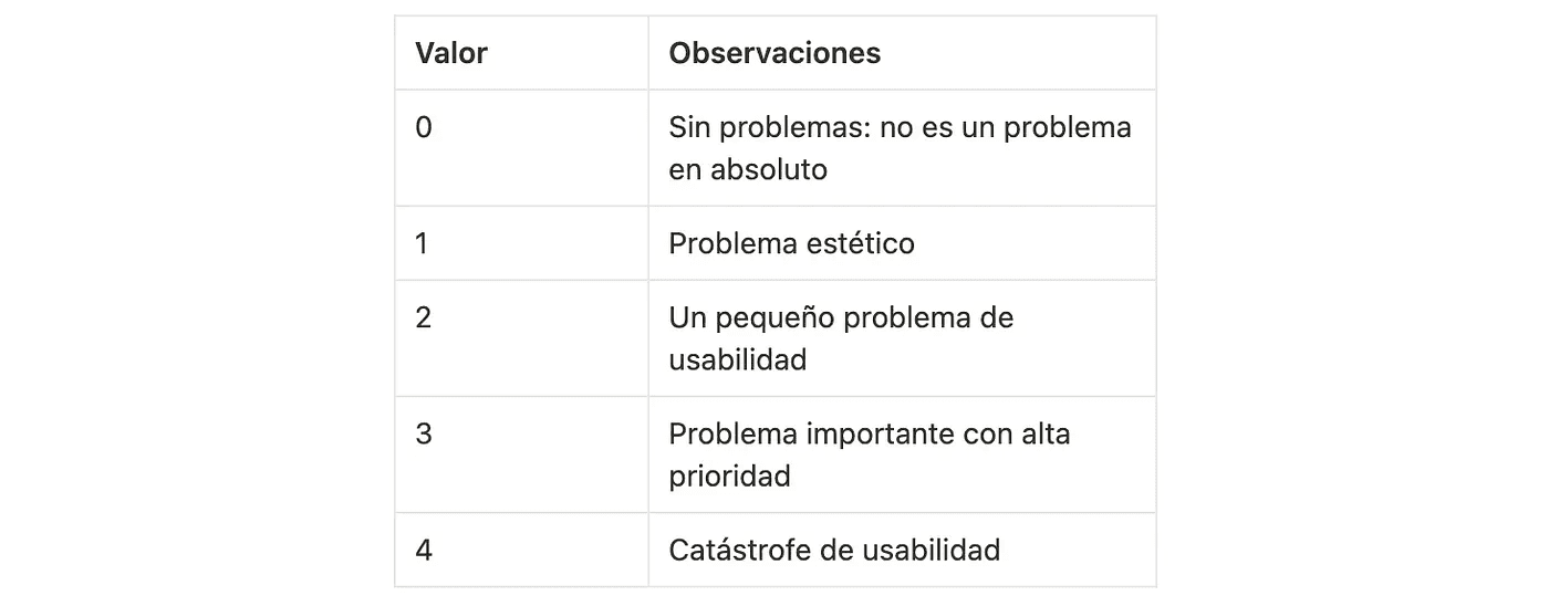
On the other hand, the identified failures according to each heuristic will be evaluated based on their degree of severity, following this ranking:
Finally, it is important to note that heuristic analysis is not an exact science but rather a qualitative technique that heavily relies on the experience and judgment of the evaluator. However, by following Nielsen's principles, we can gain valuable insights into the usability of Zalando.
3. Results
Below, we present the most significant findings from our analysis, organized by each of Nielsen's principles.
3.1 Visibility of System Status
This heuristic examines how the system aids and informs the user about everything that happens through appropriate feedback (where they come from, where they are, and what they need to do to complete each task).
Zalando does a good job of keeping users informed about what is happening. For instance, when users add an item to the cart, a notification confirming the action is displayed. However, some areas were identified that need improvement. In certain cases, the system's response is not entirely predictable, such as with filtering or navigating between sections on the homepage.
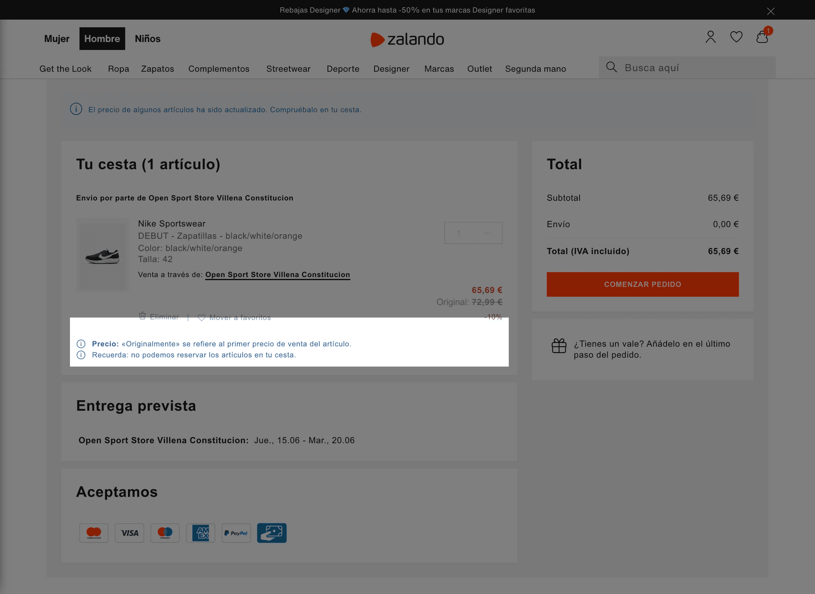
During the purchase process, the system adequately informs the user.
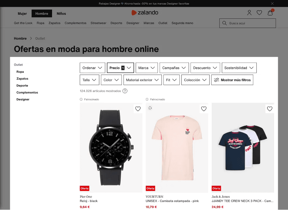
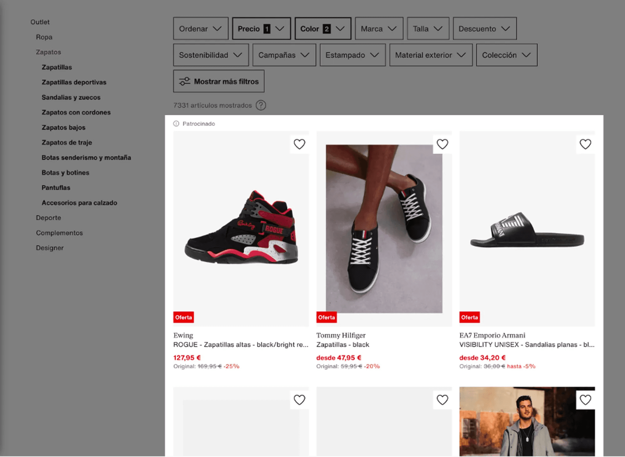
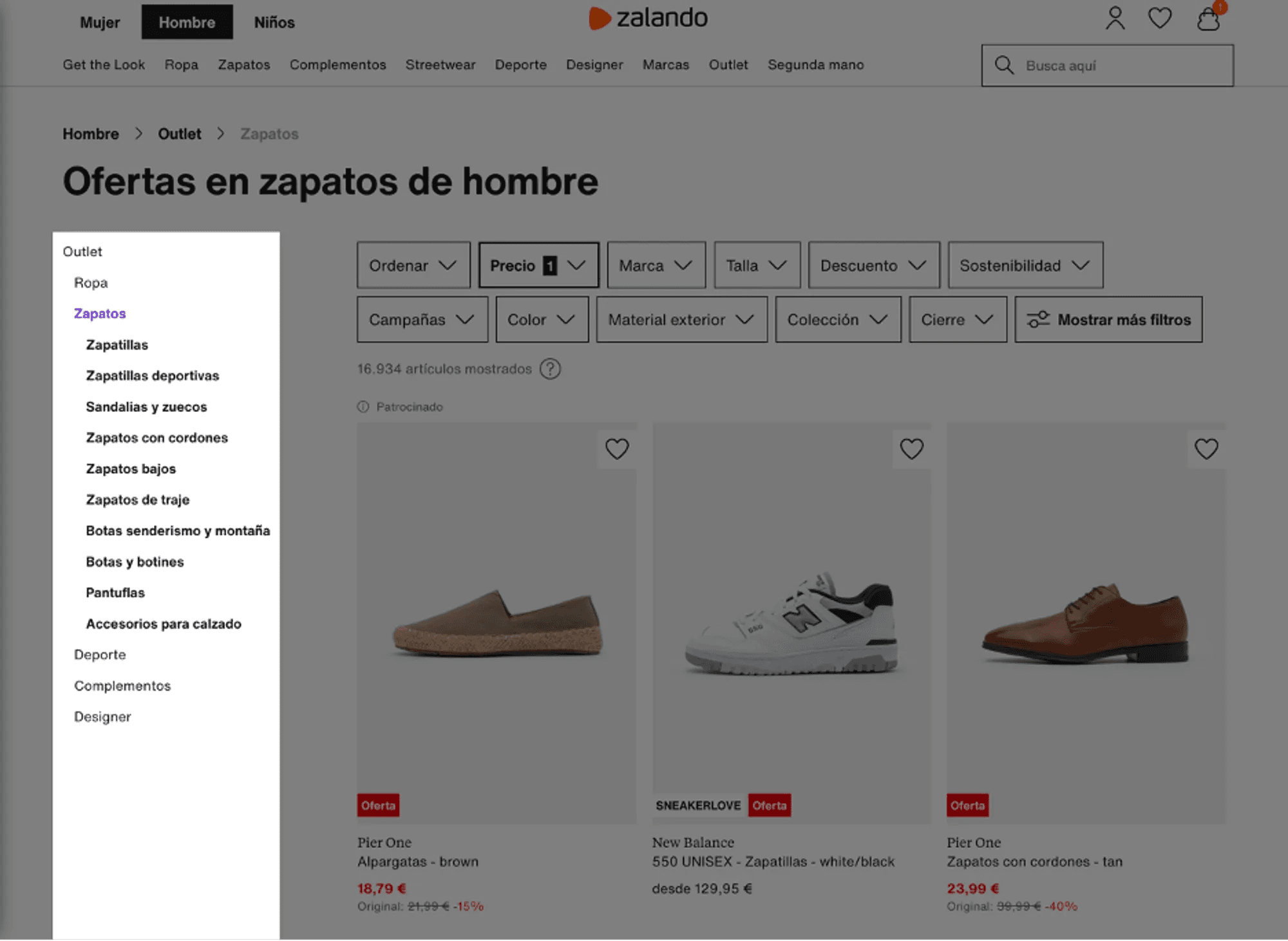
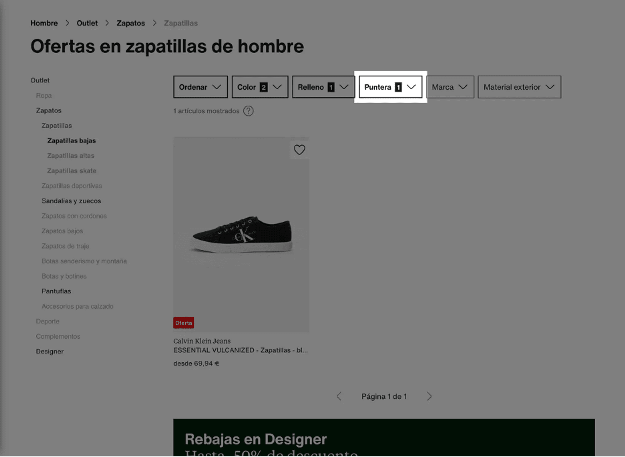
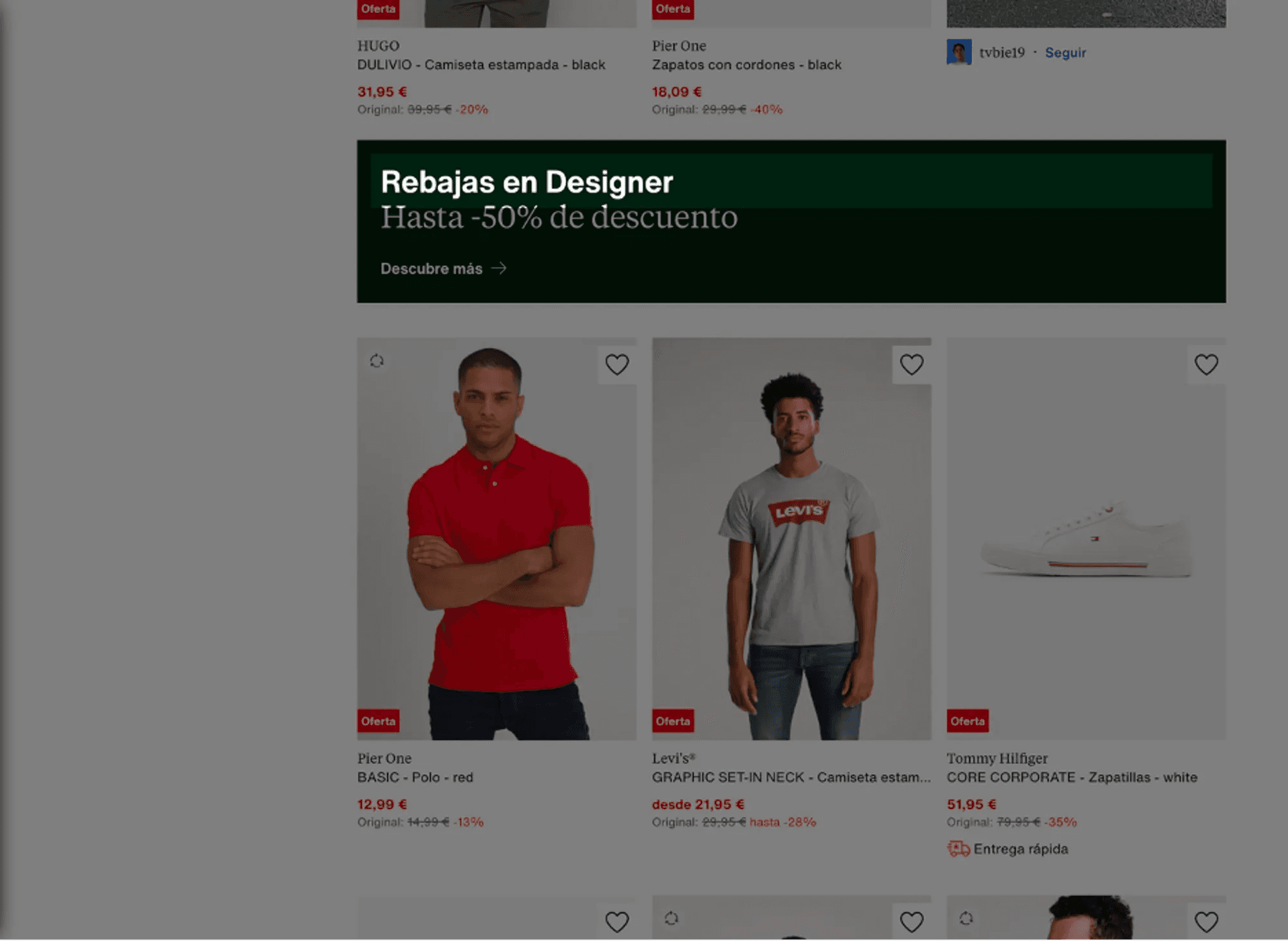
In this case, once you access the Outlet section, it's unclear why the "price" filter has been selected. Is it the general catalog with an economic filter, or is it the catalog of discounted items with a filter? This issue is classified as a minor usability problem (severity 2).
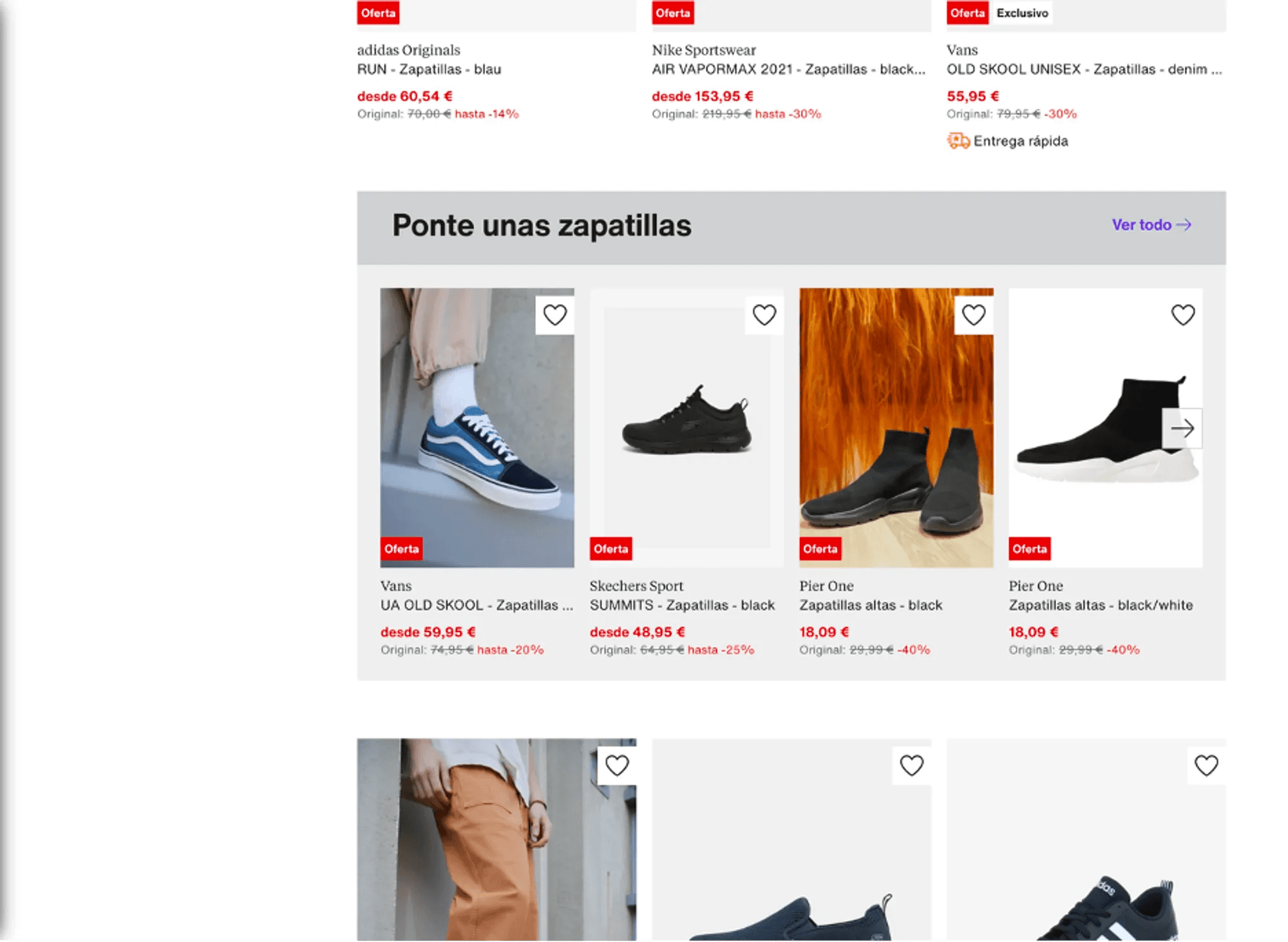
In the top left corner, the sponsored label appears. However, it's unclear which items are displayed as sponsored. If it includes all those on the screen, there is no distinction between sponsored and non-sponsored items. This error is classified as a significant, high-priority problem (severity 3).
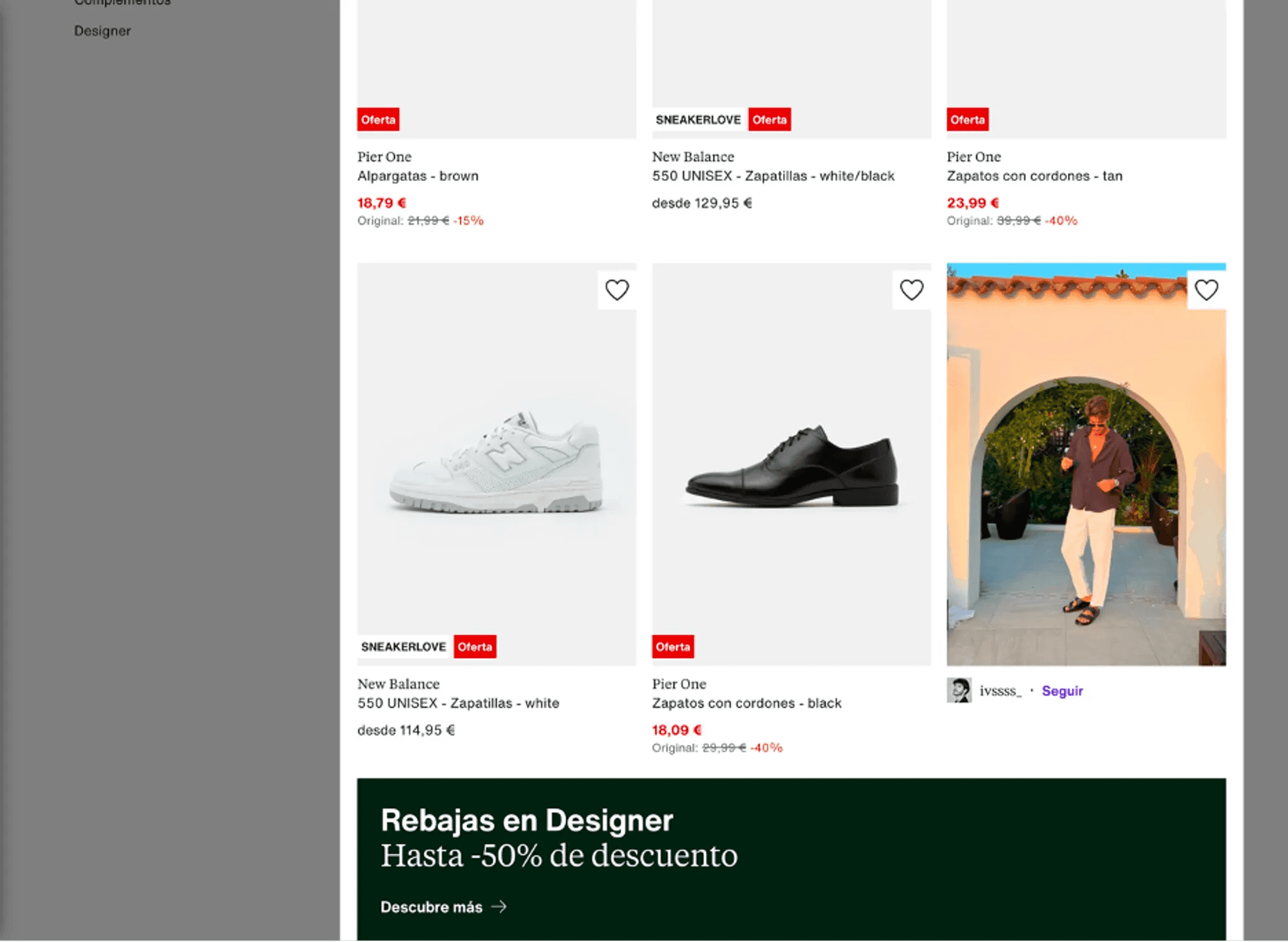
On the other hand, in this image, we see that some items on sale do not display their discounted price. This flaw is classified as a minor usability problem (severity 2).
3.2 Real-world Matching
This heuristic analyzes whether the information appears in a natural and logical order and if the system employs language similar to that of the user. Zalando uses language familiar to users. However, several problems were identified:
3.2.1 Color Filtering
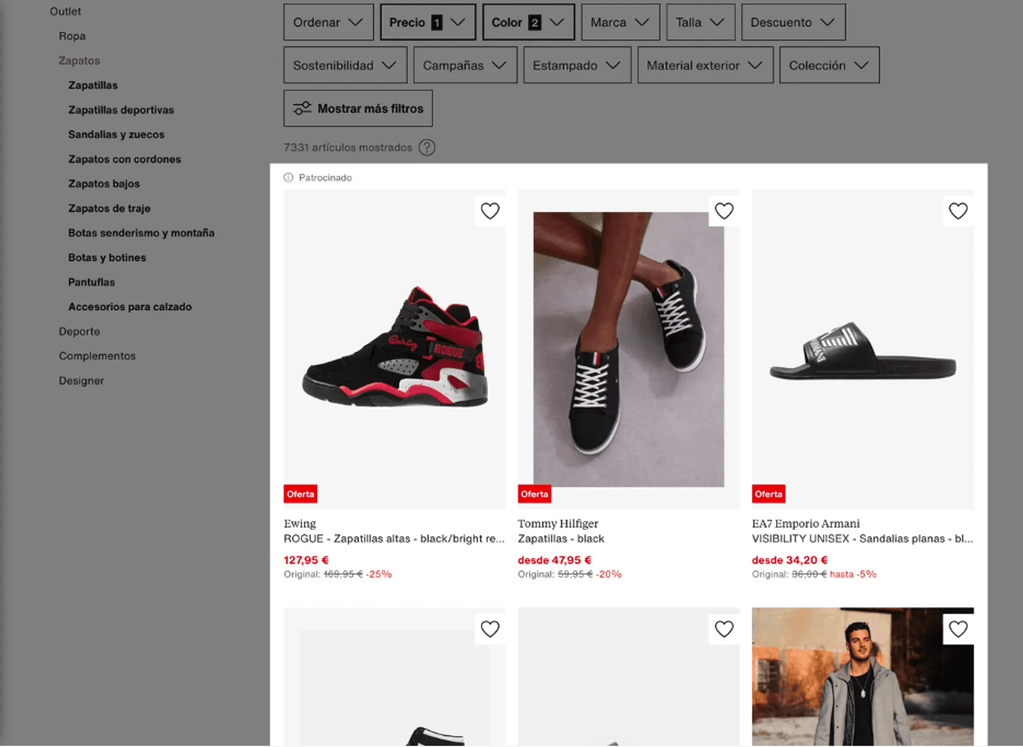
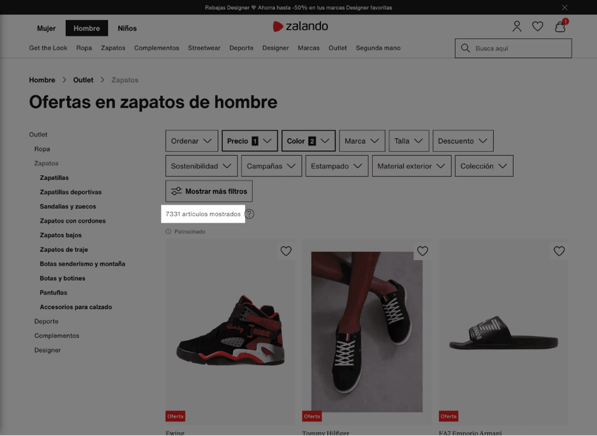
When using the search filter system to filter sneakers by the colors black and blue, the system did not only show black and blue sneakers but rather all sneakers that included shades of black or blue. In other words, the displayed sneakers have black and blue as part of their design but may not necessarily have them as the predominant colors. For example, in the previous search with blue and black selected as filters, a predominantly white sneaker with blue details is displayed. This issue can lead to user confusion and frustration as they need to spend more time searching for the desired product or may struggle to narrow down the search strictly to black and blue sneakers.
As seen in the image, there is no way to select only black and blue sneakers. When filtering the search by both colors, all sneakers containing elements of either color appear. This problem is classified as a significant issue with high priority (severity 3).
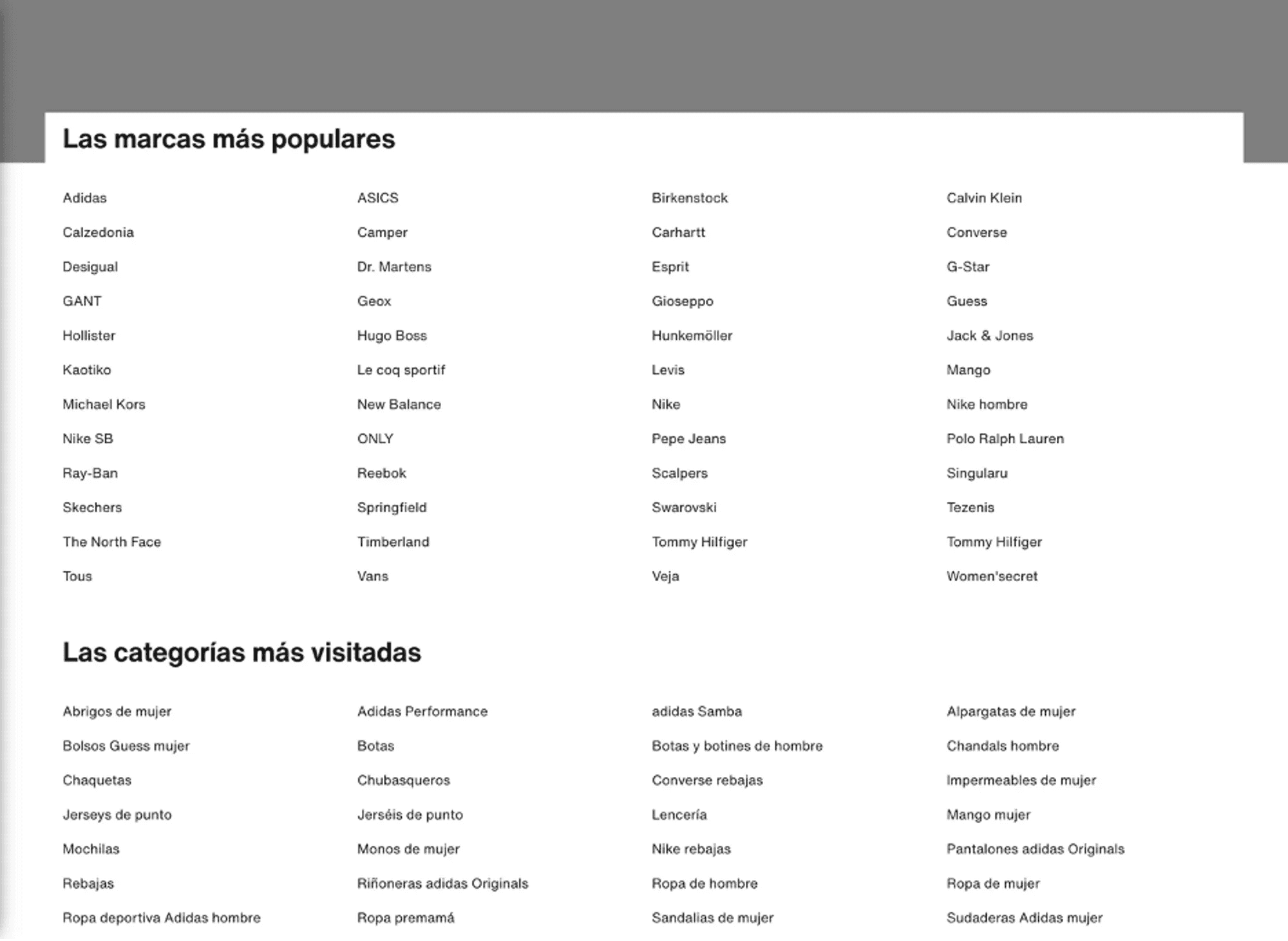
3.2.2 Product Categorization and Labeling
There are issues with categorization, and labeling is sometimes confusing. For example, some categories are not entirely intuitive, such as "zapatillas bajas," which may not be clear to the user. On the other hand, several sandals are in the category of sports sneakers, which can cause confusion.
Bathroom slippers in the category of sports sneakers (severity 2 problem).
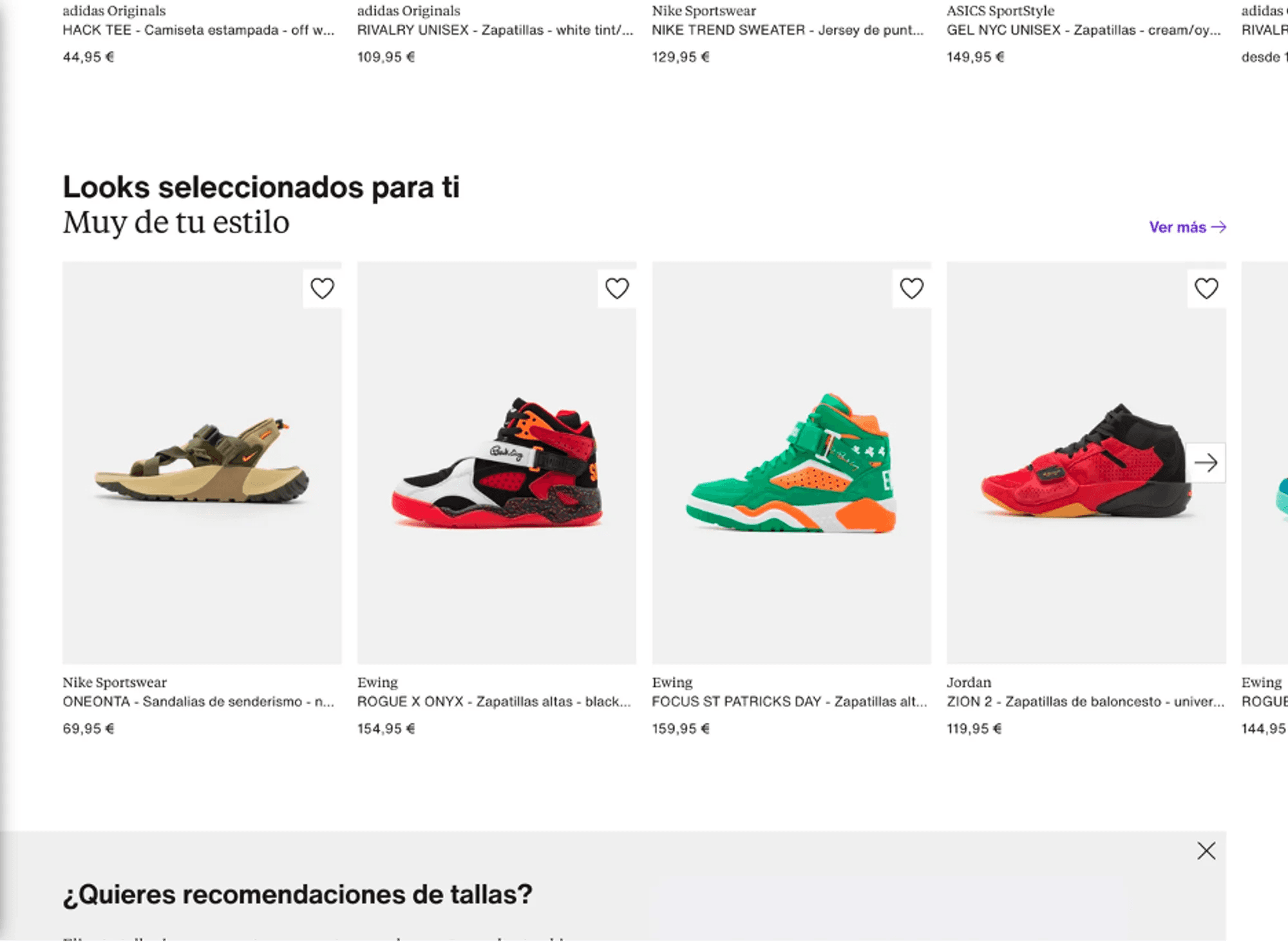
A subsection called "Looks seleccionados para ti" appears even if you are not registered or have not made previous searches on the website. This flaw is classified as a minor usability problem (severity 2).
In the category of sneakers, there are elements that encourage searching for sneakers, which can cause confusion (severity 2 problem).
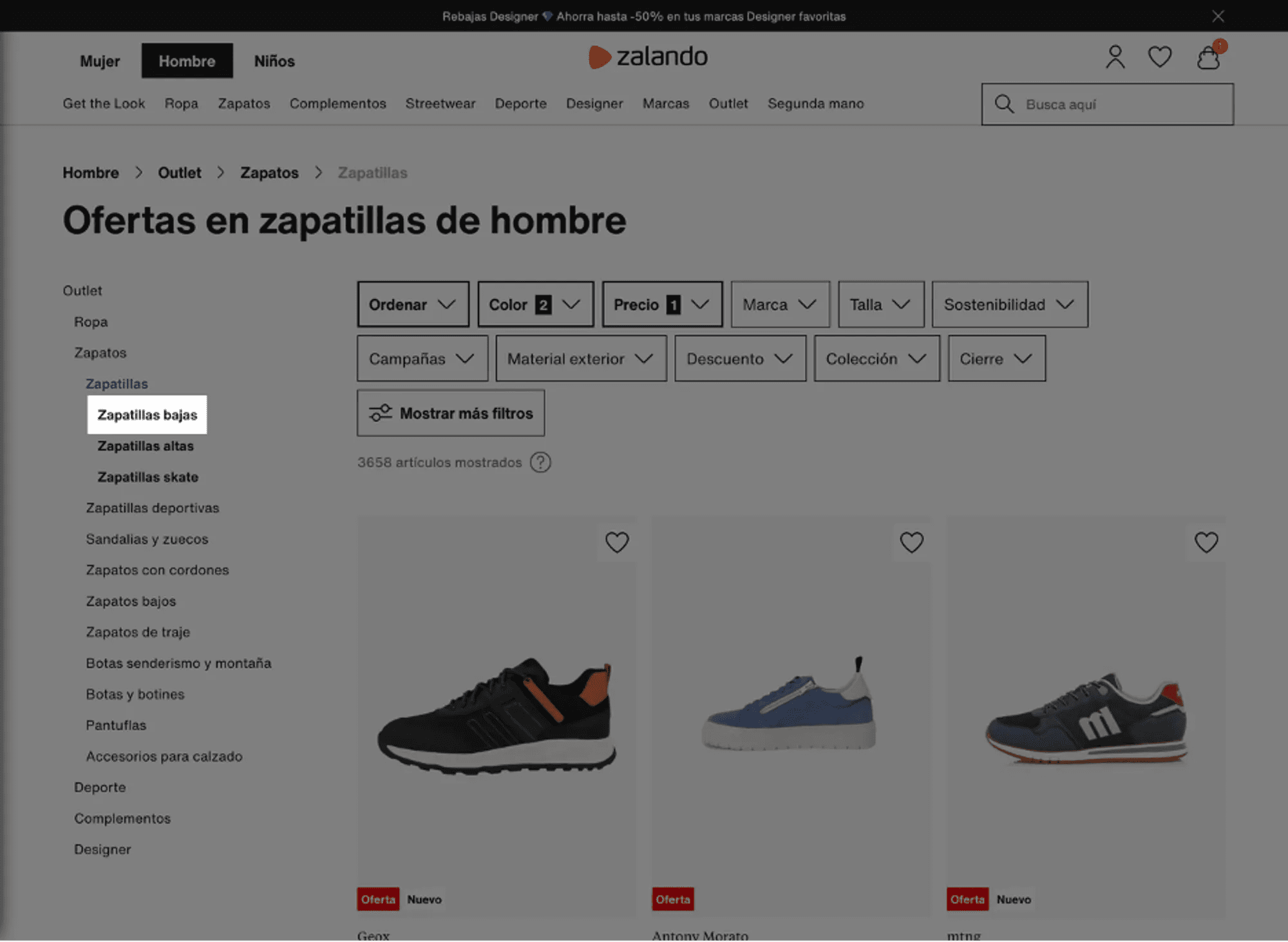
The system assumes that the user knows the difference between "zapatillas bajas" (low sneakers) and "zapatillas altas" (high sneakers) (severity 2 problem).
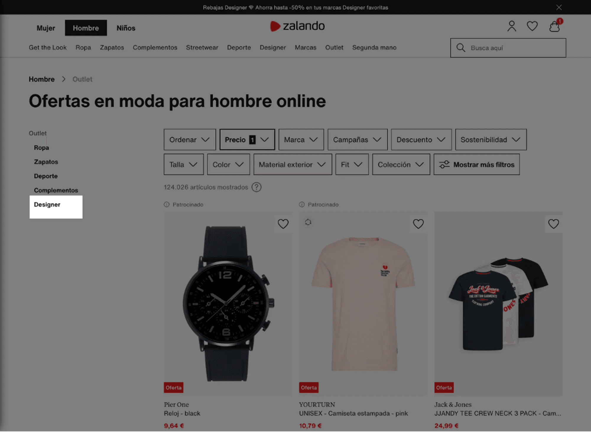
In this case, the meaning of the "Designer" category can be confusing (severity 2 problem).
3.2.3. Navigation Structure
It can be confusing for users to determine where to look for sneakers on the Zalando website. For example, it's unclear whether they should go to the "Zapatos" (Shoes) or "Deporte" (Sports) section.
3.3. User Control and Freedom
This heuristic examines how the system provides users with the ability to recover from human errors. Zalando allows users to have control over their interaction, allowing them to perform and undo actions. Users can add and remove items from their shopping cart at any time, and they can also filter and sort products according to their preferences.
3.4. Consistency and Standards
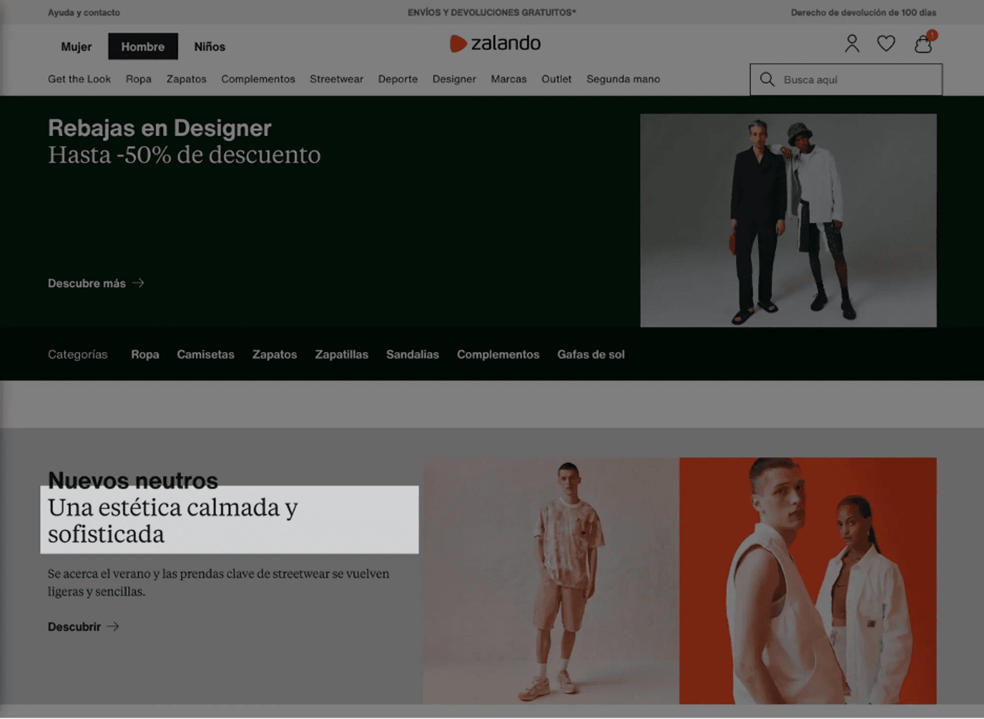
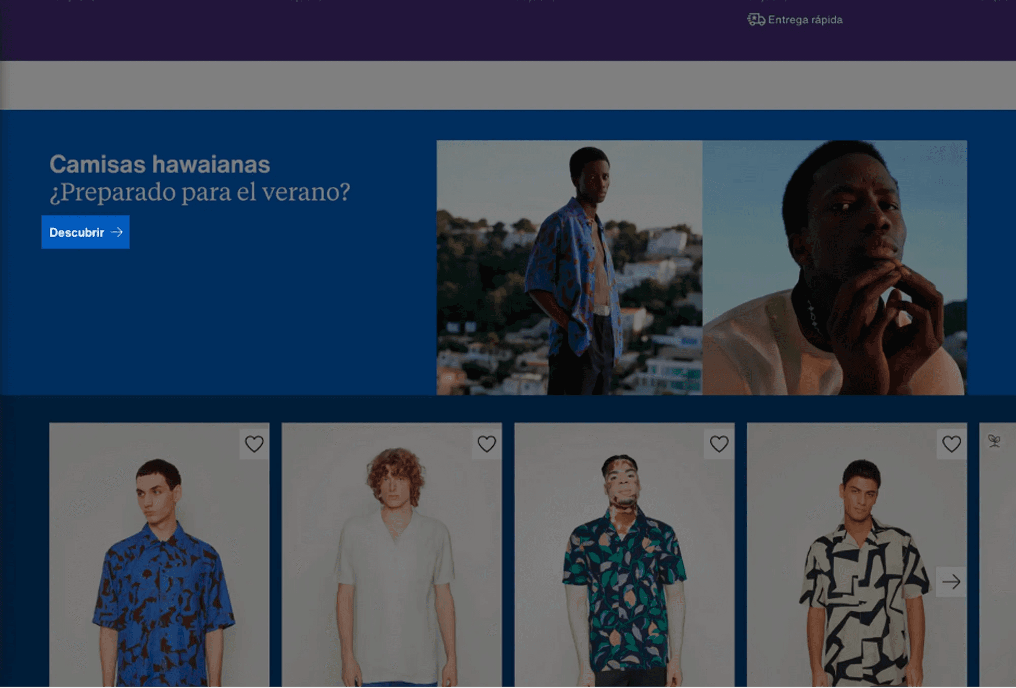
This heuristic analyzes the internal consistency of the system so that everything behaves in a consistent manner, following current standards (to facilitate the user's learning curve). Zalando is generally consistent in its use of colors, fonts, and images, and it follows web design conventions. However, an excess of content was found that creates confusion and can give the user a sense of overwhelm. For example, on the homepage, there are 17 blocks of titles and subtitles. Another confusing element is that the CTAs (Call to Action) are often very small.
This selection of categories has changed compared to the categories shown on the home page (severity 2 problem).
The subtitles are in a larger size than the titles (severity 2 problem).
The "descubrir" (discover) element is too small (severity 1 problem).
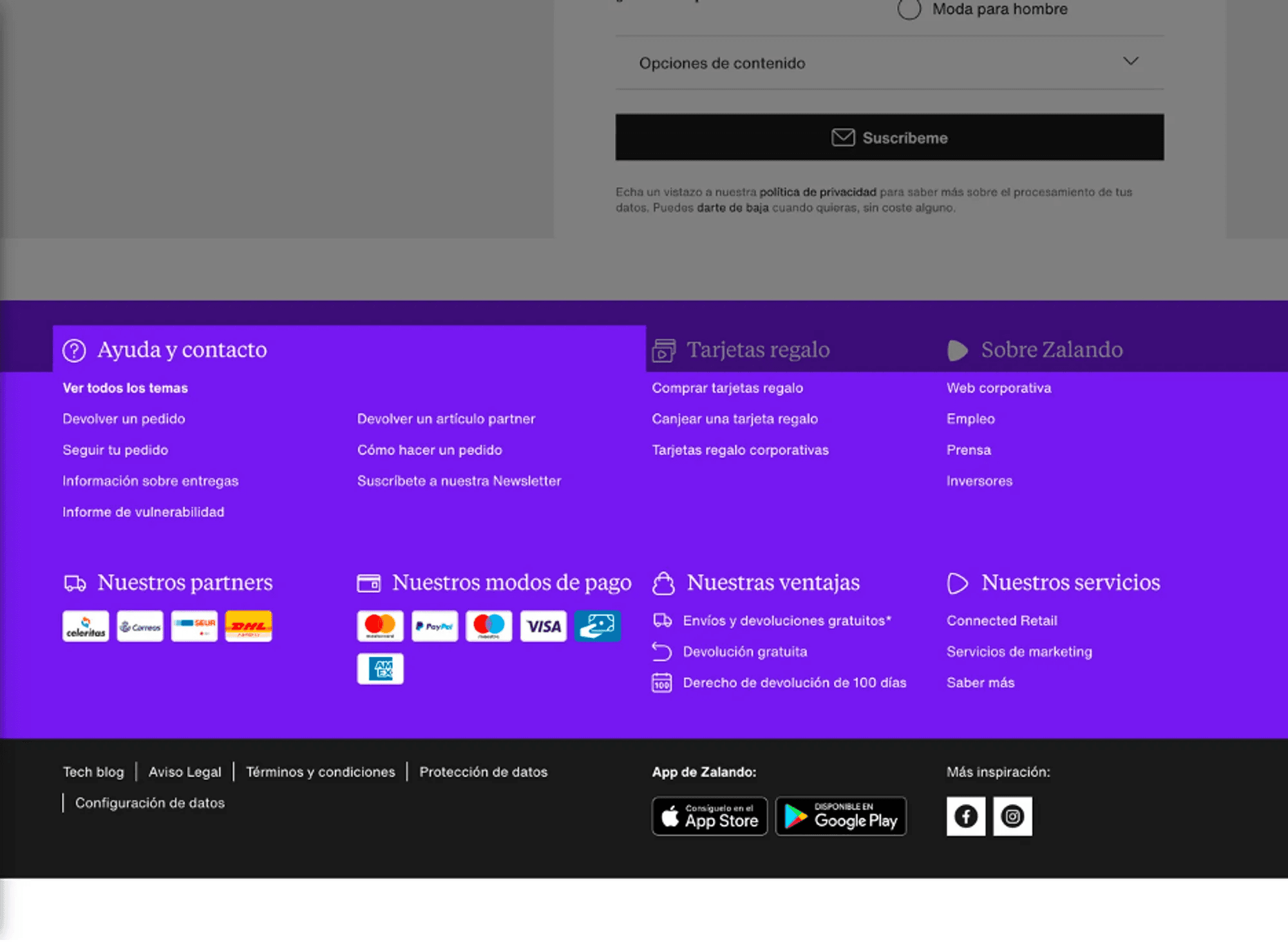
The help section in the footer of the homepage does not display the standard Frequently Asked Questions (FAQ) system.
3.5. Error Prevention
This heuristic examines how the system anticipates errors that the user may make. Zalando does a good job of preventing errors with data input validations and confirmations before critical actions. However, the system could improve in offering more relevant search recommendations.
3.6. Recognition Rather Than Recall
This heuristic is based on the idea that the user should not have to remember and memorize where they are or what they have to do but should easily recognize it. Zalando minimizes the cognitive load on the user by making objects, actions, and options visible. However, there is an excess cognitive load due to information saturation on the homepage.
3.7. Flexibility and Efficiency of Use
This principle analyzes the degree to which the interface can be used by both expert and non-expert users and suggests that the system should allow users the flexibility to use shortcuts and speed up their interactions. Zalando offers a flexible and efficient user experience. Users can search for specific products using the search bar at the top of the page. Additionally, users can filter products by categories, brands, sizes, prices, and colors, allowing experienced users to speed up their purchasing process. However, navigation can be confusing in some cases. For example, if a user is looking for sneakers, it may not be clear whether they should go to the "zapatos" (shoes) or "deporte" (sports) section. Moreover, the difference between "zapatillas" (sneakers) and "zapatillas deportivas" (sports sneakers) is not clear. Finally, the selection of discounted sneakers in black and blue resulted in a total of 7,331 items, divided into 88 pages. The manual selection of each page is laborious, and both the quantity of pages and items and the way to navigate between them require excessive effort (severity 4 problem).
There is an excess of nominal categories, with potential inconsistencies: "zapatillas" (sneakers), "zapatillas deportivas" (sports sneakers) (severity 3 problem).
The filtering system is quite precise, offering various toe types, for example. However, it never explicitly explains what these types entail. Additionally, once selected, the available options are considerably fewer, suggesting that not all products have been labeled in the same way (severity 2 problem).
When displaying discounted "shoes" in black and blue, a total of 7331 items appear.
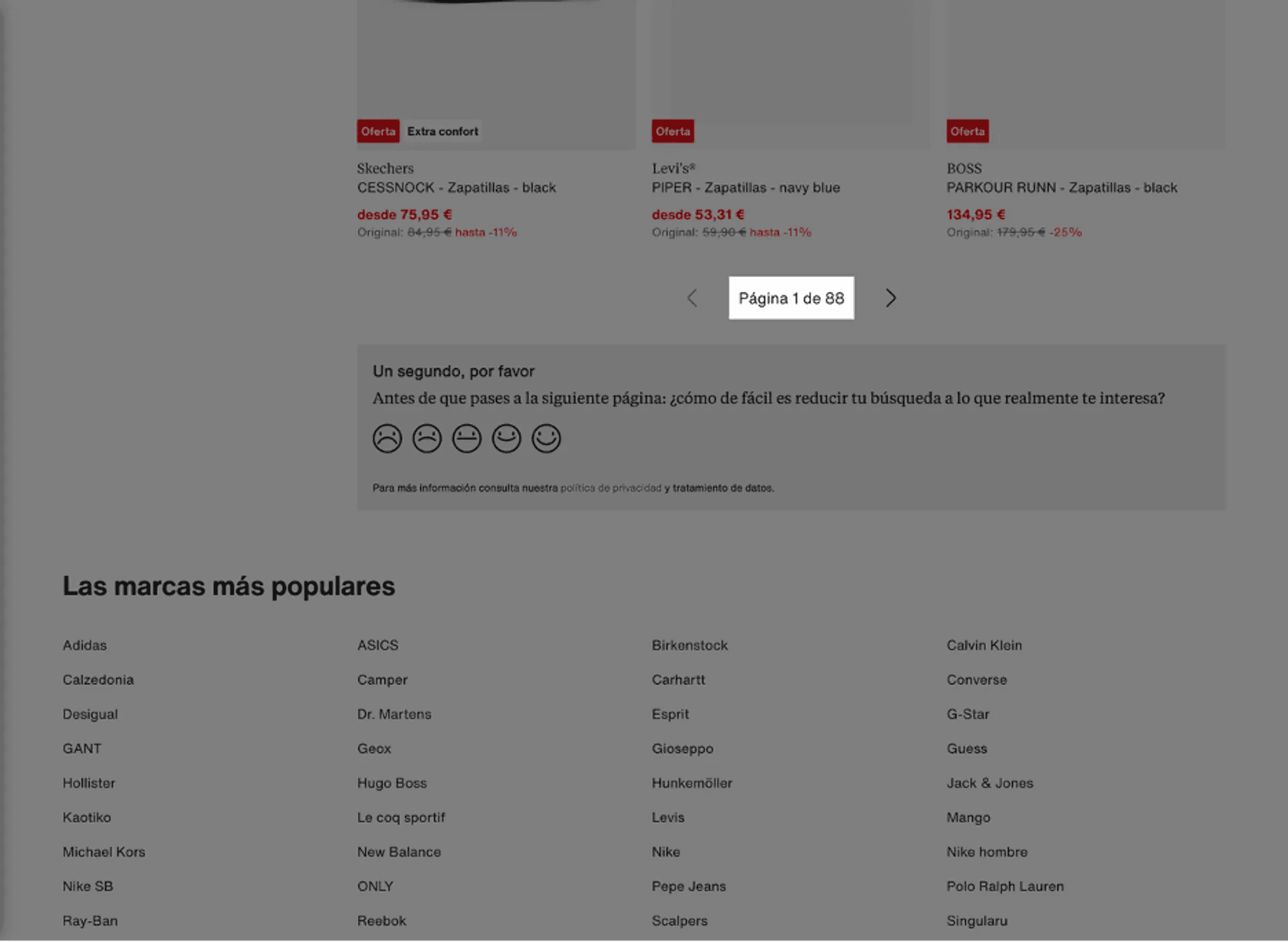
These 7331 items translate to 88 pages that the user must look through, one by one, to select their product. This is an excessive cognitive load, and we classify it as a severity 4 problem.
3.8. Aesthetics and Minimalist Design
This heuristic examines whether visual information follows a functional and communicative principle beyond mere decoration, providing an extra level of information that can assist the user in making appropriate decisions.
Zalando's website design is generally clean and minimalist, with colors, fonts, and images used consistently throughout the site, offering a pleasant and consistent user experience. However, it was found that in certain cases, the design can be excessive, potentially diverting users from their main objective.
The main issue is the excess of categories. For instance, on the homepage, 17 blocks with their respective titles and CTAs are displayed, each with horizontal scrolling. Once you start searching for products, the overall feeling is that the website shows you only 10% of the total content it hosts, which can be overwhelming due to the sheer quantity of products and information. The information hierarchy is not fully utilized, leading to a constant bombardment of information. This excess generates some visual noise, despite the careful aesthetics, as there is a large number of items, headers, blocks with various colors, etc. There are almost no blank spaces; every space is more or less occupied by information.
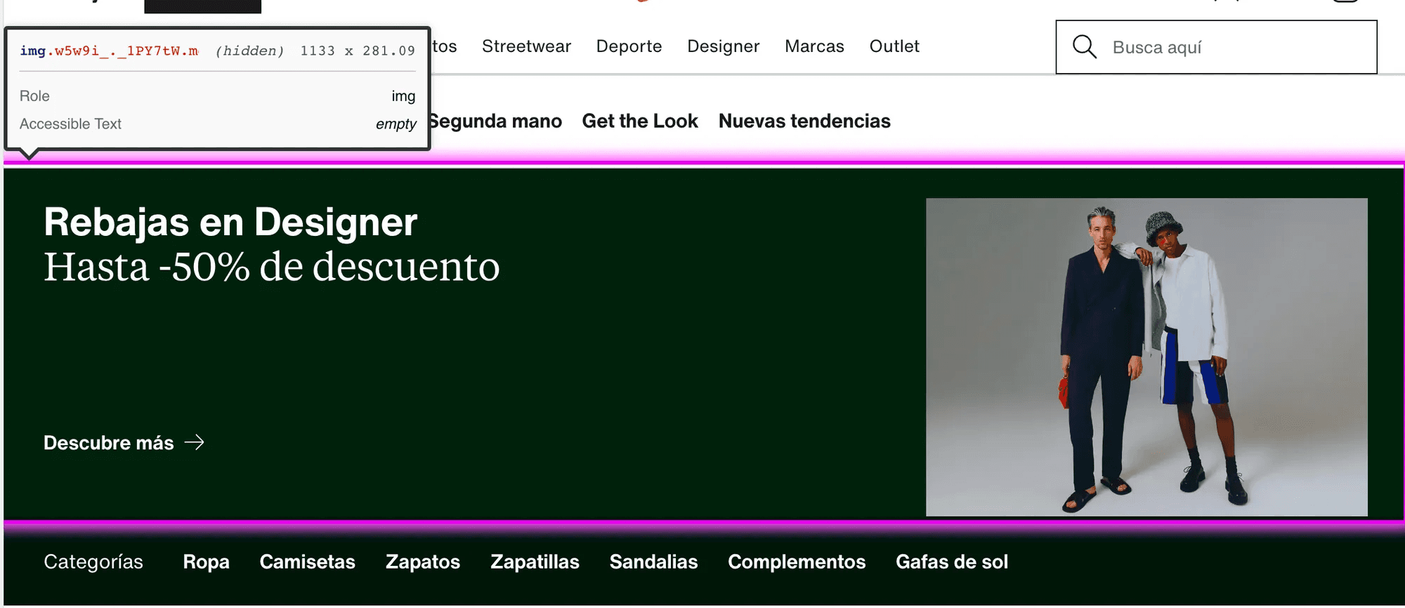
Additionally, a redundancy of some links has been detected (for example, in the Outlet section, a component called "Rebajas en Designer" is constantly displayed).
The H1 tags are too close to the immediately following text (severity 1 issue).
There is an excessive cognitive load due to the quantity of categories and elements suggested by the system (severity 2 issue).
Excessive redundancy of some components (severity 3 issue).
3.9 Help the user recognize, diagnose, and recover from errors
This principle focuses on indicating all problems and suggesting constructive solutions to the user, making it clear not only what the error is but how to recover from it.
Zalando provides clear error messages that help users recognize, diagnose, and recover from errors, ensuring that users receive clear and helpful error messages during the purchasing process to facilitate problem resolution. These messages, expressed in clear and simple language, indicate the problem and suggest a solution. For example, if a user enters an incorrect shipping address, an item is out of stock, or performs an unrecognized search, appropriate error messages are provided.
3.10 Help and documentation
This heuristic examines whether there is information on how to perform tasks.
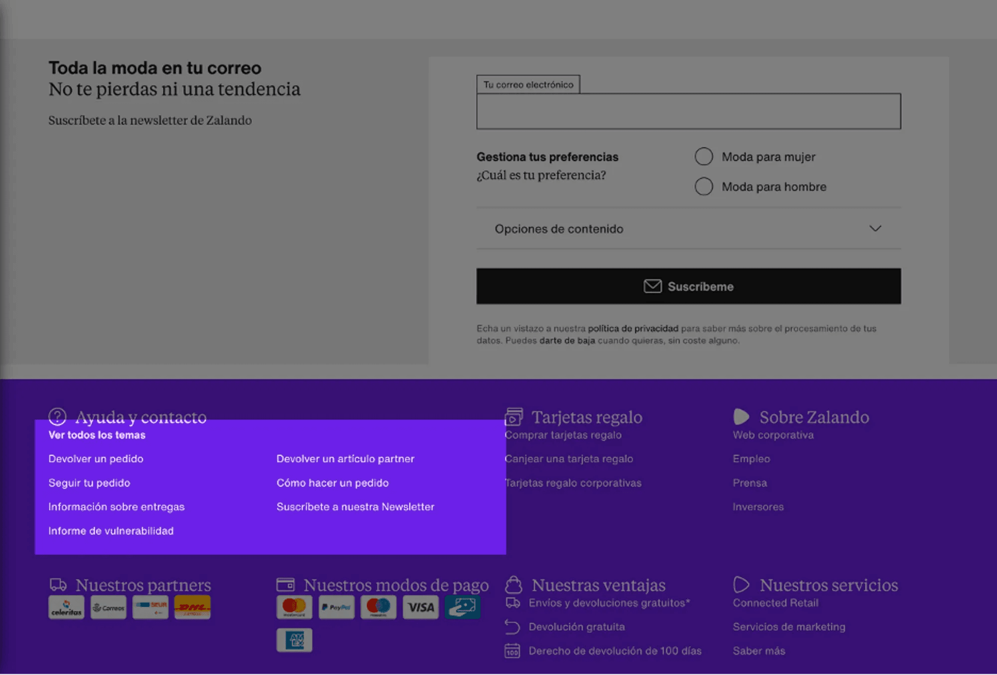
Zalando has a frequently asked questions section and offers customer assistance to help users with any problems they may encounter. This section is located in the footer of the home. Additionally, Zalando provides other relevant information such as size guides or information about return policies.
4. Implications and Recommendations
The findings of our analysis have several implications for the overall usability of the Zalando website. Although Zalando largely complies with Nielsen's heuristic principles, there are areas for improvement that, if addressed, could further enhance the website's usability and provide an even better user experience.
In terms of system status visibility, Zalando could improve by providing more consistent and predictable feedback to users. For example, it could ensure that filters work consistently and predictably, and that navigation between sections of the homepage is clear and easy to understand. Additionally, some elements like "Designer" might deserve an explanation.
Regarding the match between the system and the real world, Zalando could review its product categorization system to ensure it is intuitive and consistent. For example, a fundamental recommendation would be to offer some filtering options to show only items with the selected colors (as in the case of black and blue sneakers). In other cases, we believe that the excess of categories could be reduced by merging some of them since the current categorization is not entirely operational.
In terms of user control and freedom, Zalando could review the structure of its website to make it easier to navigate. For example, it could simplify its navigation menu and ensure that users can move easily between different sections and pages.
In terms of consistency and standards, Zalando could reduce the amount of content on its homepage to avoid information overload and confusion. For example, it could limit the number of blocks and scrolls on the homepage and ensure that the information presented is relevant and useful to users.
Regarding flexibility and efficiency of use, we believe it is essential to replace the system of pages with that of a scroll, as the number of pages of items often shown in each search is completely excessive.
Finally, in terms of aesthetics and minimalist design, Zalando could review its design to ensure that it is not excessive and does not divert users from their main objective. For example, it could limit the use of banners and other design elements that can create visual noise.
5. Accessibility Analysis
Alternative Text for Images
The images on Zalando contain alternative text, which is essential for users who depend on screen readers.
Page Structure and Navigation
The page has a clear structure with well-defined categories and subcategories. This is useful for keyboard navigation and general page understanding.
Color Contrast
All color contrasts are well-designed, which is necessary for users with vision problems to read the content easily.
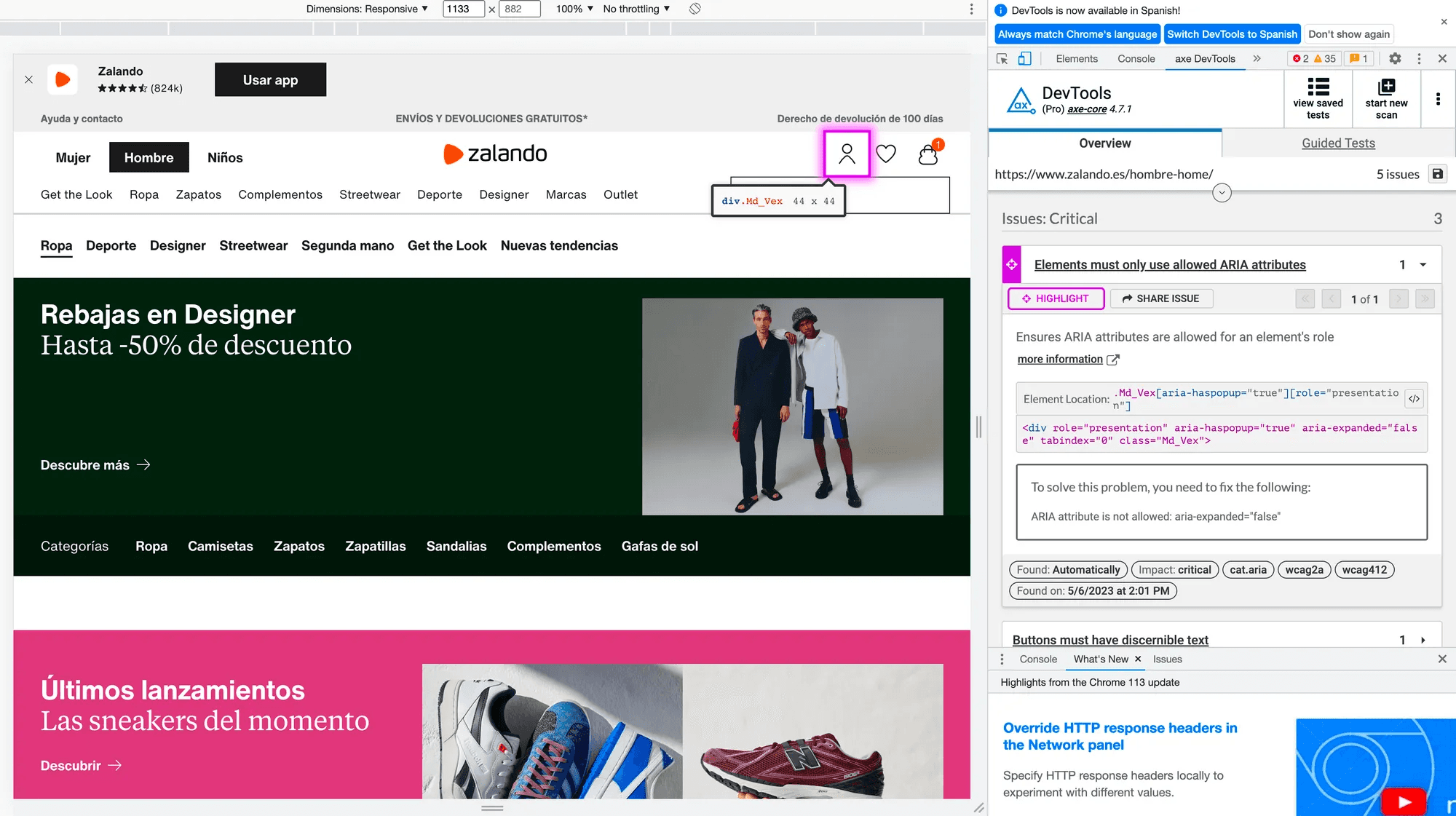
However, areas of potential improvement were also identified. For example, issues were detected with the use of ARIA attributes that are not allowed for the role of the element in question. To address this problem, it is suggested to remove or change the ARIA attribute that is not allowed.
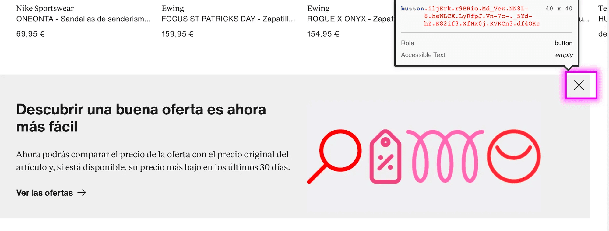
Additionally, it was found that some buttons on the page lack discernible text. This can be a problem for users who rely on screen readers as they won't be able to understand the button's function. To address this issue, it is recommended to add visible text to the button or use the aria-label attribute to provide a description of the button for screen readers.
Finally, it was identified that some images on the page lack alternative text or have a role of "none" or "presentation." Alternative text is crucial for users who use screen readers as it provides a description of the image. To address this issue, it is recommended to add an alt attribute to the image with an appropriate description or assign it a role of "none" or "presentation" if the image is purely decorative.
6. Conclusions
Our analysis of the usability of the Zalando website has highlighted several key areas for improvement. These implications are as follows:
Visibility of System Status: Zalando could benefit from providing more consistent and predictable feedback to users, especially regarding the functionality of filters and navigation between sections.
Real-world Matching: A review of Zalando's product categorization system is suggested to enhance intuitiveness and coherence, including the addition of color filters and merging redundant categories.
User Control and Freedom: Zalando is recommended to review its website structure to facilitate navigation, simplifying the menu and improving movement between different sections and pages.
Consistency and Standards: Zalando could reduce the amount of content on its homepage to avoid information overload, limiting the number of blocks and scrolls and ensuring that presented information is relevant and useful.
Flexibility and Efficiency of Use: It is suggested that Zalando replace the pagination system with infinite scrolling to address the excessive number of pages of items in each search.
Aesthetic and Minimalist Design: Zalando could review its design to reduce visual noise, limiting the use of design elements such as banners.
Regarding accessibility, we have verified that images include alternative text for screen readers; the page structure, with well-defined categories, favors keyboard navigation; and the color contrast in its design facilitates reading for users with vision impairments.
Overall, both the accessibility and usability of Zalando are quite suitable. Our recommendations focus on areas where the website could further enhance usability.